The network for creativity
Join 1.25M professional creatives like you
Connect with clients, get discovered, and run your business 100% commission-free
Creatives on Contra have earned over $150M and we are just getting started
Back to feedPost

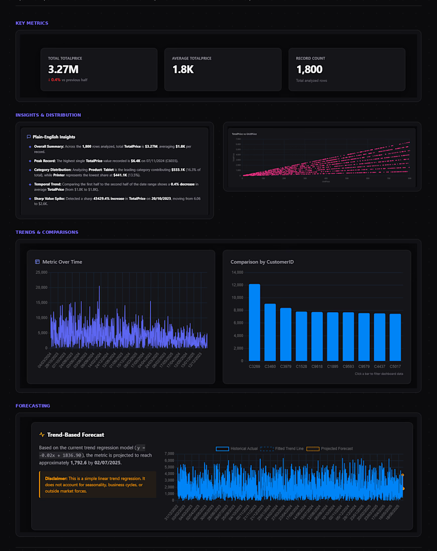
This is a budget tracking dashboard built entirely in Excel, designed to replace the typical cluttered "totals + pie charts" layout most budget templates default to.
Instead of static tables, the dashboard uses KPI cards (Total Planned, Total Actual, Variance, % of Budget Used) with sparkline trends, a Planned → Actual → Balance waterfall chart to show variance at a glance, and slicers that let the user filter by category or time period, with everything on the sheet updating live.
What it includes:
KPI summary cards with month-over-month sparklines
A waterfall-style variance chart replacing traditional bar/pie combinations
Category and period slicers connected to PivotTables for real interactivity, not just static charts
Conditional formatting on the variance table (over/under budget flagged automatically)
A plain-English insights panel summarizing what the numbers mean
A simple linear forecast projecting year-end spend based on current burn rate
Design approach: clean, minimal styling inspired by modern product dashboards (Linear, Notion) muted color palette, no gridlines, consistent typography built to look like a tool someone would actually want to open, not a default Excel export.


ooh, purdy!
The network for creativity
Join 1.25M professional creatives like you
Connect with clients, get discovered, and run your business 100% commission-free
Creatives on Contra have earned over $150M and we are just getting started
Related posts

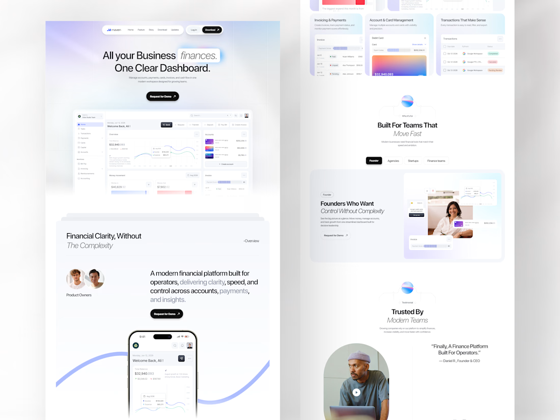
Every growing business has the same problem: finances spread across too many tools, too many tabs, and too much noise.
Maven was designed to end that. A finance SaaS landing page built for operators, founders, agencies, and startups who need one clear dashboard where accounts, payments, invoicing, card management, and cash flow all live together without fighting for attention.
All your business finances. One clear dashboard. The headline says everything, and the design proves it.
This is what a SaaS landing page looks like when it respects the intelligence of the people it's selling to.
Does this feel like a dashboard your finance team would actually trust? 👇
Tools: Figma , Jitter
#SaaSDesign #LandingPage #WebDesign #FintechUI #UIDesign #ContraFreelance #ProductDesign #DashboardDesign


Nice use of whitespace. It keeps everything focused.

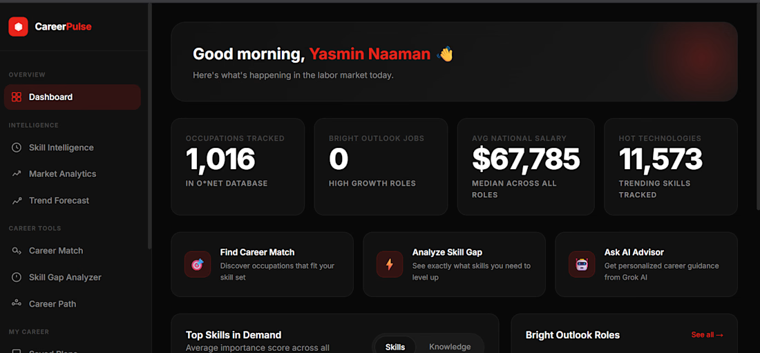
CareerPulse is a software solution built using AI to help students or anyone looking to change careers, find all the information they need from different work databases.



👋 Hey Contra fam, excited to be here!
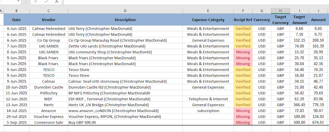
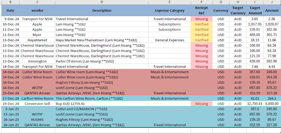
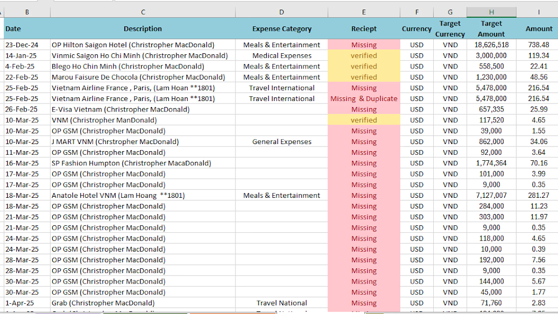
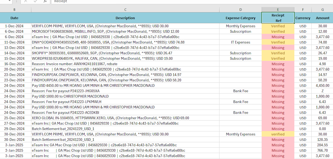
I recently took on a messy currency reconciliation project. The client had receipts in 5 different currencies completely unorganized and hard to track.
I reconciled all receipts with the recorded expenses, cleaned the data, categorized everything properly, and delivered well-organized Excel sheets for each currency.
Now the client can easily track expenses, spot issues, and maintain clean records going forward.
Here are some glimpses:
If you’re dealing with messy financial data, multiple currencies, or expense tracking chaos , I can help organize it.
Would love to hear: What’s the biggest data/expense headache you’ve faced in your business?
#Finance #Bookkeeping #DataOrganization #Excel #VirtualAssistant #ExpenseManagement








Trending

Claude
Claude has entered the design space. How are you using Claude Design?

Contra University
Learn from expert creatives how to earn more using next-gen AI tools.
fifaworldcup2026
The World Cup is here and the whole world's watching. How are you designing for the world stage?
creativeaiflow
Creative AI workflows are evolving. What tools do you use, and what are their strengths and weaknesses?
freelancerlife
Freelancer life is wins, pivots, and everything in between. What’s yours right now?