The network for creativity
Join 1.25M professional creatives like you
Connect with clients, get discovered, and run your business 100% commission-free
Creatives on Contra have earned over $150M and we are just getting started
Back to feedPost
Matching the vibe. 🎨
One of my favorite things about building extensive color libraries is seeing how existing colors can capture completely different visual moods.
Fashion, interiors, photography, branding, nature: I love finding connections.
I've been doing these little color-matching experiments for months, using colors from my libraries of 654 dessert-inspired colors, 365 cultural palettes, and 49 luxury color systems.
The references change. The colors are already there. The fun is in finding the right combinations.
Here are a few of my favorites.
P.S. Want me to match the vibe of your work? Any kind of work: branding, illustration, photography, fashion, interiors, anything! Share it below. I'll pick a few and find matching colors from my libraries. 👀

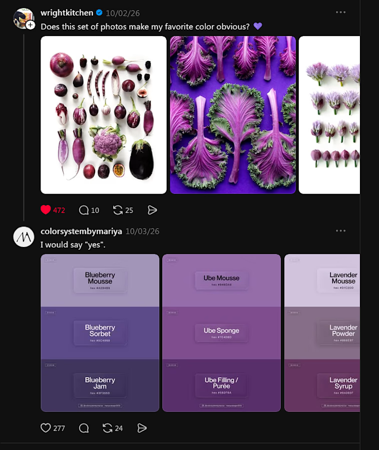
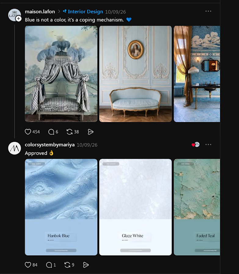
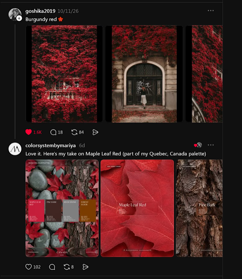

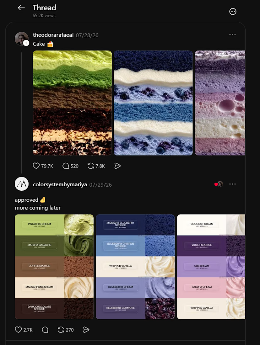
For this one, I rearranged colors from my existing library to match the cakes' layers. 🍰 Same colors, different combinations!
And if you've spent time on Pinterest, you've probably come across some of my palettes already. In the past 30 days alone, they've reached more than 2.7 million views and 31,000 saves. 🥹

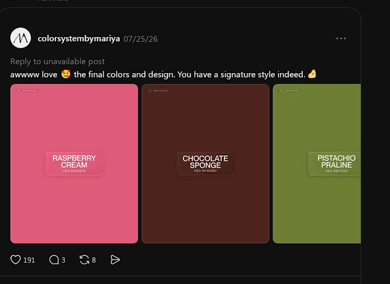
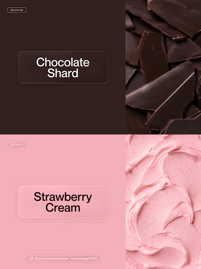
The raspberry pink with chocolate brown is such a lovely match, Mariya
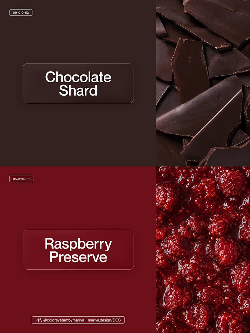
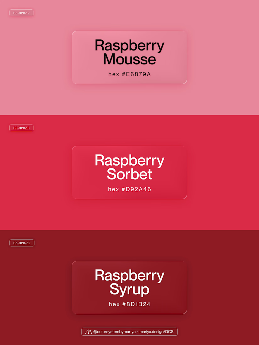
Thanks, Thayline! This is my most recent favorite combo with Chocolate Shard. And I am also obsessed with tonal trios, these always do magic for any type of content: from packaging, through interior and fashion to UI.
I keep falling down the rabbit hole: there are more than 17k...
The network for creativity
Join 1.25M professional creatives like you
Connect with clients, get discovered, and run your business 100% commission-free
Creatives on Contra have earned over $150M and we are just getting started




Related posts

A brand built on the daily walk.
For Patta, a Brazilian pet-lifestyle brand, the wordmark leans like a pair walking side by side, and dog-tag shapes frame everything from packaging to Barkz, its collectible charms.
Pet brands: cute, or bold enough to wear?


I like it!🔥 Best one since morning.

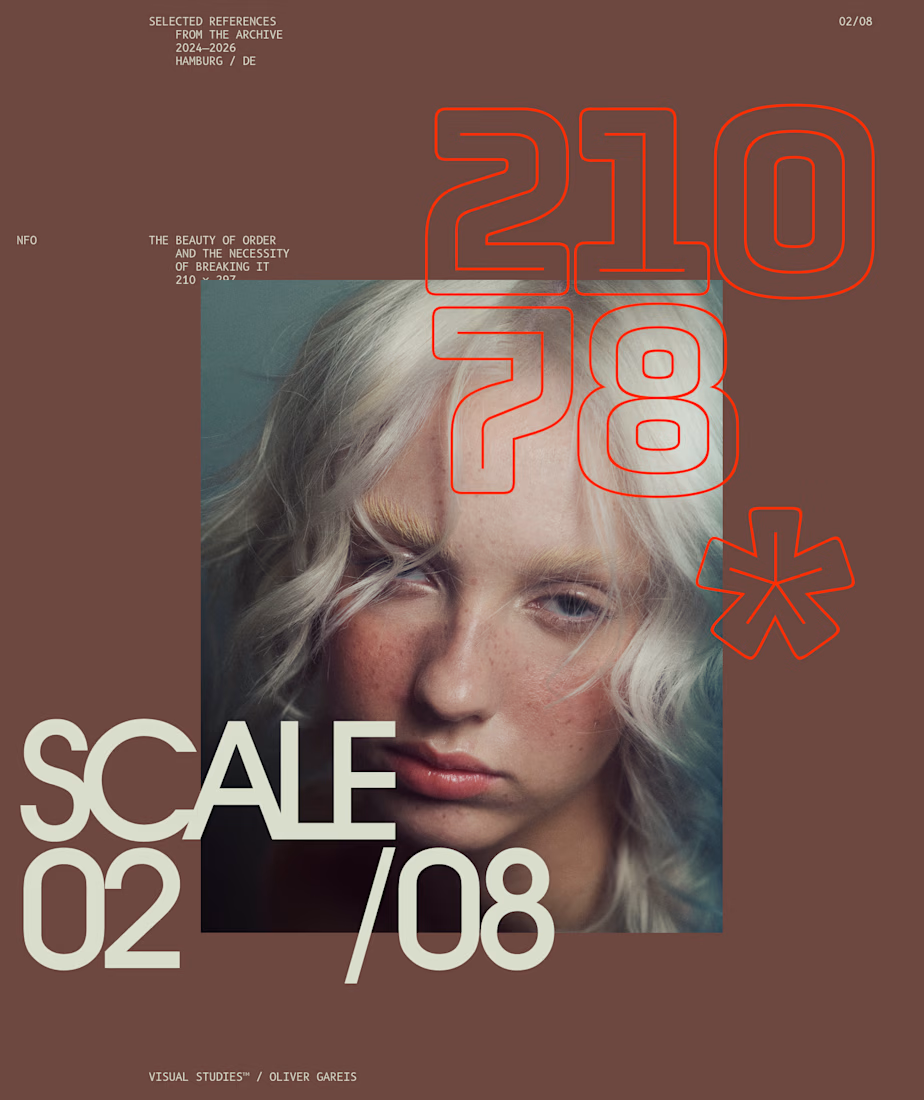
I designed these typographic layouts as part of my ongoing visual series on scale, grid and rhythm
↳ Master typography & layout - The foundation of timeless web design. Join 350+ designers inside my 13-hour online course https://typomonday.com/course
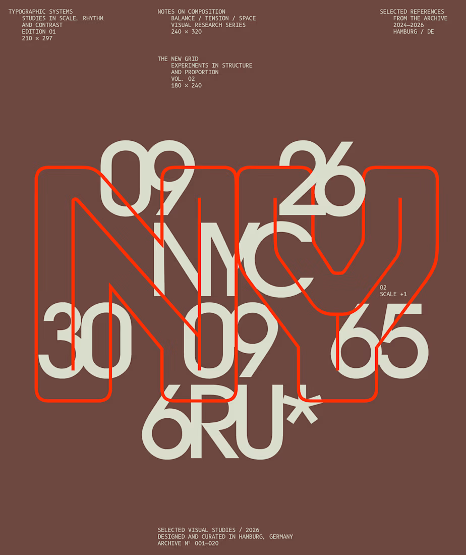
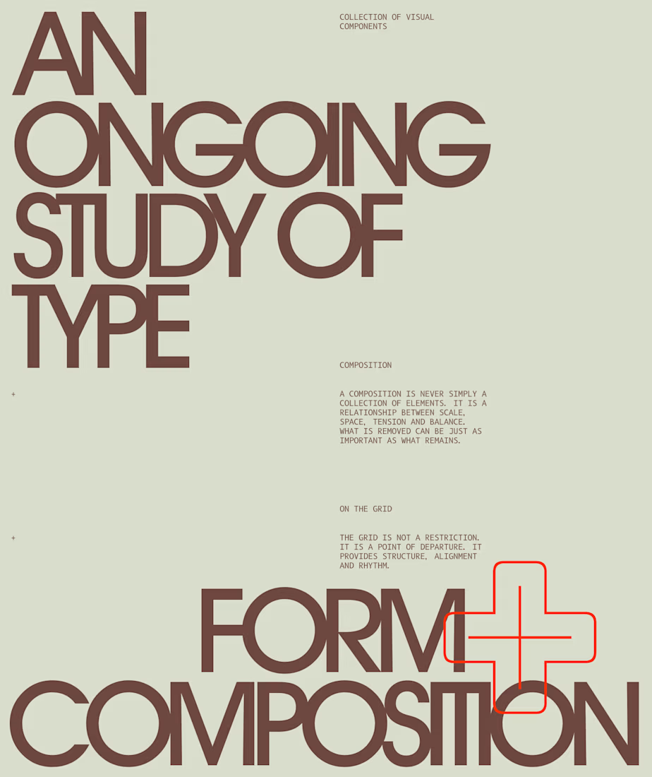

Beautiful wo

Need a second pair of eyes 👀
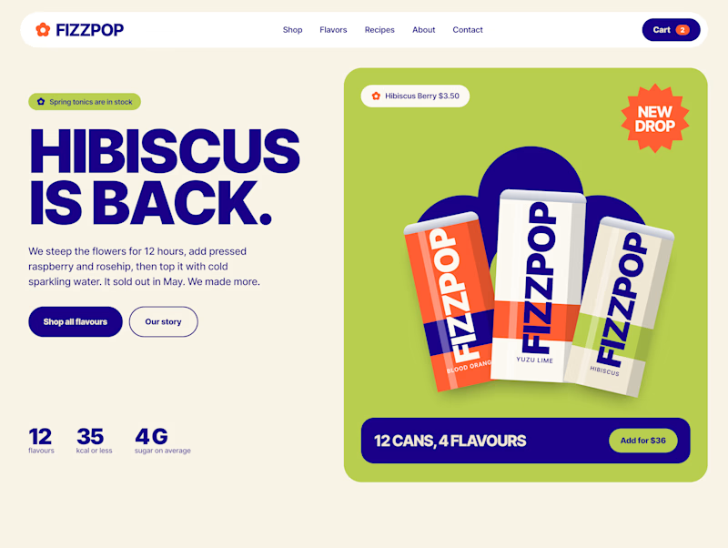
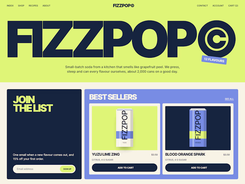
I'm designing the online store for FizzPop, a craft soda brand: all-natural sodas, sparkling waters and botanical tonics.
Flower Fizz(A): eggshell, tiger orange and deep ultramarine, with flower shapes and stacked colour swatches for the flavours
Corner Shop(B): lime, soft blues and navy, editorial layout with a giant wordmark and menu-style flavour tiles
38 voted
44%
48 voted
56%
86 votes
Closed
