The network for creativity
Join 1.25M professional creatives like you
Connect with clients, get discovered, and run your business 100% commission-free
Creatives on Contra have earned over $150M and we are just getting started
Back to feedPost


The network for creativity
Join 1.25M professional creatives like you
Connect with clients, get discovered, and run your business 100% commission-free
Creatives on Contra have earned over $150M and we are just getting started

Challenges
View all


Related posts

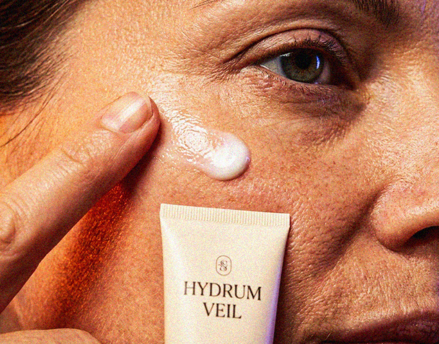
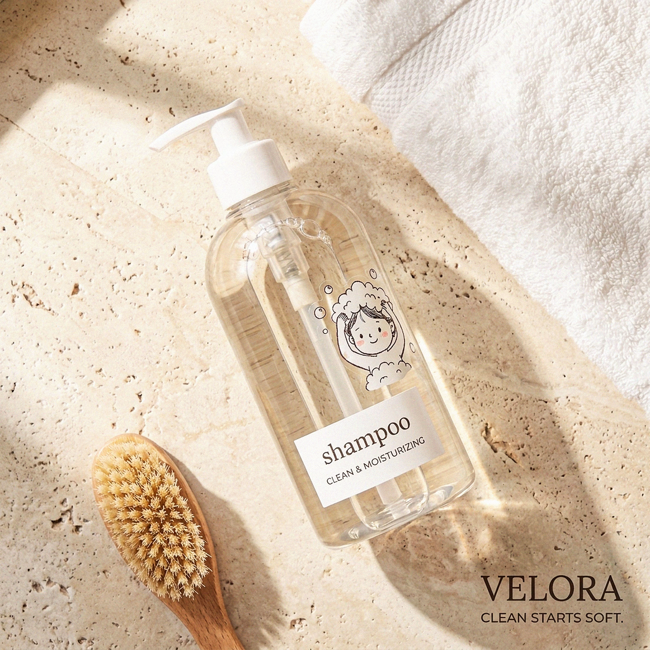
My Top Featured Projects on @Contra Labs 🔥
⚡| NEXVOLU
⚡| HYDRUM VEIL
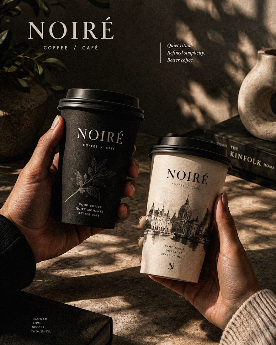
⚡| NOIRÉ
Each project explores a different direction, but the goal stays the same: build brands that stand out.
Which project is your favorite?
Drop the name below 👇



These are 🔥 Mine are all fav 🙌
Congo for Featured on @Contra HQ & @Contra Labs ... 😍

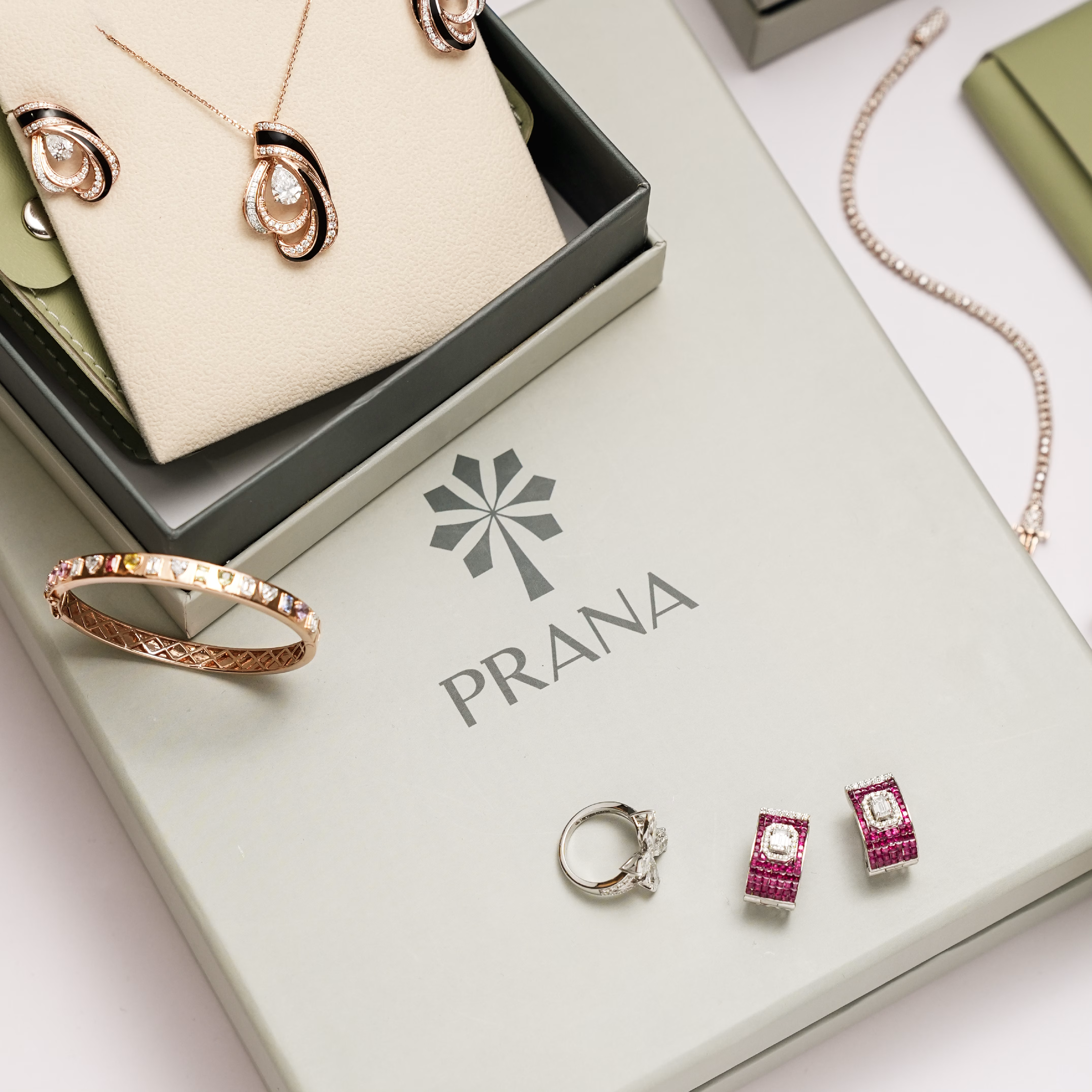
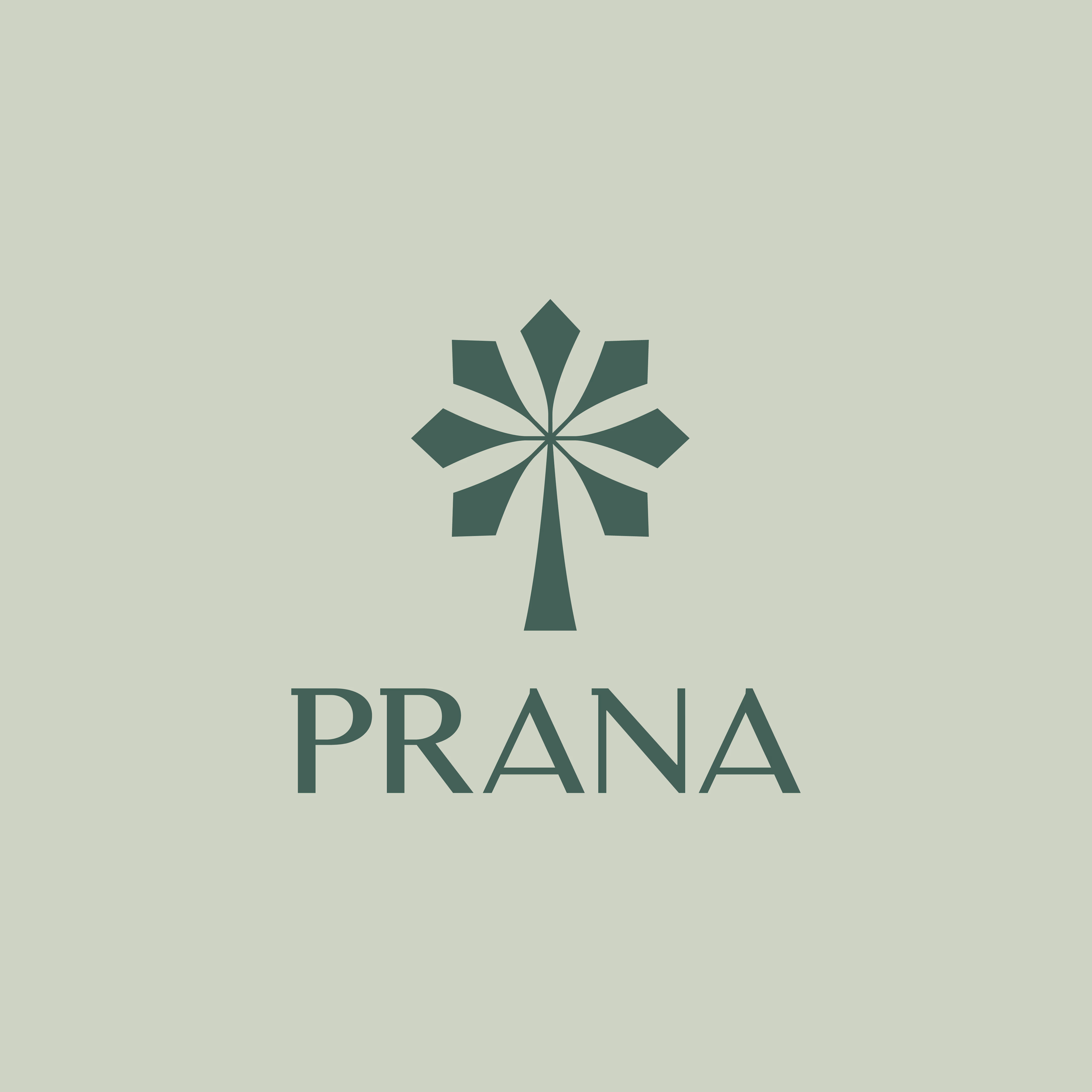
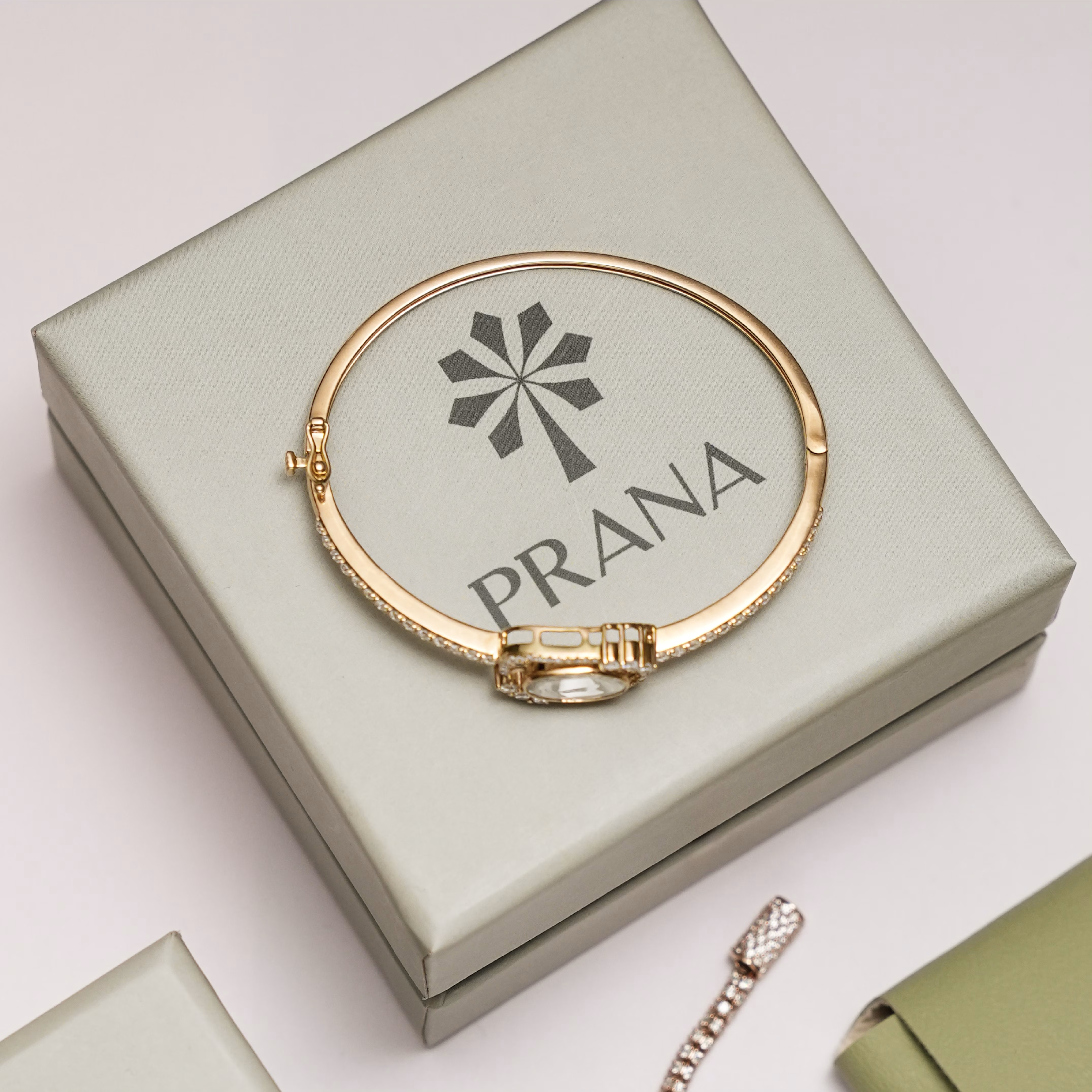
Introducing PRANA — a fine jewellery visual identity ✨
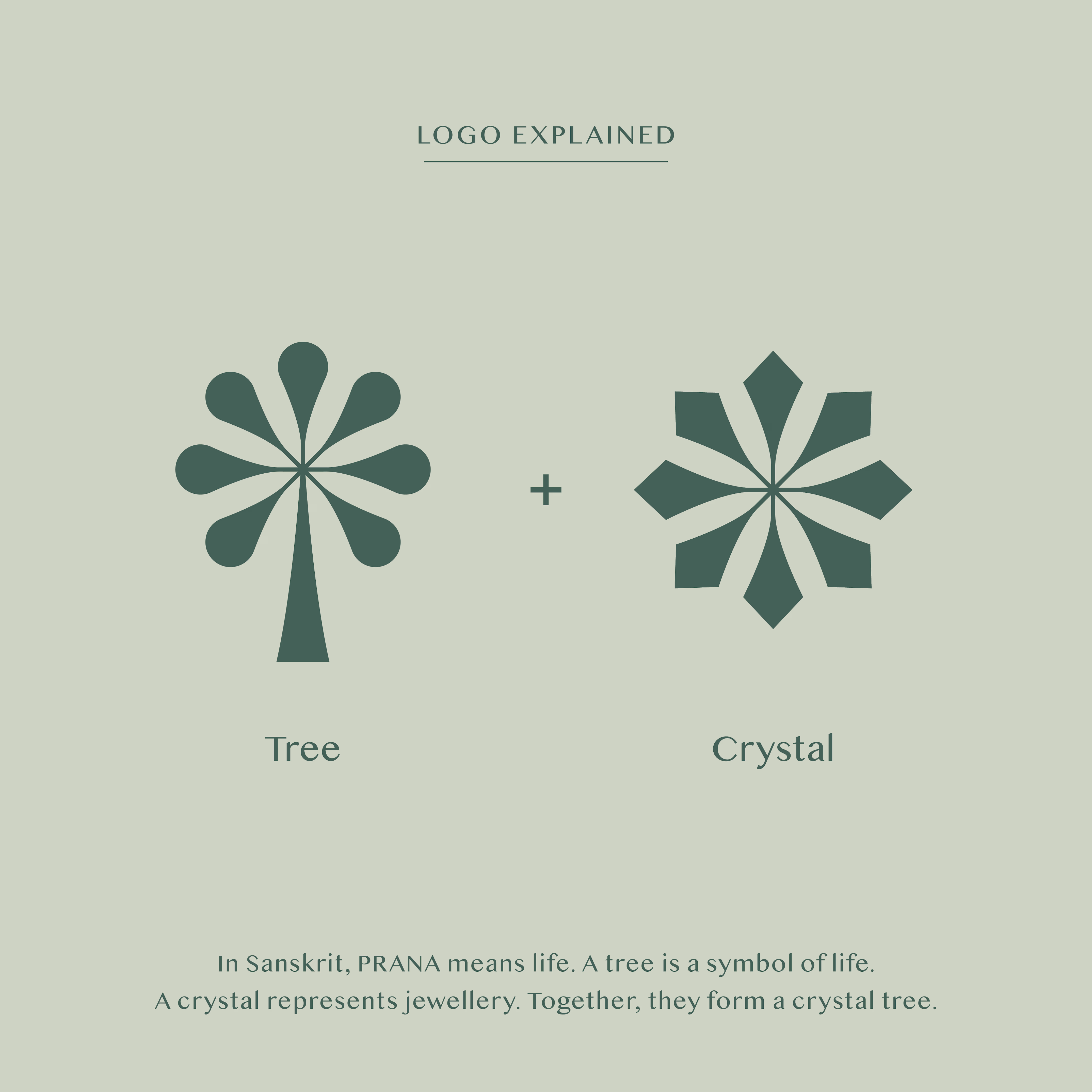
In Sanskrit, Prana, means force of life. A tree is a symbol of life. A crystal is a symbol of jewellery. Combined, we have a crystal tree - the concept behind the logo. The soft greens and the luxurious stylised typography reflect the brand’s beautiful designs that are rooted in elegance and timelessness.
Photos and website courtesy of @pranafinejewellery_.

Good !!

From a grid to a complete studio website.
FRAME 019 is live. I built it around bold type, editorial imagery and one changeable accent, then connected the details: CMS case studies, a full-screen menu and interactive process tabs.
A quick walkthrough of the finished build below.
13 page layouts. 6 sample projects. Desktop to mobile.
Available now for $10.
FIRSTFRAME is coming soon: a planned 3-day free launch offer. The coupon is NOT active yet. I'll share the confirmed dates when it's ready.
Which detail would you make your own?
#Framer #WebDesign #FramerTemplates


Limiting the design to one changeable accent color makes it surprisingly effective for client handoffs. It lets buyers rebrand the identity without unraveling the entire layout system.