The network for creativity
Join 1.25M professional creatives like you
Connect with clients, get discovered, and run your business 100% commission-free
Creatives on Contra have earned over $150M and we are just getting started
Back to feedPost

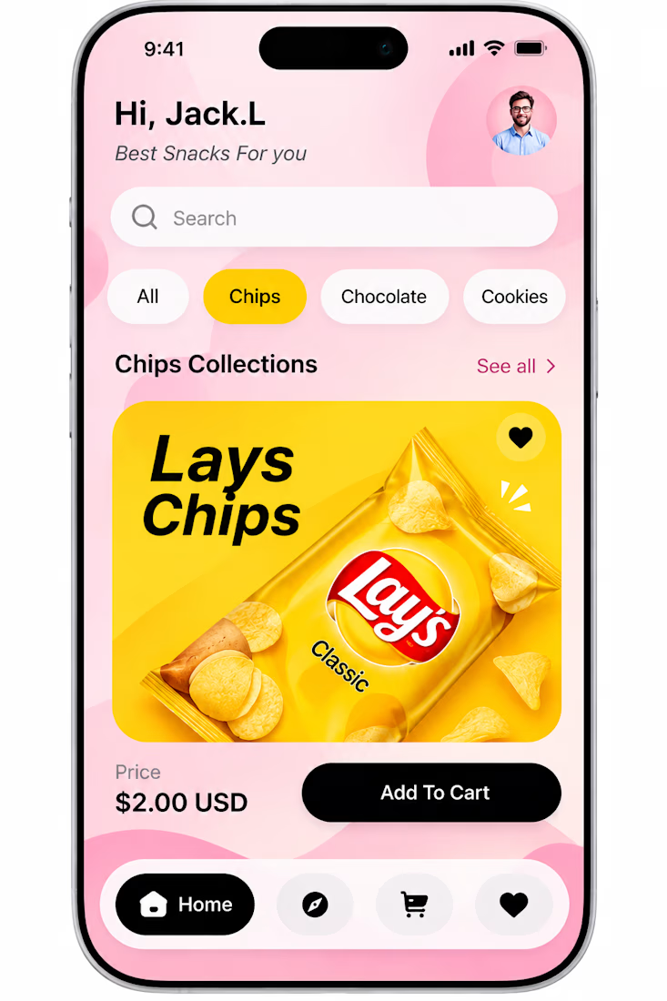
Craving a better UX? 🍟 Just shipped this mobile commerce concept.
Hey Contra community! 👋
I’ve been exploring how to make food delivery apps feel more tactile and appetizing. For this snack ordering concept, the goal was to reduce friction and boost the "Add to Cart" action.
A few design decisions I focused on:
🍋 Appetite-driven color theory: Using warm, energetic yellows to draw the eye straight to the product.
🛍️ Breaking the grid: Popping the 3D chip bag out of the card boundaries to create depth and make the product feel tangible.
🖤 High-contrast CTAs: A bold, pill-shaped black button so the primary action is unmistakable.
🧭 Seamless filtering: Clean category pills for effortless browsing.
I’m currently available for new mobile projects! If you need a developer who cares about the details and the user journey, let's chat. Drop a comment or send me a DM. 💬
Availability: Open for freelance & contract roles.
#MobileDesign #UIUX #ProductDesign #Ecommerce #Contra #FreelanceDeveloper

The colors make it feel playful.
The network for creativity
Join 1.25M professional creatives like you
Connect with clients, get discovered, and run your business 100% commission-free
Creatives on Contra have earned over $150M and we are just getting started



Related posts


October was one hell of a month!
Packed with creativity, experiments, and some seriously satisfying UI motion.

These are some clean design Divan!




Dark makes the logo pop out more

AI Health & Wellness Companion App
Vita is a concept mobile app that makes personal health feel calm, clear, and human. Instead of overwhelming users with charts and numbers, it uses a soft, glass morphic interface and gentle motion to turn daily health data into simple, actionable guidance.
AI VIsual DesignerMobile DesignUI DesignAdobe After EffectsClaudeFigmamobileappdesignhealthappmobileapp


