The network for creativity
Join 1.25M professional creatives like you
Connect with clients, get discovered, and run your business 100% commission-free
Creatives on Contra have earned over $150M and we are just getting started
Back to feedPost
Taste Test

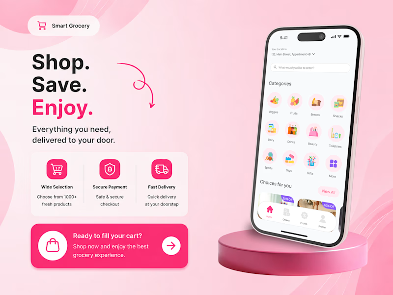
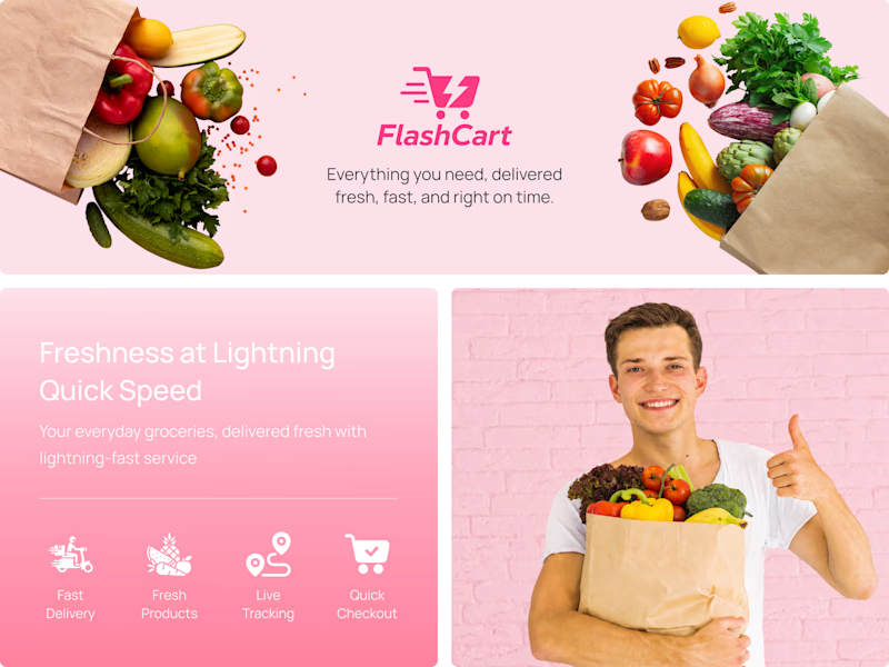
Which visual better communicates FlashCart’s fast and simple grocery delivery experience?
We are exploring two visual directions for FlashCart, a mobile grocery delivery app. The first focuses on the app interface and shopping experience, while the second highlights the brand identity and service concept. Which direction feels clearer, more engaging, and better suited to a grocery delivery platform? Share your choice and feedback below.
View the full FlashCart case study on Dribbble: https://dribbble.com/shots/27624144-FlashCart-Fresh-Grocery-Delivery-App-UI-UX-Case-Study

1 vote
Ends in 1d
The network for creativity
Join 1.25M professional creatives like you
Connect with clients, get discovered, and run your business 100% commission-free
Creatives on Contra have earned over $150M and we are just getting started
Trending

Claude
Claude has entered the design space. How are you using it?

Contra University
Learn from expert creatives how to earn more using next-gen AI tools.
Brand Design
The best brand designers are on Contra. Scroll to see what's trending in brand design. What are you building?
creativeaiflow
Creative AI workflows are evolving. What tools do you use, and what are their strengths and weaknesses?
freelancerlife
Freelancer life is wins, pivots, and everything in between. What’s yours right now?





Related posts

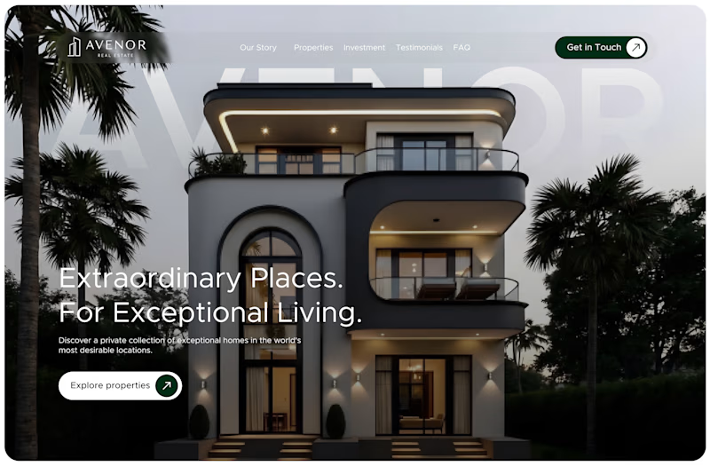
I'm currently working on this real estate landing page.
So I have two hero section choices
The one with a video background and the one with a static image background.
Which of these fits the brand better and will make users more likely to explore?
A. Motion Hero
B. Static Hero

34 voted
87%
5 voted
13%
39 votes
Closed

I would say motion hero attarcts


Nice work


Which showreel opening would you choose - 3D Object or Hero Reveal? 👀✨
Brand DesignCreative Design Motion DesignAdobe After EffectsCinema 4DLottieFilesmotiondesignweb3creativeproject


17 voted
45%
21 voted
55%
38 votes
Closed

Totally 3D