The network for creativity
Join 1.25M professional creatives like you
Connect with clients, get discovered, and run your business 100% commission-free
Creatives on Contra have earned over $150M and we are just getting started
Back to feedPost

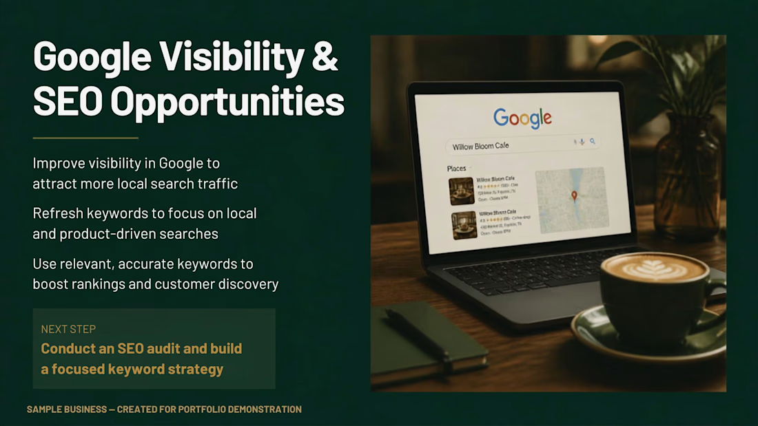
A focused analysis of Google visibility and SEO opportunities for a small business. This work identified opportunities to improve local search visibility, refine keyword targeting, and strengthen customer discovery through a more focused SEO strategy.

The network for creativity
Join 1.25M professional creatives like you
Connect with clients, get discovered, and run your business 100% commission-free
Creatives on Contra have earned over $150M and we are just getting started

Challenges
View all


Related posts

This is a modern and fully responsive real estate marketplace website designed to connect buyers and sellers through a simple and intuitive property discovery experience. The platform combines advanced property search, category-based browsing, saved listings, property filters, and a dedicated seller dashboard for managing listings and tracking inquiries


Aisha's Hair - Price List Flyer
I created a minimal and luxury price list flyer for a hair stylist brand.
Goal: Show prices clearly and make the brand look premium.
What I did:
Used elegant black and gold colors for luxury feel
Simple layout: Braids N15k, Wig Install N8k
Added Home Service Available for more bookings
Clean call to action: DM to book + WhatsApp
Tools: Canva
Result: A classy, easy-to-read price list that helps the client get bookings on Instagram and WhatsApp.
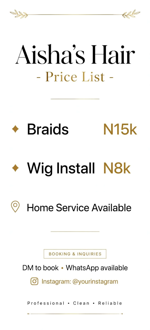

Putting the prices in gold rather than the service names is the choice doing the real work — the number becomes the accent instead of the thing you soften, which is the reverse of how most rate cards handle it. Hard numbers do date a flyer fast though; did she get an editable file so she can reprice without coming back to you?


What does “simple skincare” look like as a brand?
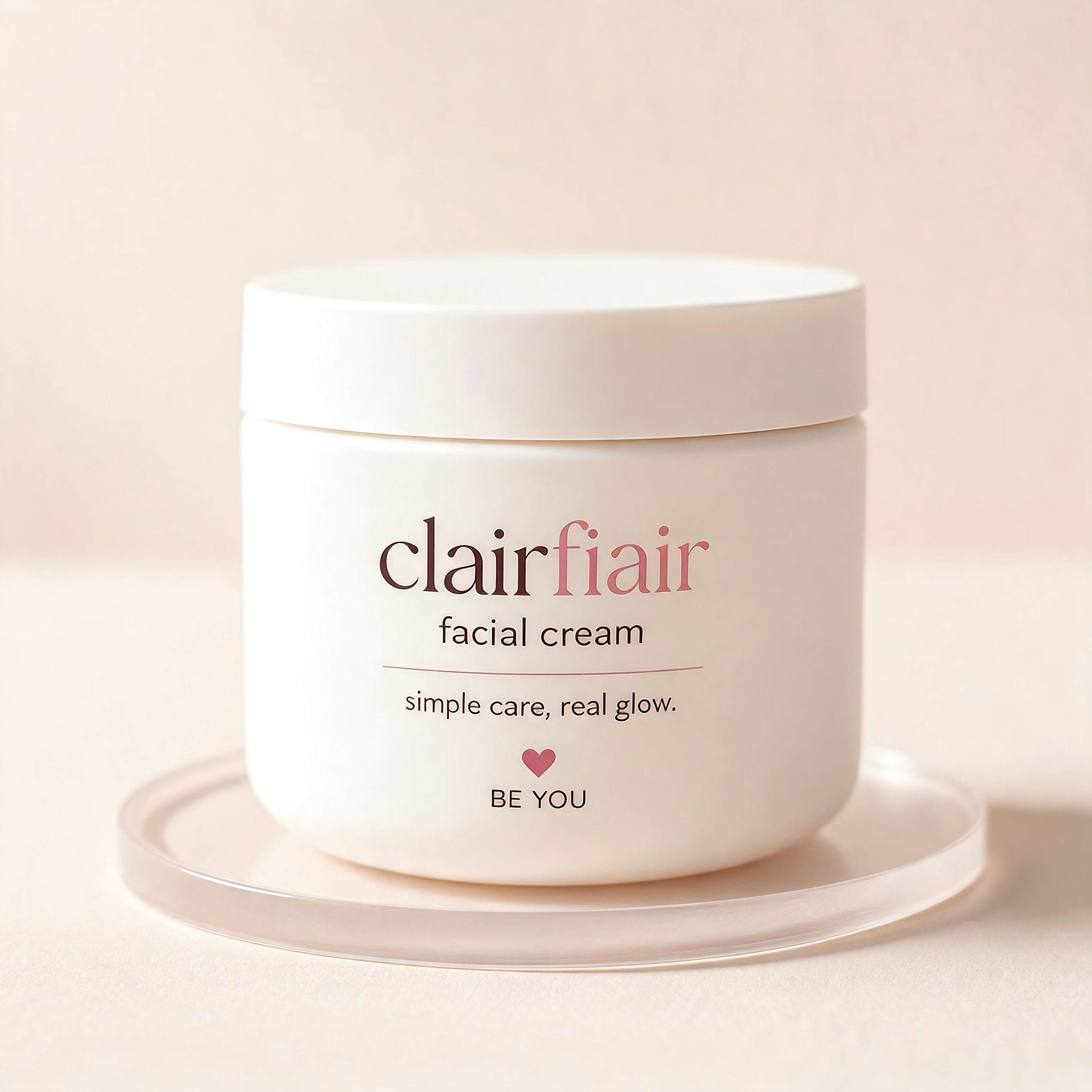
For Clairfair, I explored a soft, youthful visual identity built around a simple idea: care should feel gentle, approachable, and personal.
I developed the direction across the logo, typography, color palette, messaging, and facial-cream packaging keeping the system clean and minimal while adding subtle playful details through the soft pink palette, hearts, and expressive typography.
The goal wasn't to make skincare feel clinical or overly luxurious. It was to create something that feels friendly, confident, gentle, and easy to connect with.
I also explored how the identity could translate into a broader brand system rather than stopping at the logo.
Does this feel more like a skincare brand for teens, young adults, or both?

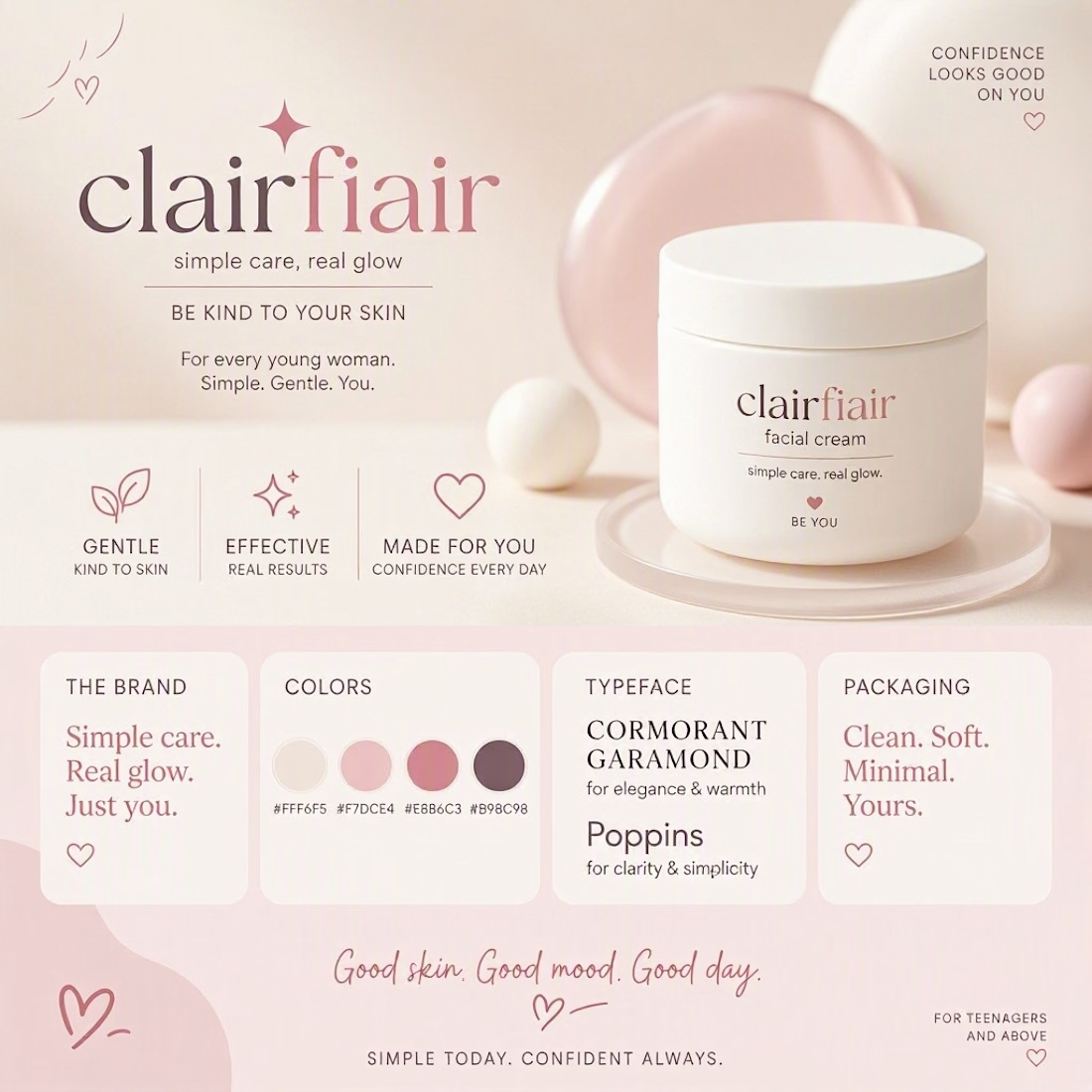
Teen-leaning to me, and the hearts are what tip it — they're the one element an older buyer would read as aimed at someone younger. The script wordmark and that muted rose palette on their own would sit fine in early-twenties territory. If you want it to stretch to both, the...