The network for creativity
Join 1.25M professional creatives like you
Connect with clients, get discovered, and run your business 100% commission-free
Creatives on Contra have earned over $150M and we are just getting started
Back to feedPost


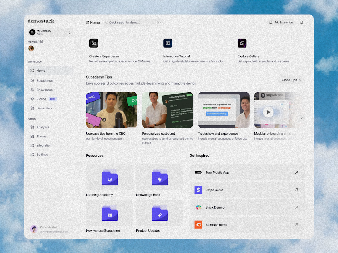
played with demostack a bit more, and bro the product needed to feel simple even when there are a lot of moving parts, workspaces, demos, videos, resources, all that, so we kept the screen calm and easy to move through


yes broo

amazing work


Taming a complex workflow with multiple moving parts into a calm, effortless interface is the ultimate UI/UX win. Clean visual architecture and thoughtful spacing make navigating total smooth sailing!

Simplicity is the ultimate cheat code to dashboard design, there is always a lot of information to fix on one screen but thinking through all of these and making it less complex is really great work

Fantastic work !
The network for creativity
Join 1.25M professional creatives like you
Connect with clients, get discovered, and run your business 100% commission-free
Creatives on Contra have earned over $150M and we are just getting started
Trending
retrofuturism
Share your favorite designs from the past exploring the distant future. Or your own take on the aesthetic 🚀
halftone
Dots. Texture. Grain. Let's see your designs using the halftone technique.

Midjourney
Creatives are showing off what they're making with Midjourney.
colorgrade
Video editors sound off: How do you enhance the mood of your video in color grading?





Related posts

Almost two years ago, I started shaping the visual identity of my own studio.
Time flies. Couldn't be happier with what we've built so far, and what's next!
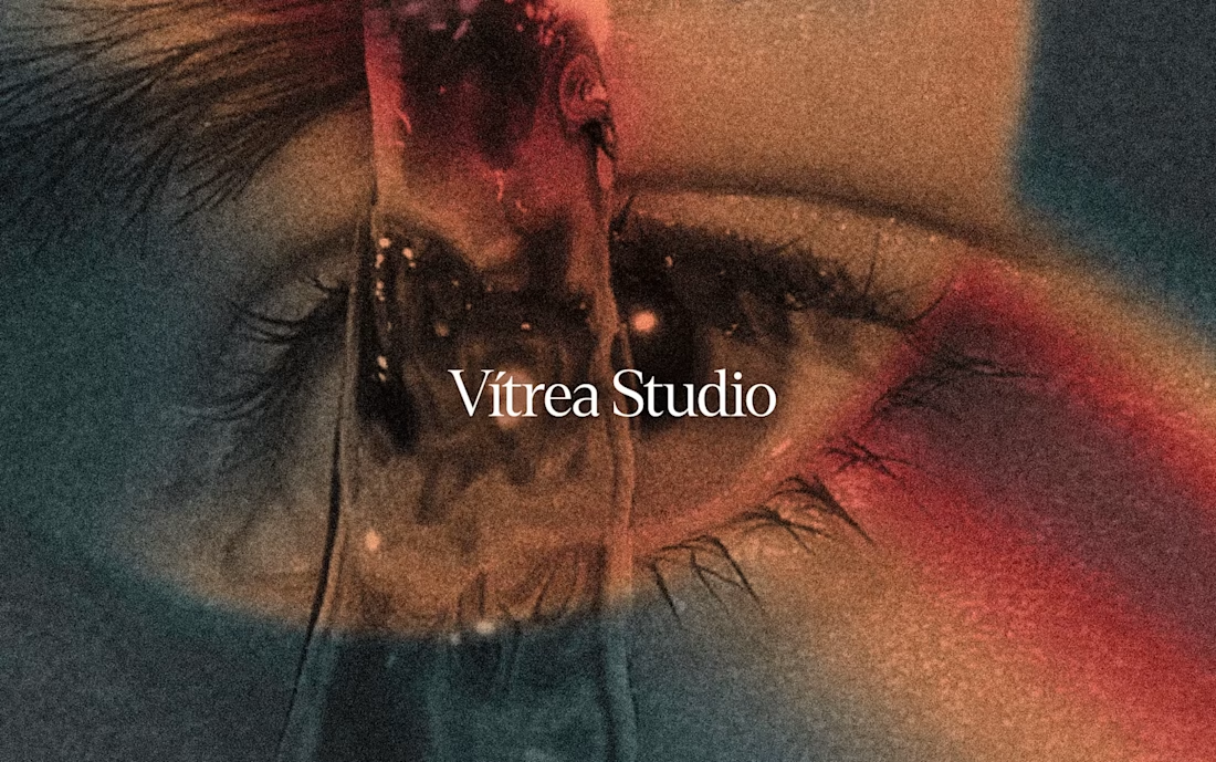
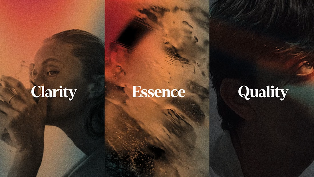
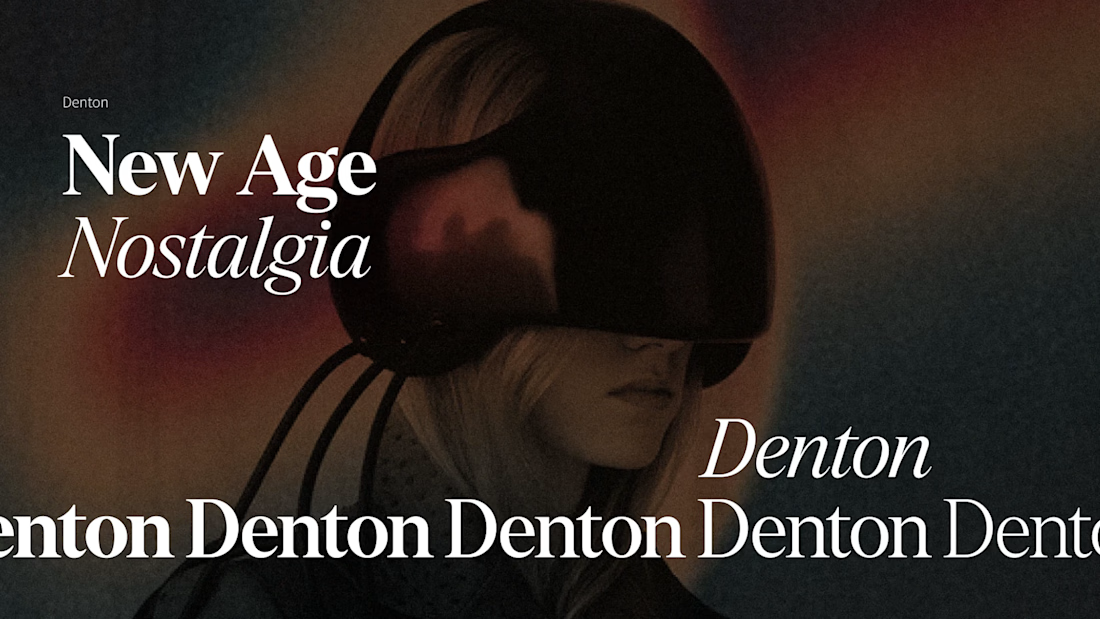

The eye motif carrying through every project instead of just the logo is what makes the studio's own identity actually recognizable, most agencies never bother applying their brand to themselves that consistently.







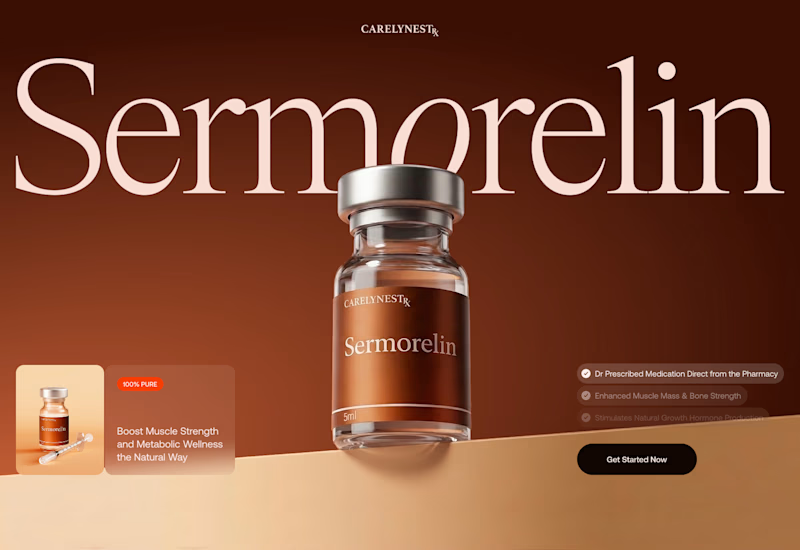
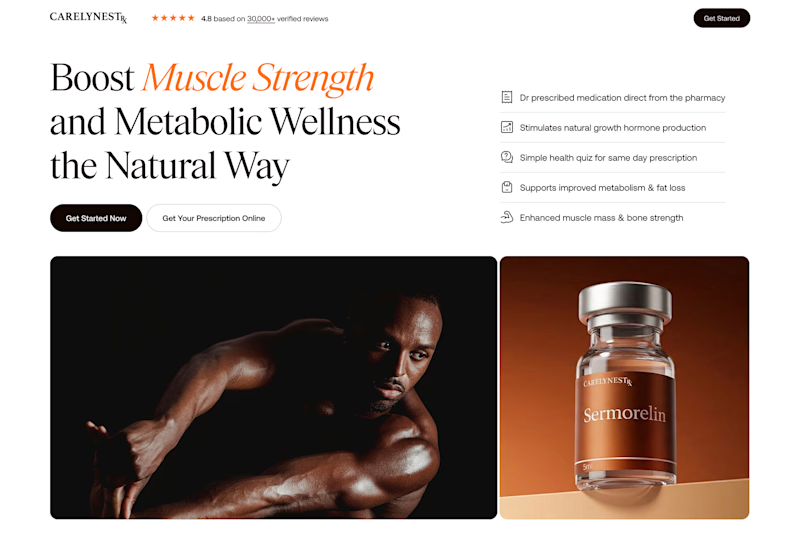
I'm exploring a new concept for the Telehealth product. Which one would convert better?
31 voted
72%
12 voted
28%
43 votes
Closed

Variant 1 looks great! 🤩