The network for creativity
Join 1.25M professional creatives like you
Connect with clients, get discovered, and run your business 100% commission-free
Creatives on Contra have earned over $150M and we are just getting started
Back to feedPost
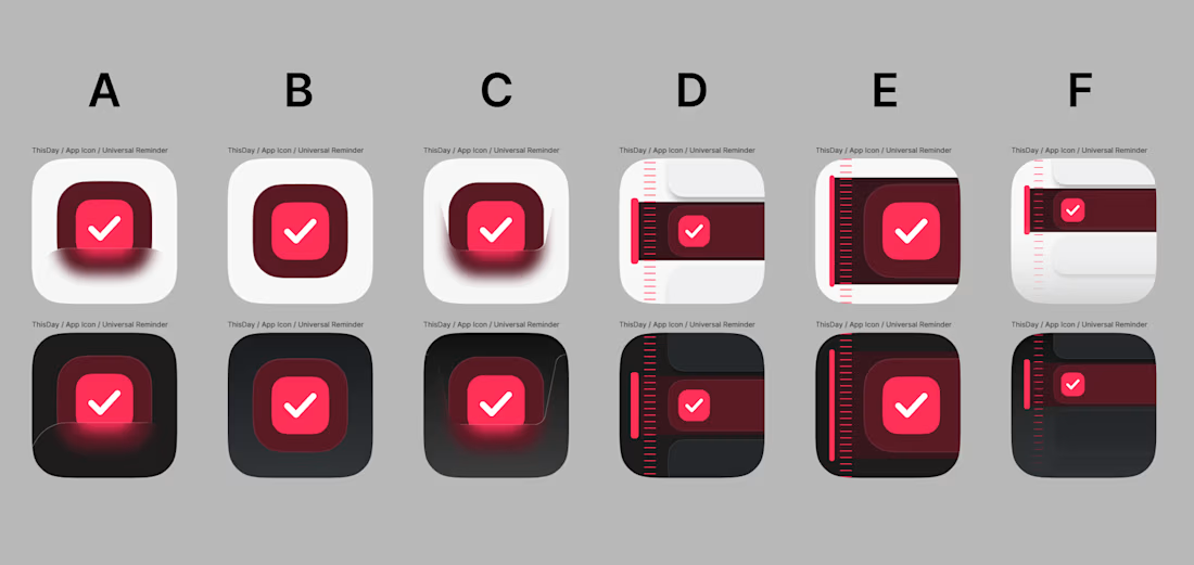
Would you download an app if it had one of these icons or no?
*or at least be intrigued?
be honest

Naaaaa

Beautiful project.


Not at all

Honestly D and F would stop my thumb mid-scroll for completely different reasons, one feels safe and one feels like it's hiding something. Which one are you leaning toward for the actual app?

i'd at least be intrigued about C

thank you

I dont think people download an app according to icons.


You sir are not correct. Lot's of people do! they are drawn to by the icon look which leads to downloads. I even sometimes don't use or e uninstall apps if the icon is to ugly on my screen, but I'm a bit weird
I care much more about accessibility, usability, and the overall user experience. The icon might get my attention, but the product itself is what makes me install and keep it.
The network for creativity
Join 1.25M professional creatives like you
Connect with clients, get discovered, and run your business 100% commission-free
Creatives on Contra have earned over $150M and we are just getting started
Trending

Claude
Claude has entered the design space. How are you using it?

Contra University
Learn from expert creatives how to earn more using next-gen AI tools.
Brand Design
The best brand designers are on Contra. Scroll to see what's trending in brand design. What are you building?
creativeaiflow
Creative AI workflows are evolving. What tools do you use, and what are their strengths and weaknesses?
freelancerlife
Freelancer life is wins, pivots, and everything in between. What’s yours right now?



Related posts


Brilliant Work

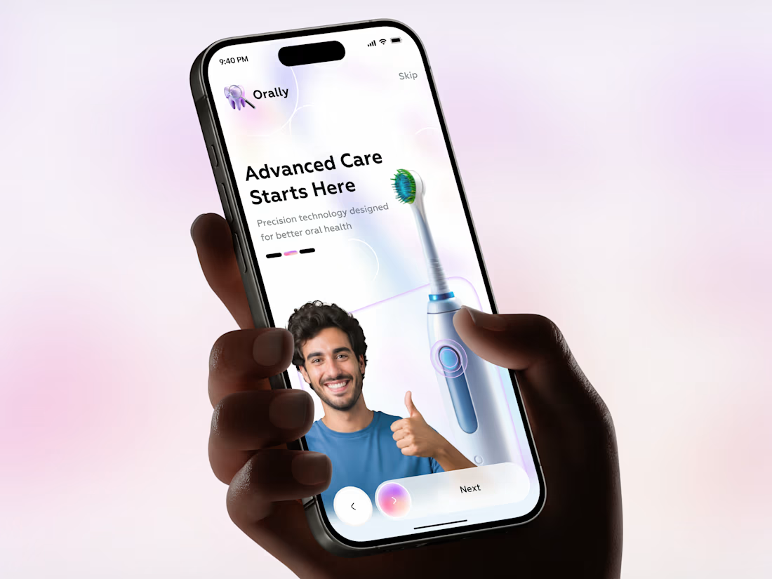
Smart Electric Toothbrush Mobile App UI
mobileappdesignelectrictoothbrushAI Agent DesignerProduct DesignUI DesignAdobe XDFigmatoothbrushmobileappui

👀 Which platform inspires your UI/UX journey?
❤️ YouTube - https://www.youtube.com/@gopiuix
🔁 X - https://x.com/gopiuiux
🚀 Don't forget to Follow on X & Subscribe on YouTube!




8 votes
Ends in 1d


Def Youtube, What inspires you