The network for creativity
Join 1.25M professional creatives like you
Connect with clients, get discovered, and run your business 100% commission-free
Creatives on Contra have earned over $150M and we are just getting started
Back to feedPost

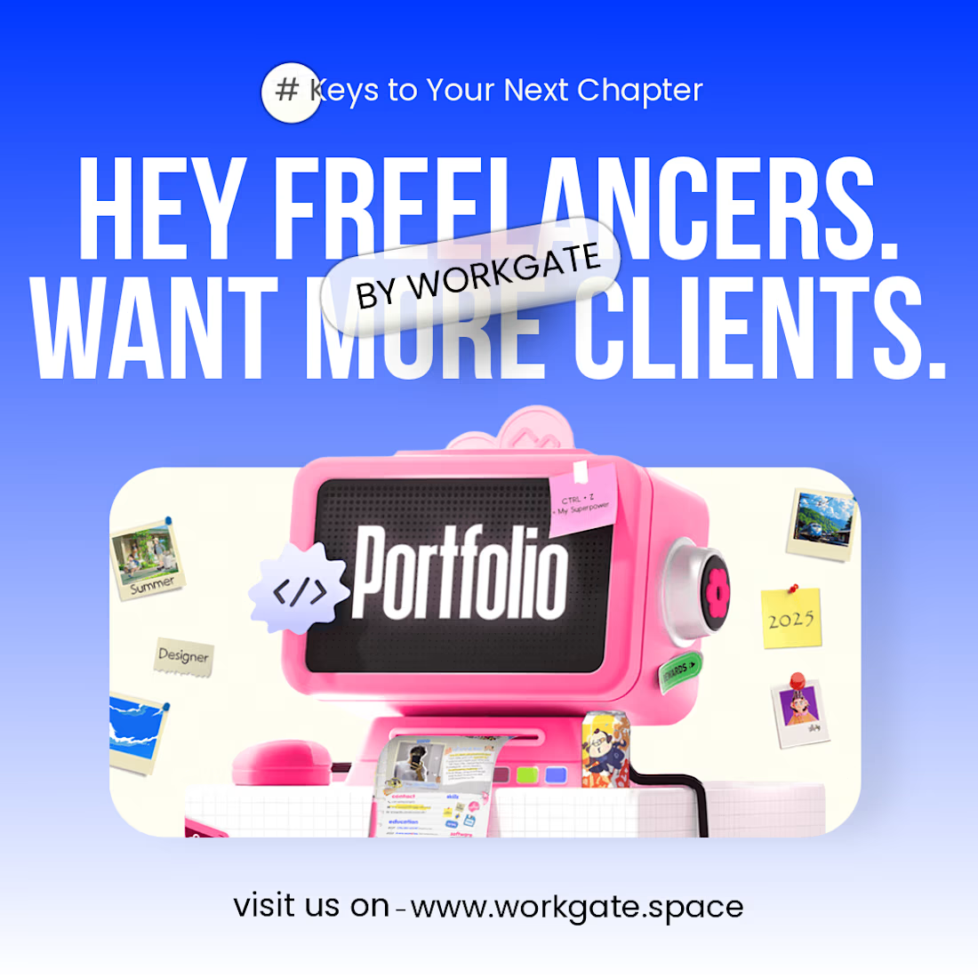
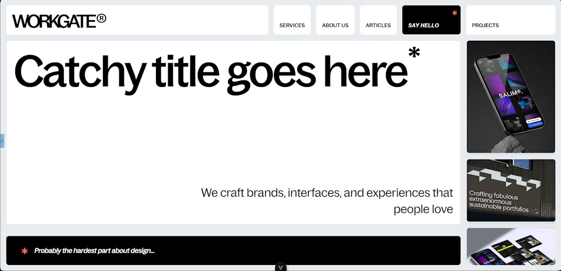
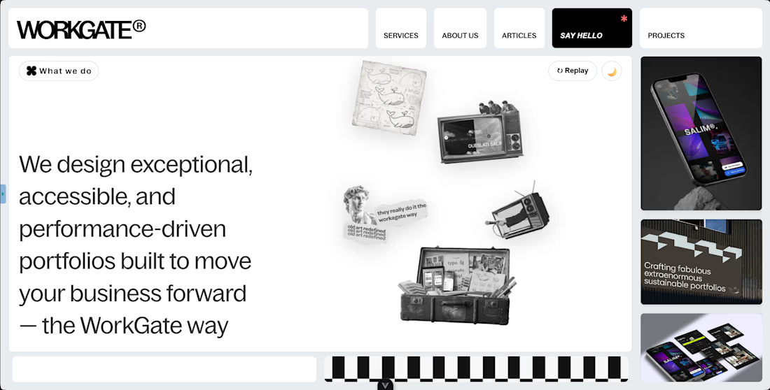
What do you guys think of the creative direction and these landing page screens? 👀
This is part of a project I’m working on for Workgate, a concept built around making personal websites more accessible.
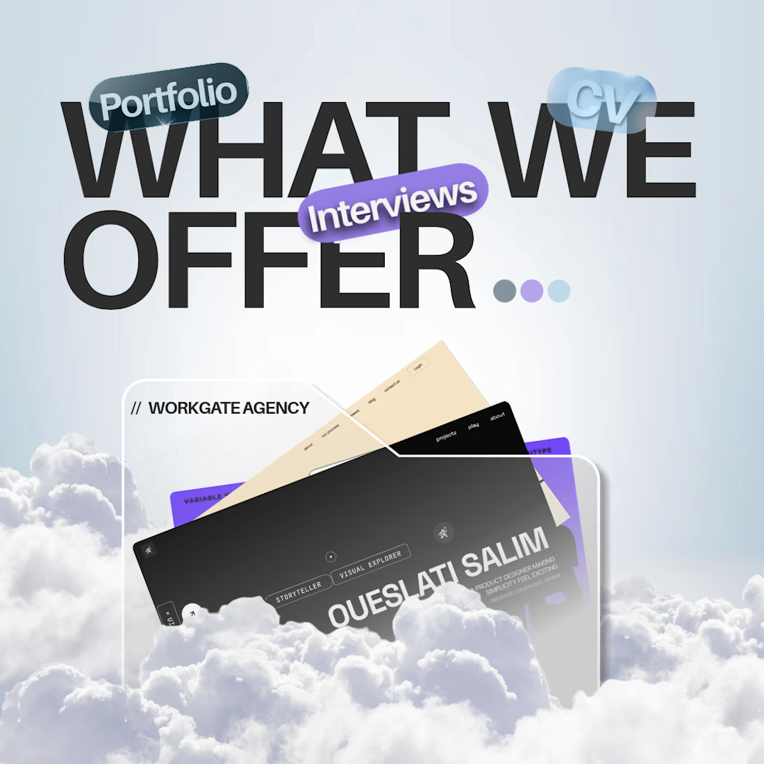
The idea is simple: discover standout portfolio designs, DM us to customize one to your taste, and get your own personalized website within hours.
We’re also exploring how to bring this experience to social media, making it easier for people to discover designs and turn inspiration into their own online presence.
Would love to hear your thoughts on the visual direction and the concept itself. What would you improve?
The network for creativity
Join 1.25M professional creatives like you
Connect with clients, get discovered, and run your business 100% commission-free
Creatives on Contra have earned over $150M and we are just getting started

Challenges
View all


Related posts

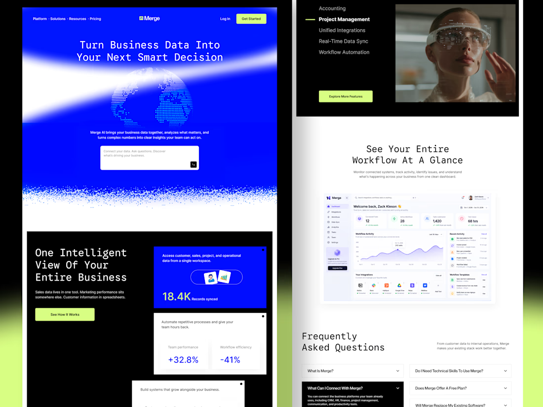
Merge — AI-Powered Business Intelligence SaaS Landing Page Design
Businesses often struggle with disconnected tools, scattered data, and complicated workflows. When important information lives across multiple platforms, teams waste time switching between tools instead of focusing on growth.
For Merge, I designed a modern SaaS landing page concept that presents business intelligence, unified integrations, and workflow automation through a clear and engaging user experience.
The goal: Create a landing page that communicates product value quickly, builds trust, and helps potential customers understand how the platform fits into their workflow.
Design focus
Clear value proposition and messaging
Strong visual hierarchy and conversion-focused CTAs
Dashboard UI to demonstrate product capabilities
Feature sections that simplify complex functionality
Consistent design language across the entire page
A SaaS website should do more than look attractive. It should help the right customers understand the product, recognize its value, and feel confident taking action.



Outstanding work

The median landing page conversion rate is 6.6%, according to Unbounce research.
Here's how you could improve yours.
Show users how your product can help them instead of just explaining what it does.
Add trust signals so visitors know they can trust your product.
Keep your message clear and concise. People don't want to read long sentences just to understand what you're offering.
Your CTA is what encourages visitors to take the next step. Make it clear what they should do.
Give users a reason to try your product. A free trial or demo can make them feel like they have nothing to lose by giving it a try.
That's what you want users to think when they land on your page.
If you are having problem in conversion. Let's talk
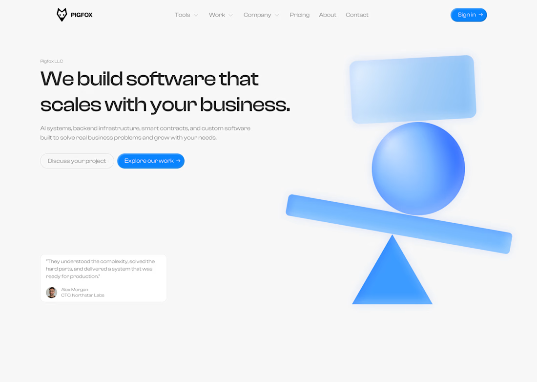
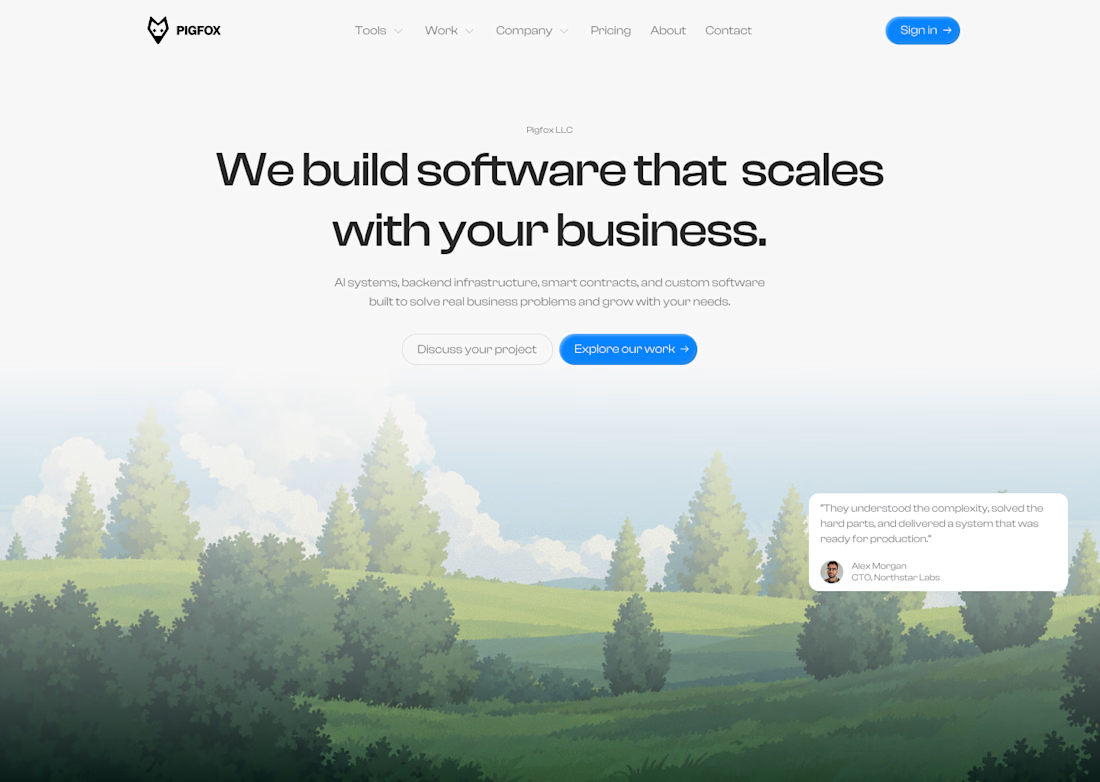


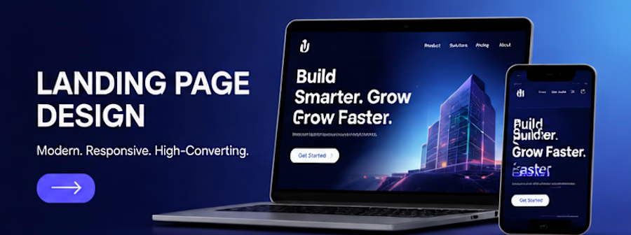
A landing page concept created for a fictional digital product business. The design focuses on clear messaging, strong visual hierarchy, intuitive navigation and strategically placed calls to action. The project demonstrates how thoughtful UI design can communicate value and guide users towards a desired action.
Deliverables: Hero section, feature sections, testimonials layout, CTA sections and responsive mobile concept.