The network for creativity
Join 1.25M professional creatives like you
Connect with clients, get discovered, and run your business 100% commission-free
Creatives on Contra have earned over $150M and we are just getting started
Back to feedPost

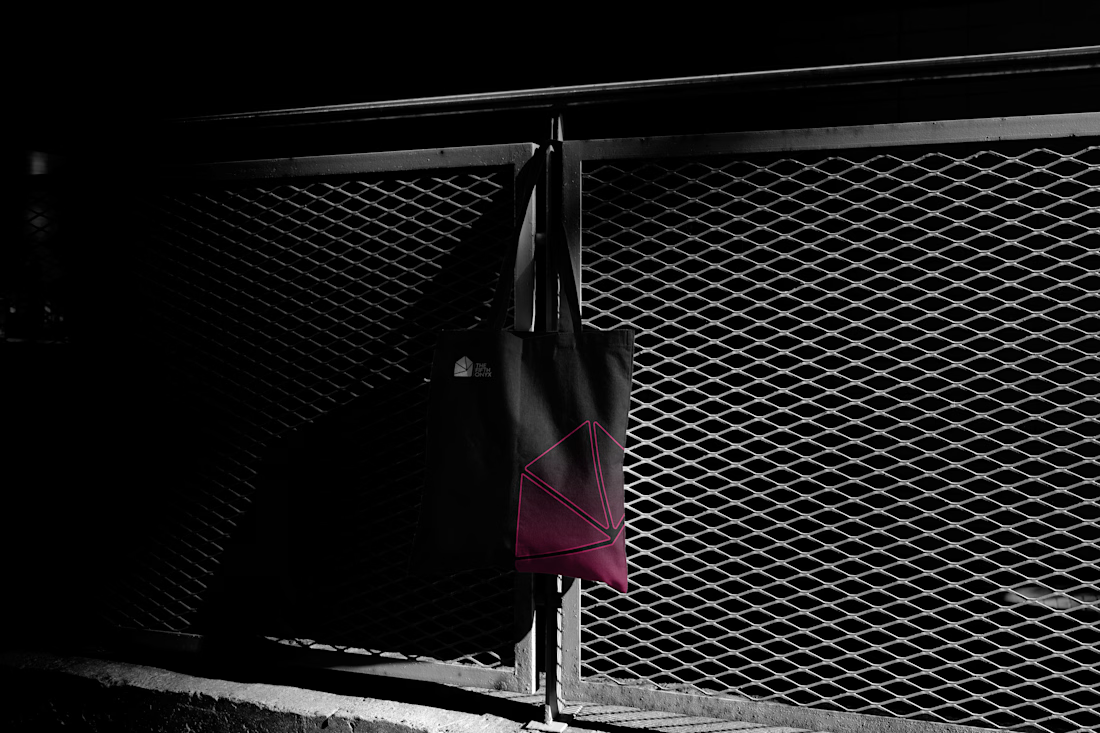
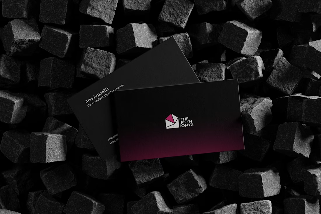
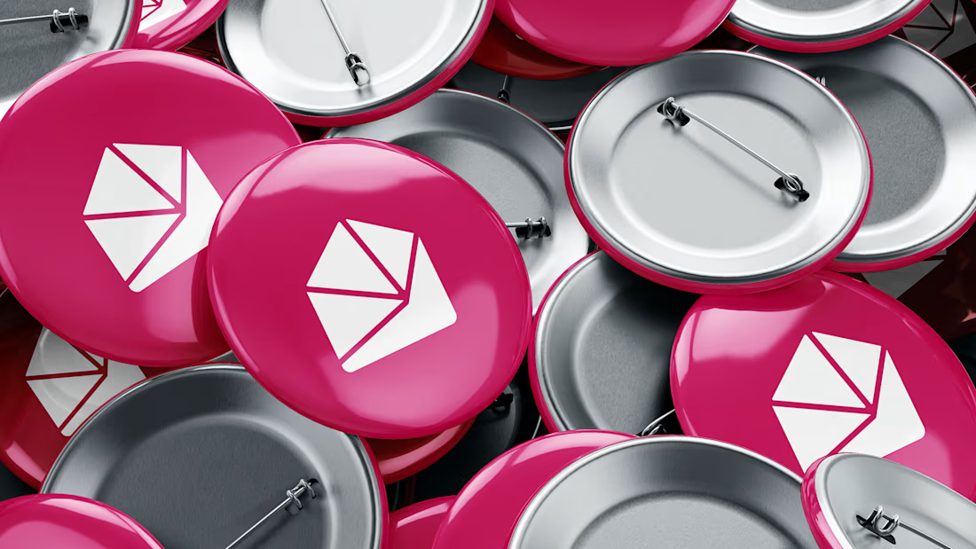
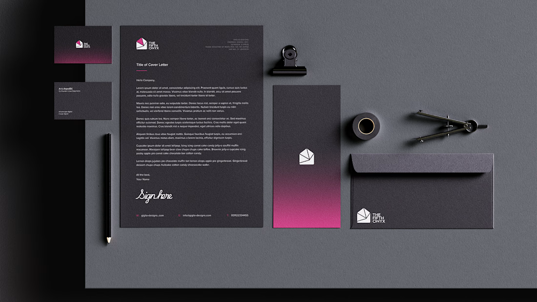
Designing the identity for THE 5TH ONYX was an interesting experience. The goal was to create something that felt premium and professional, while still being bold enough to stand out as a consulting studio.
One of the biggest challenges was the color choice. At first, I was skeptical about whether the colors would work together and still give the brand the premium feel we wanted. But through the right balance and application, the colors became one of the strongest parts of the identity.
In the end, everything came together in a way that felt confident, refined, and unique. THE 5TH ONYX became a great example of how taking a creative risk can lead to something that truly works for a brand if I may say so myself.


The network for creativity
Join 1.25M professional creatives like you
Connect with clients, get discovered, and run your business 100% commission-free
Creatives on Contra have earned over $150M and we are just getting started





Related posts

My latest branding project for the Atlanta Museum of Paleontology.
Check out the full project at maximjungle.com

A T-rex drawn in one thin outline is such a good mark 🦖 I'd happily visit that museum.


Built to become an icon.
First or Nothing came to us with ambitions beyond their first product. They wanted a brand mark that could live on a supplement bottle, across apparel, or even become someone's next tattoo.
The result? A bold, distinctive identity with four layers of meaning and a hidden '1' in the wordmark.
Once you see it, you can't unsee it.
A brand built for where they're going, not just where they started.

The hidden 1 in the wordmark is a clever find. I can see that mark working as a tattoo too.

A little creative experiment I'm working on ✳️
Playing with bold typography, playful motion, and unexpected interactions for a UGC creator portfolio.
Still a work in progress, but having way too much fun with this one.


The big stacked WORK / RESULTS / RATES menu next to the loose purple stickers keeps the portfolio playful while the navigation stays easy to scan. Do the stickers react on hover, or are they tied to scroll?


