The network for creativity
Join 1.25M professional creatives like you
Connect with clients, get discovered, and run your business 100% commission-free
Creatives on Contra have earned over $150M and we are just getting started
Back to feedPost
Taste Test
same prompt. different results, which one should I go for?
This is meant to work as a advertorial page main/hero image
0 voted
0%

4 voted
100%

4 votes
Closed

p.s the stainless cutting board is the main product
The network for creativity
Join 1.25M professional creatives like you
Connect with clients, get discovered, and run your business 100% commission-free
Creatives on Contra have earned over $150M and we are just getting started



Related posts

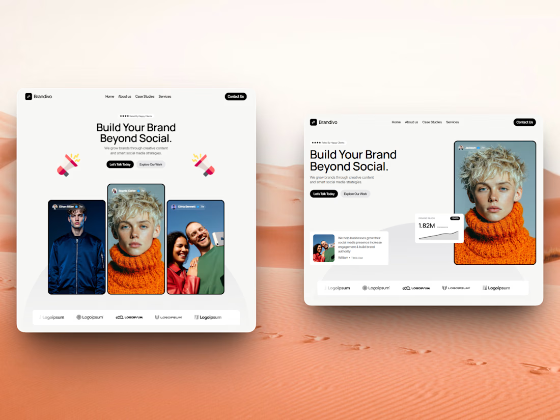

I'd pick the right one. The headline and image split is cleaner and the stats card gives proof right away, the left feels busier with three portraits. Is this template for Webflow?

Quick one for SaaS founders and designers: which homepage hero would make you book a demo?
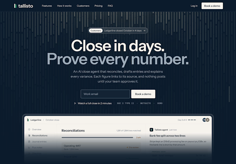
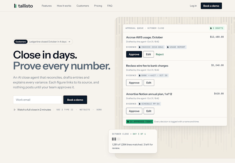
I’m designing the website for Tallisto, a concept AI accounting tool that helps finance teams close the month in days. Both versions use the same copy, so only the layout changes.
A is centred and dark. The headline does the talking, and the product sits right underneath it.
B is a light split layout. You read on the left and see the approval queue on the right, where every entry waits for a person to approve it.
Vote for the one you’d click, and tell me why in the comments. I’m building the winner in Webflow next.


4 votes
Ends in 1d
Split and light for me. The approval queue next to "Prove every number" shows the proof right away, which is what a finance team wants to see. The dark one looks moodier but the product sits low. Will you test the CTA copy too?

Another SaaS Hero design deserves to look this simple, clean, and attractive. This is not my original design.
Is it clean enough?