The network for creativity
Join 1.25M professional creatives like you
Connect with clients, get discovered, and run your business 100% commission-free
Creatives on Contra have earned over $150M and we are just getting started
Back to feedPost

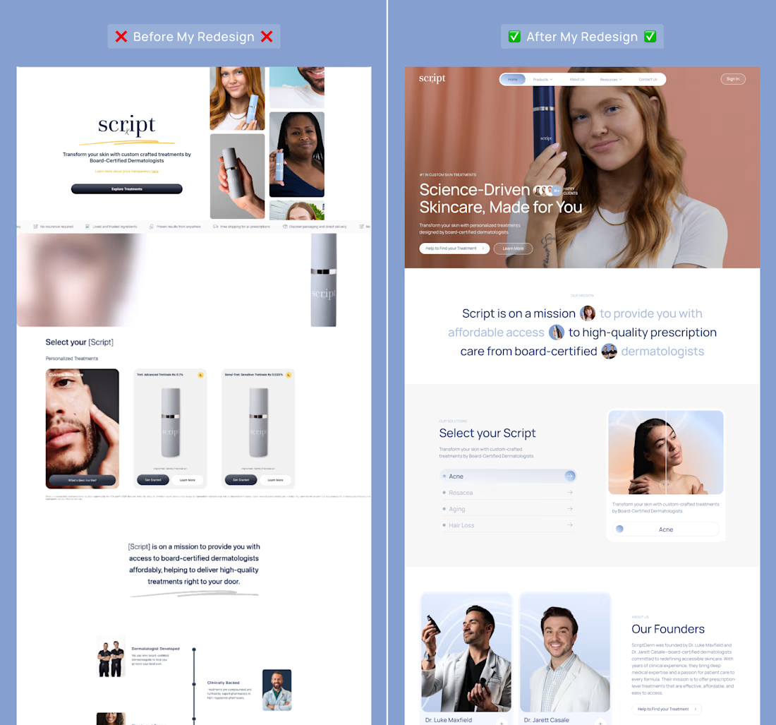
From generic template to trusted dermatology brand.
I redesigned the homepage for Script, a telehealth skincare brand with prescription-grade treatments from board-certified dermatologists.
The original site looked like a template. For a brand selling prescription skincare, that costs trust.
What was wrong:
❌ No clear navigation, so visitors couldn’t jump to products
❌ No guidance. People had to scroll and guess which treatment fit
❌ The dermatologists behind the brand were barely visible
❌ Thin proof: one testimonial and a static photo grid
❌ A cropped hero collage and sections that looked unfinished
What I changed:
✅ Sticky navigation with a clear sign-in
✅ An interactive picker: choose a concern and see the matching treatment
✅ A primary and a secondary CTA, one for ready buyers and one for people still deciding
✅ A founders section that puts the dermatologists front and center
✅ A full proof layer: testimonials, educational video, an FAQ that answers real objections, and a UGC gallery
✅ A cohesive visual system and real product images
In telehealth, design is part of the credibility. People are deciding whether to trust you with their skin and their health before they ever talk to a doctor.
Which version would you trust with your skin? 👇
The network for creativity
Join 1.25M professional creatives like you
Connect with clients, get discovered, and run your business 100% commission-free
Creatives on Contra have earned over $150M and we are just getting started






Related posts


Home A wins, its clarity suits a consultancy.

✨ Your website is your brand's first impression. Make it count.
Recently, I worked on an e-commerce website project focused on creating a premium shopping experience through elegant visuals, strategic product presentation, and conversion-focused design.
From curated collections to seamless navigation, every detail was designed to turn visitors into potential customers.
Let's talk! What's more important to you when visiting an online store: beautiful design or an effortless shopping experience? 👇
#EcommerceDesign #Shopify #WebDesign #UIUXDesign #WebsiteDesign


Beautiful design grabs attention, but a smooth shopping experience is what keeps customers engaged and encourages them to buy. I believe the best e-commerce websites combine both. Great work on this!


New case study🥤
Lifestyle-led Shopify for a daily supplement brand 🤸♀️

The mood of an athletic lifestyle is captured perfectly. The emotions and overall style convey a clear sense of it.