The network for creativity
Join 1.25M professional creatives like you
Connect with clients, get discovered, and run your business 100% commission-free
Creatives on Contra have earned over $150M and we are just getting started
Back to feedPost
Taste Test


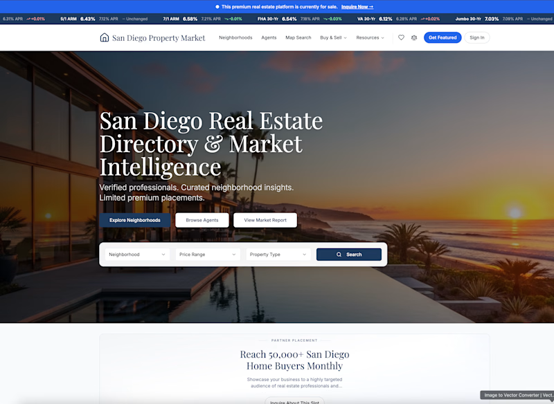
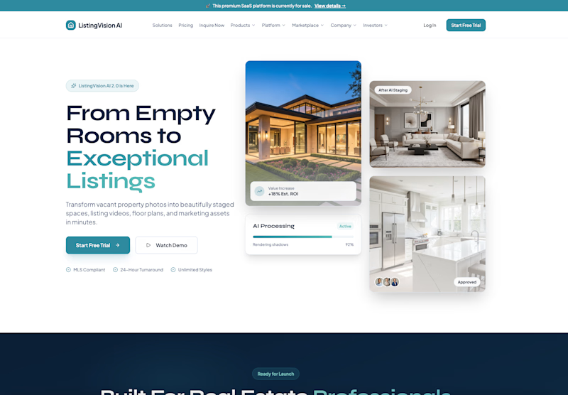
Which real estate homepage makes the stronger first impression?
ListingVision AI features a bright layout, teal accents, and property imagery to introduce its AI staging and listing tools.
San Diego Property Market pairs coastal photography with classic typography, neighborhood search, and market resources.
Which design feels more inviting and makes you want to explore further? Does the clean presentation of ListingVision AI catch your attention, or do you prefer the location-focused experience of San Diego Property Market?
Vote for your favorite and share what influenced your choice: imagery, colors, typography, layout, or calls to action.
#WebDesign #RealEstateMarketing #AIWebsites #UIUXDesign #TransformedDesign


7 votes
Ends in 4h

SD Property Market had the look and feel
I agree. SD Property Market has a strong look and feel that makes the site feel polished and cohesive.

ListingVision AI. One clear primary button and the staged before/after right in the hero, while San Diego asks you to choose between three equal buttons and a search bar before you know why.
That’s a great point. ListingVision AI makes its value and primary call to action clear right away. The San Diego page could simplify the first step and explain the value before asking visitors to choose.

The first one wins for me. It feels calmer and the photos get the attention, which is what a homepage should do.

SD property market looks good
Thank you Maniruzzaman. I appreciate your vote for SD Property Market. What stood out most to you about the design?

LightVision AI all the way. The SD property Market looks dull and the unnecessary 3 buttons there makes it seem off, plus I personally like the layout of the LightVision AI.
Thank you Isaac. I appreciate the specific feedback on the three buttons. A clearer primary action could help simplify that section. Helpful to hear that LightVision AI’s layout stood out to you.
The network for creativity
Join 1.25M professional creatives like you
Connect with clients, get discovered, and run your business 100% commission-free
Creatives on Contra have earned over $150M and we are just getting started



Related posts


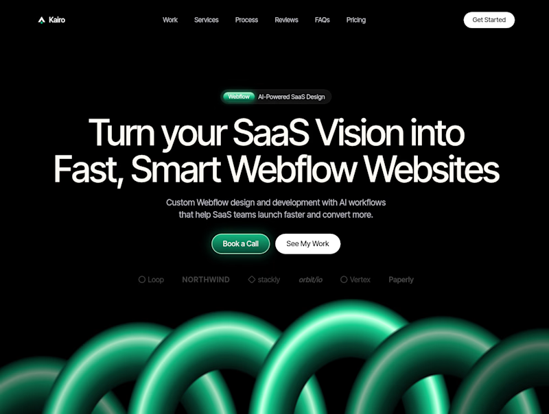
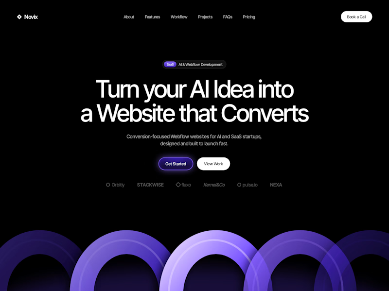

Both look great, but Violet & Black gets my vote! The purple accents give it a more modern, premium feel while keeping the design clean and focused on conversions. Amazing how a color change can create such a different brand personality. Have you tested which version performs better with visitors?


Video-led hero for me. The big script Presence over the field sells a feeling in one glance, which is what wellness needs. The expanding gallery would work well as the second section.

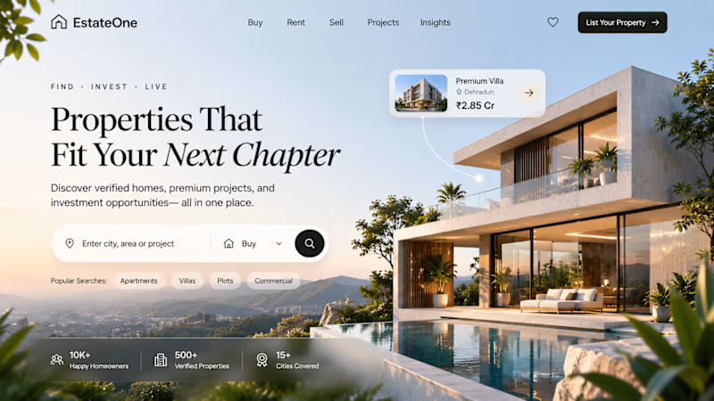
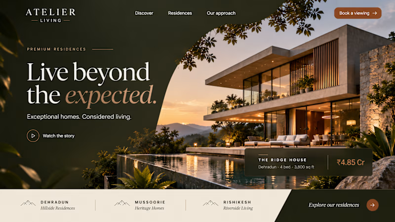
Two concepts. One vision. What makes a property worth coming home to?
A home is more than its walls. It’s the feeling of being exactly where you belong.
For this real estate concept, I explored a more considered approach to digital property experiences, combining strong visual storytelling with a clear, focused user journey.
The goal was simple: make discovering a home feel as meaningful as finding one.
Which direction would you choose for a premium real estate brand?
A or B?
6 voted
100%
0 voted
0%
6 votes
Closed

Second one feels more premium.