The network for creativity
Join 1.25M professional creatives like you
Connect with clients, get discovered, and run your business 100% commission-free
Creatives on Contra have earned over $150M and we are just getting started
Back to feedPost

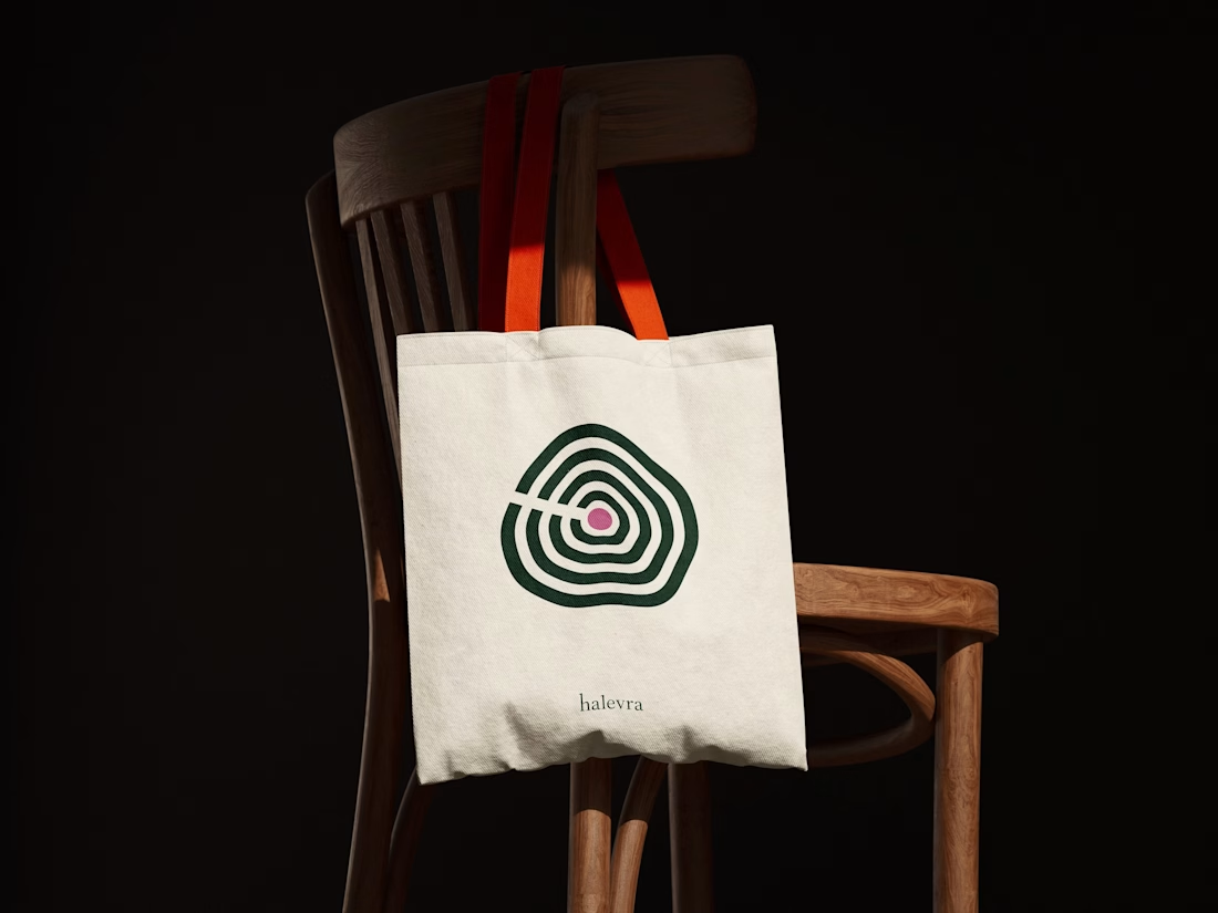
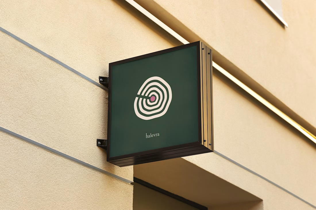
Halevra is a brand identity I designed for a concept longevity and skin clinic in Marylebone.
The mark is a tree’s growth rings. A tree keeps a record of every year it grows, which felt right for a clinic that reads your health early and follows it over time. The plum dot at the centre is the heartwood, and it’s the only colour the pattern ever gets.
For type, Source Serif 4 has the authority of a medical journal without feeling cold. Atkinson Hyperlegible Next was made with the Braille Institute for low-vision readers. Many members would be over 50, so being easy to read mattered more than looking like a spa.
The system covers the logo suite, a seamless pattern, logo motion, brand guidelines, stationery, signage, and web and app assets.
The network for creativity
Join 1.25M professional creatives like you
Connect with clients, get discovered, and run your business 100% commission-free
Creatives on Contra have earned over $150M and we are just getting started



Related posts

Brand work for HauntChain
I'm loving building this brand and the results so far
A deFi platform with some gamification


That's cute ❤️

Rebuilt my portfolio with AI and added new case studies.
Brand, web, and product UI. All custom coded, all in one page.

One page with brand, web and product UI together is a strong move. Clients see the range without clicking around. Rebuilding mine with AI coding tools taught me the same thing: the speed lets you spend the saved time on the case study writing, which is what actually wins work.