The network for creativity
Join 1.25M professional creatives like you
Connect with clients, get discovered, and run your business 100% commission-free
Creatives on Contra have earned over $150M and we are just getting started
Back to feedPost

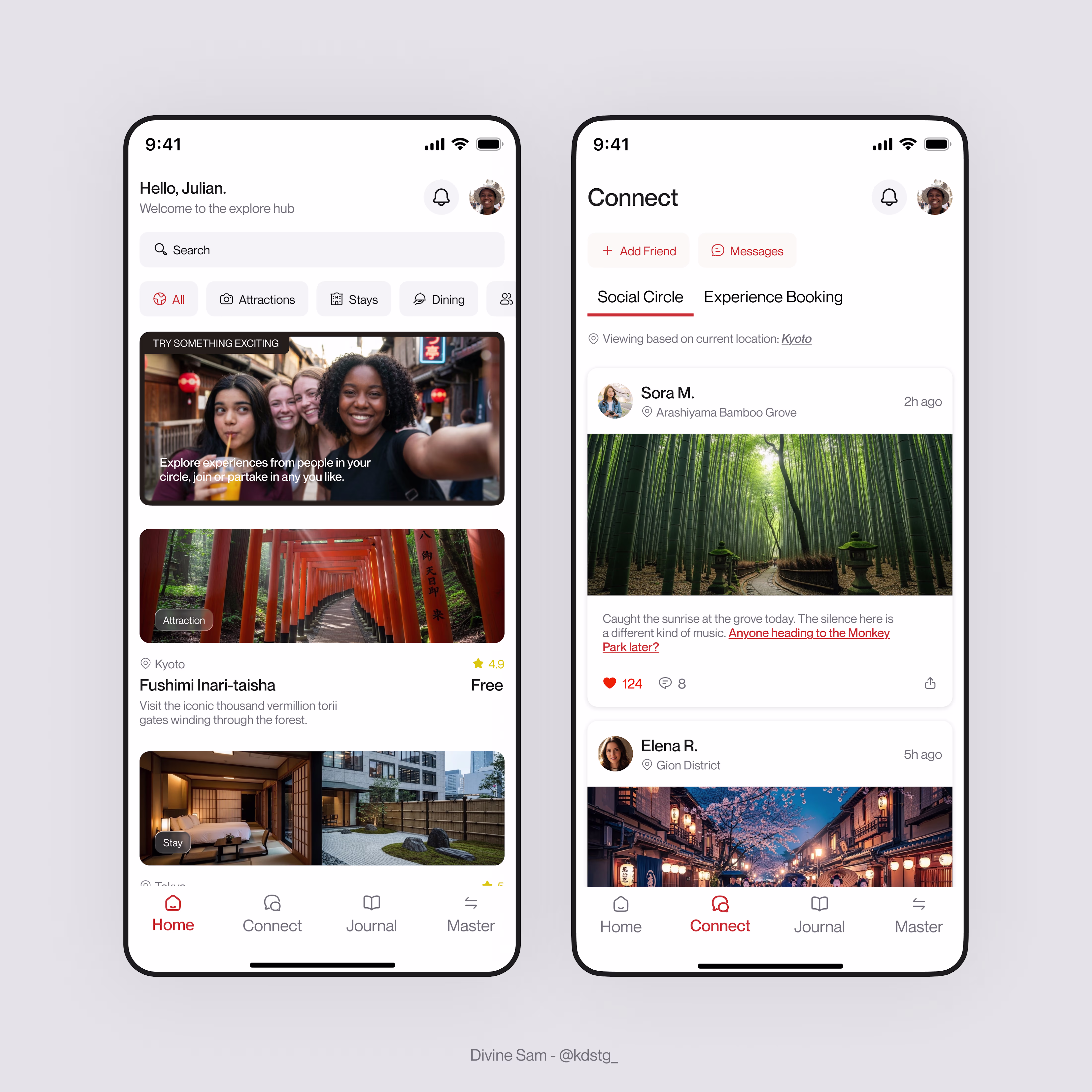
Screen 01: The Explore Hub(Screen On The Left)
UI/UX Breakdown.
The Social Banner(s): This acts as a soft conversion point for the Connect Hub and promotes in-app engagements.
Contextual Tagging: I implemented clear, pill-shaped category markers (Attractions, Stays, Dining etc) that match the design tokens. For example, the Attraction tag overlaid on the Fushimi Inari image provides immediate mental categorization.
I also balanced aesthetics with data. For example, on the first experience card; the Location (Kyoto), Rating (4.9), and Price (Free) grouped together. This reduces cognitive load because the user knows everything they need to know about the entry price at a glance.
Screen On The Right(Connect Page-Social Circle Screen) - Breakdown Soon.
The network for creativity
Join 1.25M professional creatives like you
Connect with clients, get discovered, and run your business 100% commission-free
Creatives on Contra have earned over $150M and we are just getting started
Related posts

Created a concept hero banner for a farmer education platform in Framer FP-06. Focused on clean visual storytelling while learning smooth micro-interactions for text and sections. ^^


Love the clean layout and storytelling here. The hero section feels very focused and easy to explore. Nice work!

I just designed a 1$ million dollar product that could change how people find homes.
Interaction DesignMobile DevelopmentUX DesignClaudeFigmaFigma Makeproductdesignermobiledesignerproptech


Nice 🙌

A clean and calming e-commerce concept for a luxury furniture brand. The design balances beautiful photography with a warm, natural color scheme (peach and sage) to create an inviting, high-end user experience. Focused on showcasing styles and inspiring home decor.
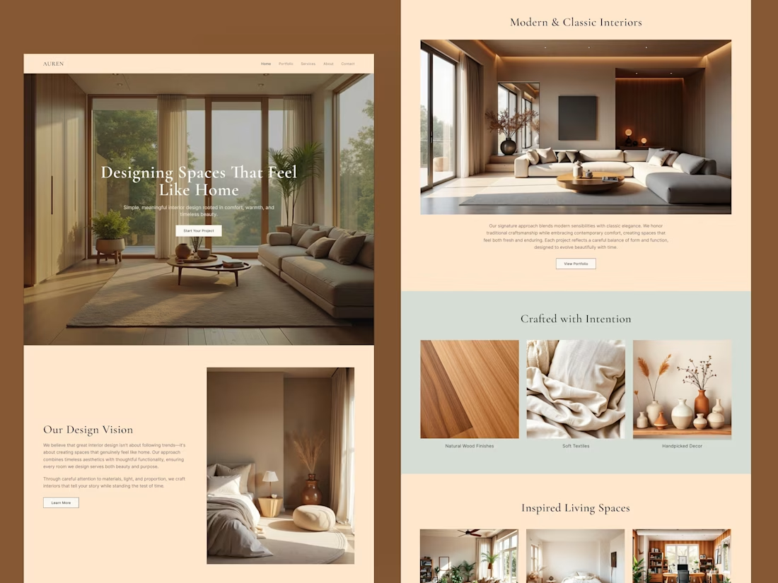
Really nice work. The natural tones and photography make the page feel very calm and premium.


Trending
aivideo
AI video tools are moving at warp speed. Which ones are you experimenting with?
illustration
Handcrafted illustration is bubbling up across the web. What are you drawing lately?
aidesignflow
AI tools are redefining design work. What's your current workflow?
returntonature
Spring is a reset for creativity. What’s inspiring you outside the screen right now?
freelancerlife
Freelancer life is wins, pivots, and everything in between. What’s yours right now?