The network for creativity
Join 1.25M professional creatives like you
Connect with clients, get discovered, and run your business 100% commission-free
Creatives on Contra have earned over $150M and we are just getting started
Back to feedPost

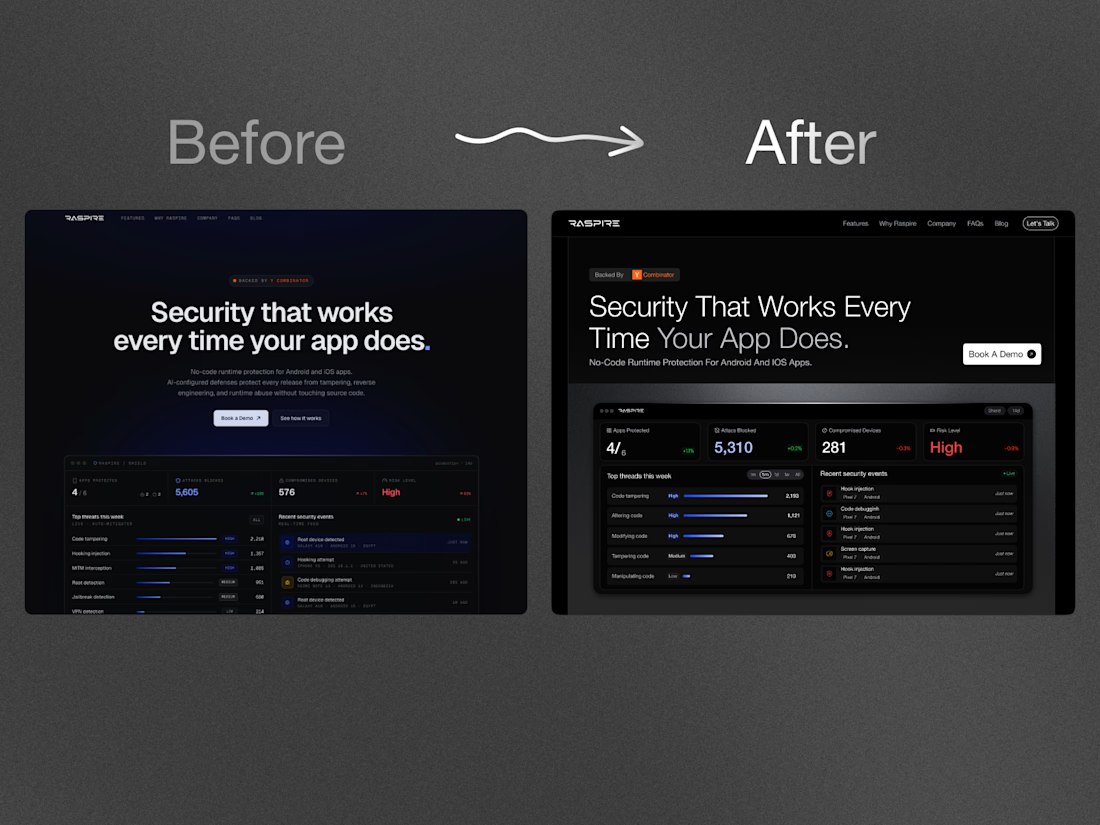
Redesigned a 🟧 YC-backed startup's hero. Unprompted, no pitch.
Three changes:
→ Dropped the generic "AI blur." Swapped the fuzzy gradient-glow every AI startup uses for a clean, type-led layout. Typography carries the message.
→ Product above the fold. The real dashboard now lands full, no scroll. A founder's best proof is the product - so I show it first.
→ One CTA, not five. Single clear action = cleaner flow = more clicks.
Same product, sharper signal. Most SaaS heroes describe the product - the good ones sell the outcome.
I build sites that convert for founders. Open to new projects💬
We worked on a similar project recently and one thing stood out founders often focus on communicating every feature while users are usually trying to answer one question what outcome does this help me achieve? the best landing pages make that obvious within seconds.

This changes the complete experience with focus on the right things.
Both looks clean and well thought out. How long did it take you to bring everything together?
The network for creativity
Join 1.25M professional creatives like you
Connect with clients, get discovered, and run your business 100% commission-free
Creatives on Contra have earned over $150M and we are just getting started
Related posts

Most websites look good.
Few make people stop, trust, and take action.
This landing page was designed with one goal: clarity over complexity.
Every section has a purpose:
- Clear visual hierarchy
- Generous whitespace
- Clean, modern UI
- Scalable components
Good design isn't about adding more,it's about removing what doesn't help users.
I'd love to hear your thoughts:
What part of a landing page has the biggest impact on conversions?
If you'd like, I can also make it more viral, designer-focused, or client-attracting.


Weldone ☀️ 💖

Hey Contra 👋
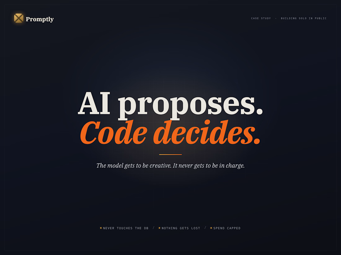
Two months ago I posted Promptly here as a work-in-progress and said I'd launch in about three weeks.
Then a health issue knocked me flat, and the three-week plan was gone.
I'm good now — and as of today, the build is done. I just published the full case study as well.
Quick recap: after shipping 20+ projects as a tech lead, I kept watching the same thing break. A founder says one thing, the developer hears another, and a month in, the whole build is based on a misunderstanding nobody caught early.
Promptly closes that gap. You describe your idea in plain English; the AI interviews you, pushes back on the vague parts, and writes a developer-ready spec while you chat.
But the chat is the easy part. The real engineering is everything that stops the AI from being trusted too much:
→ It never touches the database. 16 agents can only propose changes through typed tool calls; backend code checks each one, and invalid calls get rejected and logged.
→ Nothing ever gets lost. It snapshots before anything risky, so you can roll back a single module or the whole project.
→ Spend is capped, always. Every AI call passes four checks before it fires, and each one is logged with its exact cost.
One line sums up the architecture:
The AI proposes. The code decides.
The model gets to be creative. It never gets to be in charge.
Full case study is on my profile, and the product is live if you want to poke at it.
One question:
Shipped anything with LLMs in production? What guardrail saved you — or what missing one burned you?
Every comment on the last post shaped what got built. Thank you for that 🙏
building solo, in public

Hi everyone! 👋
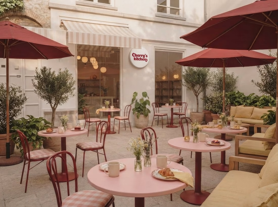
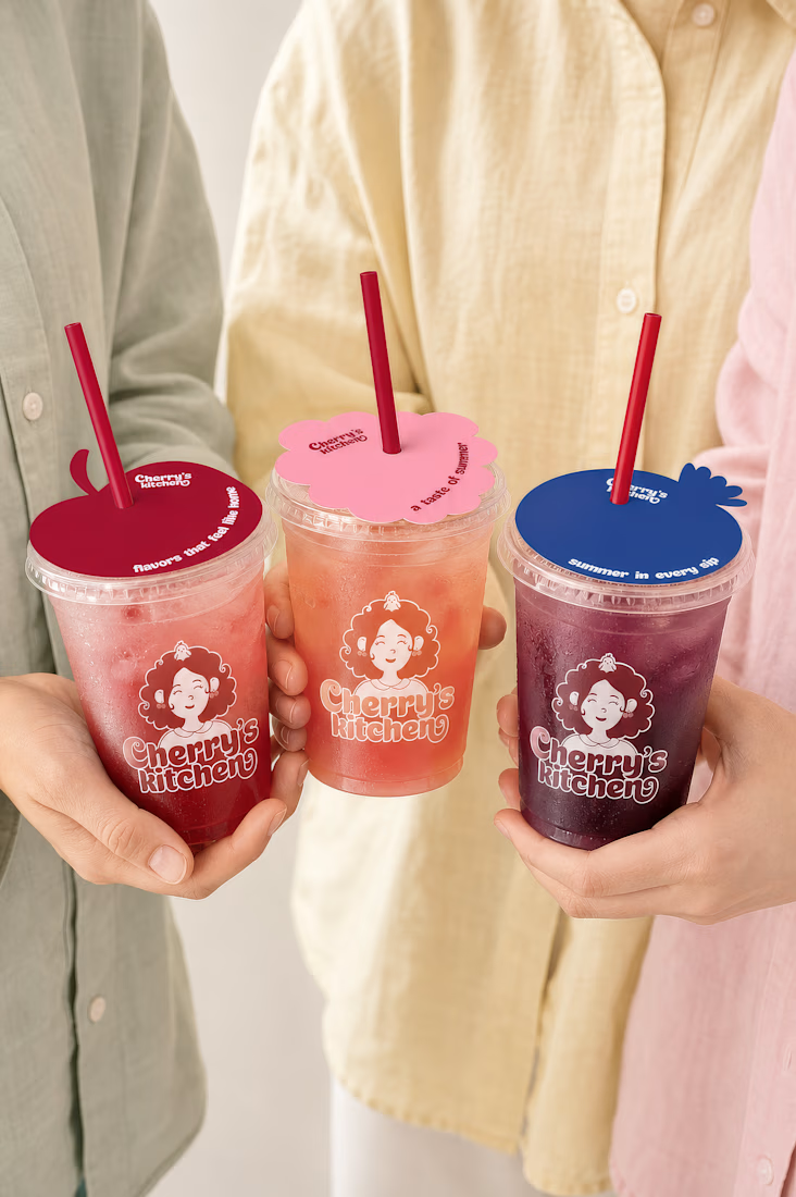
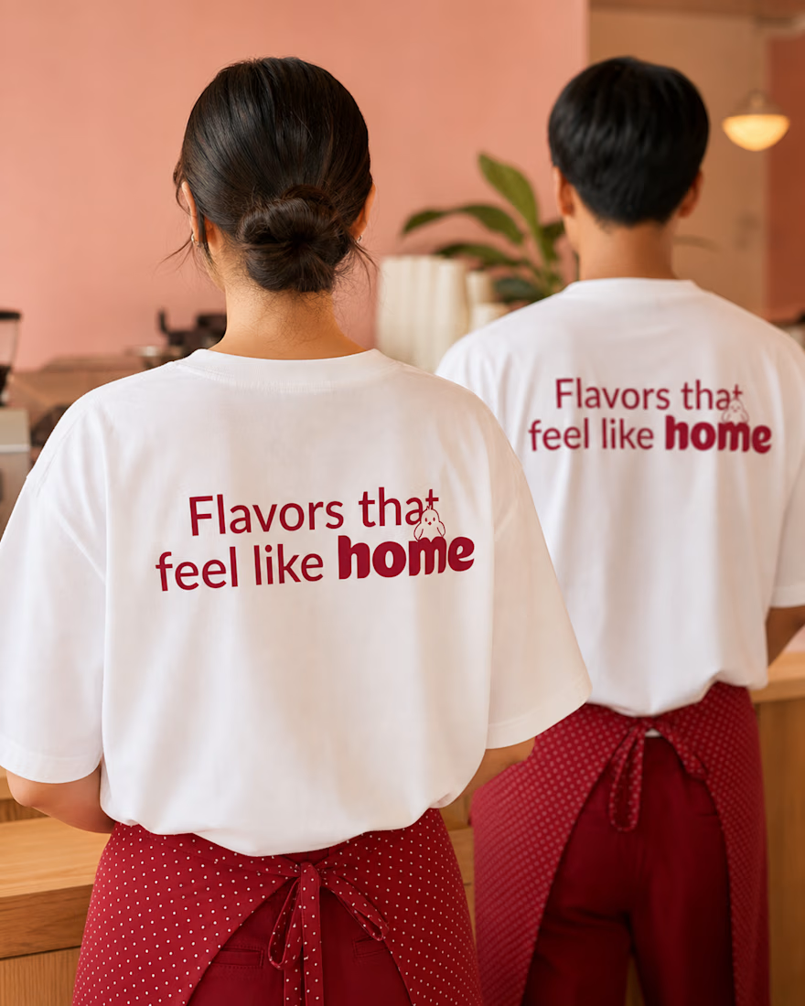
For the #envatochallenge, I wanted to explore Envato in as many ways as possible, from stock assets and fonts to AI image generation, video creation, animation, mockups, and even the music for this video. To do that, I created Cherry's kitchen — a cozy café brand inspired by warm summer afternoons, homemade cherry desserts, and family gatherings.
Throughout the project, I used Envato as my main creative toolkit while bringing everything together in Figma. I designed the mascot, visual identity, packaging, café interiors, animations, and brand guidelines. And honestly... I just couldn't stop exploring. Every time I finished one part of the project, I found another way to bring the brand to life.
One of my favorite parts of the process was deciding what truly belonged in the brand identity. I explored different concepts and made the creative decision, choosing what to keep, what to refine, and what to leave behind.
Check out the process video below! I'd love to hear your thoughts on the project 🍒😍




love seeing your process for this!










Trending

Claude
Claude has entered the design space. How are you using Claude Design?

Contra University
Learn from expert creatives how to earn more using next-gen AI tools.
creativeaiflow
Creative AI workflows are evolving. What tools do you use, and what are their strengths and weaknesses?
freelancerlife
Freelancer life is wins, pivots, and everything in between. What’s yours right now?