The network for creativity
Join 1.25M professional creatives like you
Connect with clients, get discovered, and run your business 100% commission-free
Creatives on Contra have earned over $150M and we are just getting started
Back to feedPost

Day 2: Layout Lab
I started noticing how often I was falling back on the same layout ideas, so this series is my way of pushing past that and exploring new directions more intentionally.
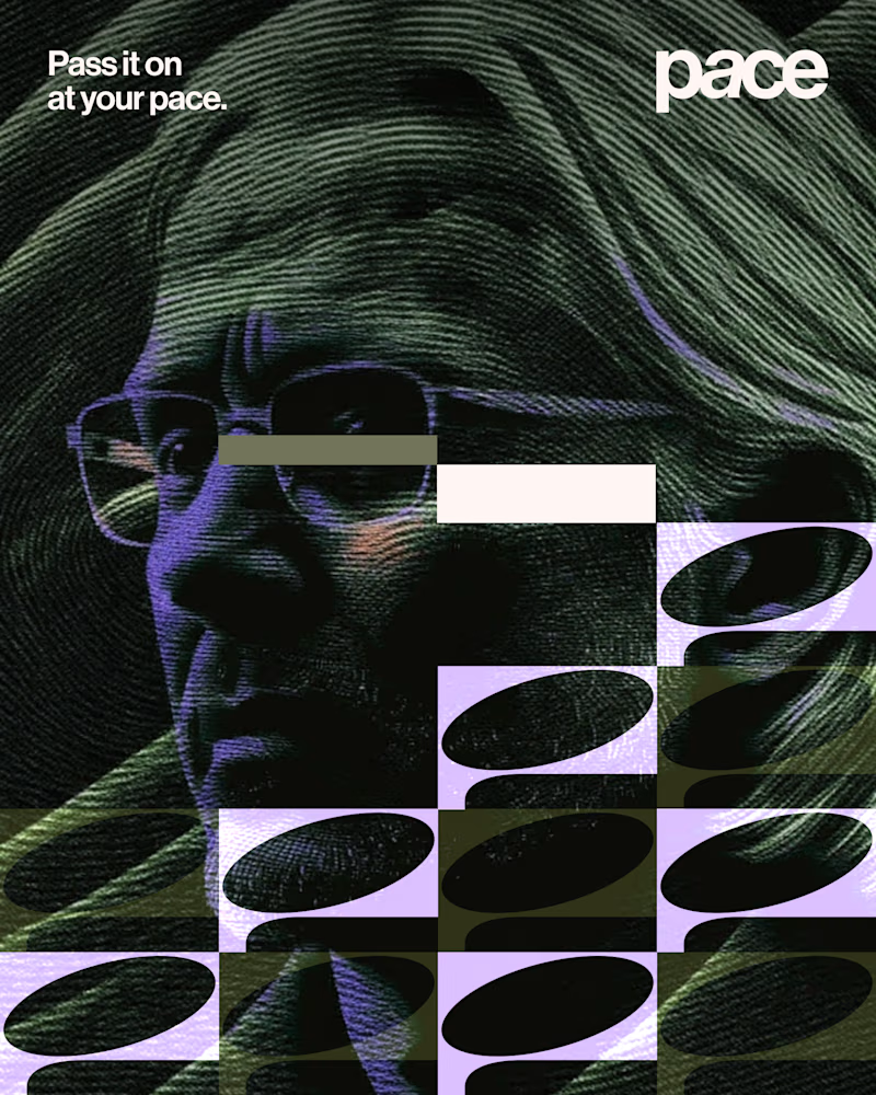
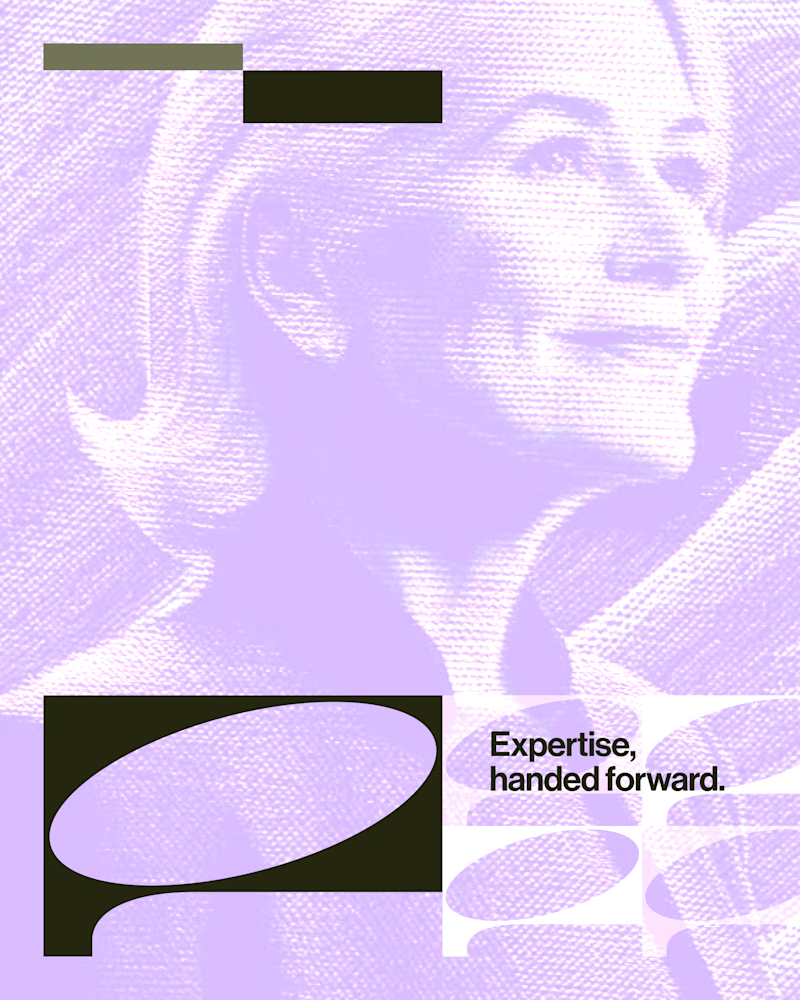
-> Today’s concept: Classic Z layout with an enhancement using shape masked with images instead of regular images
Every layout in this series has to meet a simple standard:
support a real business outcome
Stay WCAG compliant (AA)
doesn’t drag down performance

The network for creativity
Join 1.25M professional creatives like you
Connect with clients, get discovered, and run your business 100% commission-free
Creatives on Contra have earned over $150M and we are just getting started



Related posts

Experimental layouts for Pace. Which one do you like?
23 voted
52%
21 voted
48%
44 votes
Closed

Looks cool.


I've just put a new case study live.
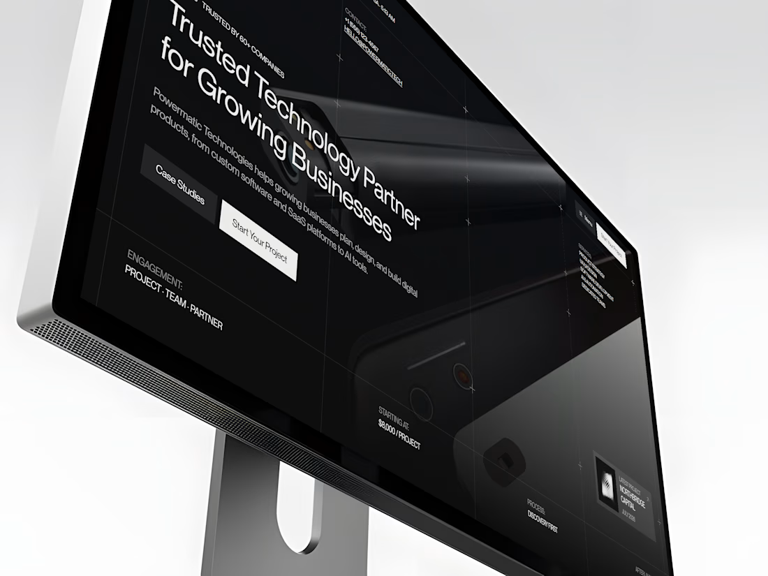
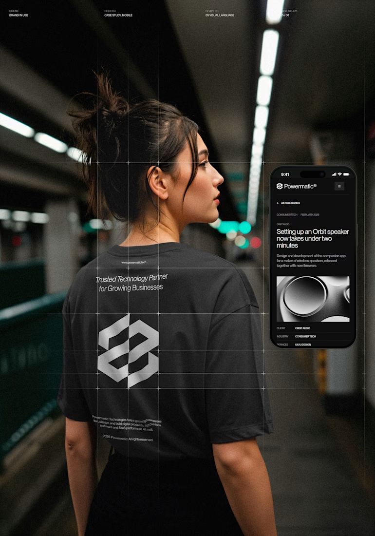
Powermatic Technologies helps growing companies with strategy, design and software. I did the whole project on my own: the logo and identity, the design in Figma, the code and the copy on the site.
The site sits on a four-column grid, and you can see its lines on the screen. Graphite palette with no pure black or white, PP Neue Montreal, and a bit of ASCII art.
The page I'm happiest with is Careers. My first idea was to repeat the home page layout. I dropped it. Now the page opens with the open roles set in 72 px type, with a filter by team. A candidate sees the role, the city and the pay before they scroll.
The menu turns like a drum. You can drag it or use the arrow keys, and it opens on the section you're reading.
It's all hand-written HTML, CSS and JS, no framework. It holds up from a phone to an ultrawide monitor.
The live site is open, so you can click through it yourself.



Nice!


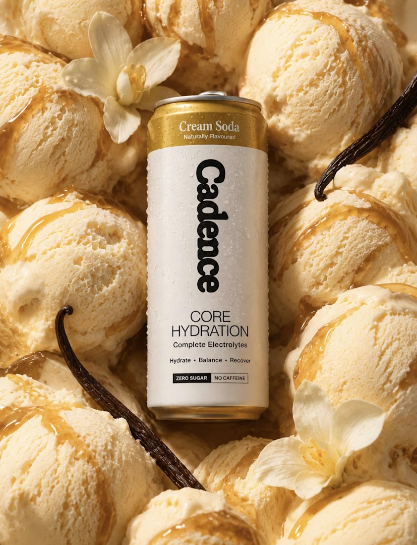
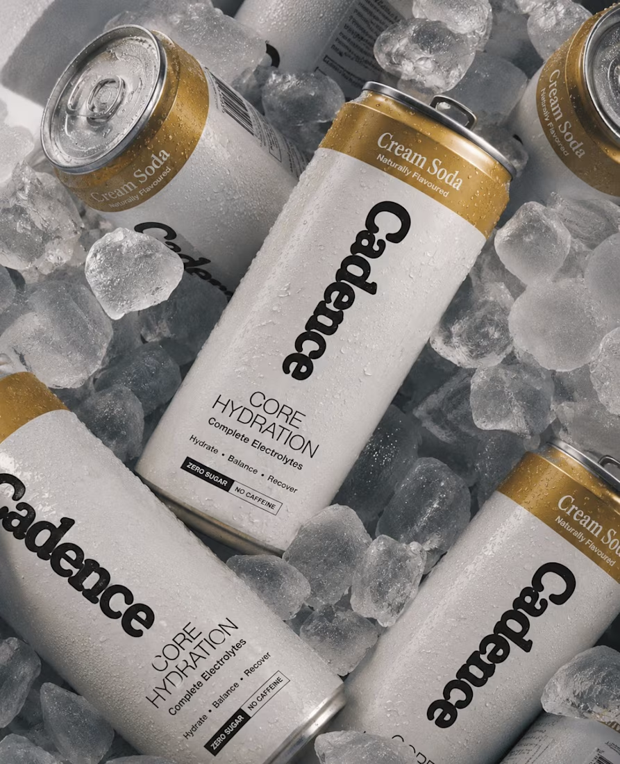

The textural work on this is insane! That crushed sand background against the metallic can reflections creates such a rich, tactile contrast. Lighting looks so natural in Blender—stellar product visualization, Zander!