The network for creativity
Join 1.25M professional creatives like you
Connect with clients, get discovered, and run your business 100% commission-free
Creatives on Contra have earned over $150M and we are just getting started
Back to feedPost

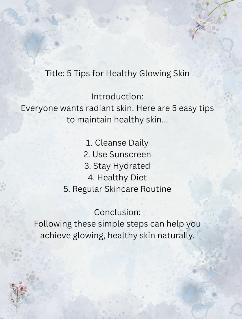
"skincare blog sample-5 tips for healthy glowing skin. Includes introduction, daily tips, and conclusion. Written in a friendly, informative tone for beginners. suitable for beauty blogs, brand websites,or social media content

The network for creativity
Join 1.25M professional creatives like you
Connect with clients, get discovered, and run your business 100% commission-free
Creatives on Contra have earned over $150M and we are just getting started

Challenges
View all


Related posts

A modern pasta advertising poster designed with a warm, minimal color palette and bold typography. I combined a pasta dish photograph with oversized text, layered shapes, and promotional elements like 50% OFF and ORDER NOW to create an eye-catching food campaign.
I focused on typography, composition, contrast, and visual hierarchy while keeping the overall design clean and commercial.
Skills: Graphic Design · Food Advertising · Typography · Poster Design · Photo Composition · Promotional Design
#GraphicDesign #PastaDesign #FoodAdvertising #PosterDesign #Typography #FoodBranding #SocialMediaDesign #AdvertisingDesign #VisualDesign #CreativeDesign
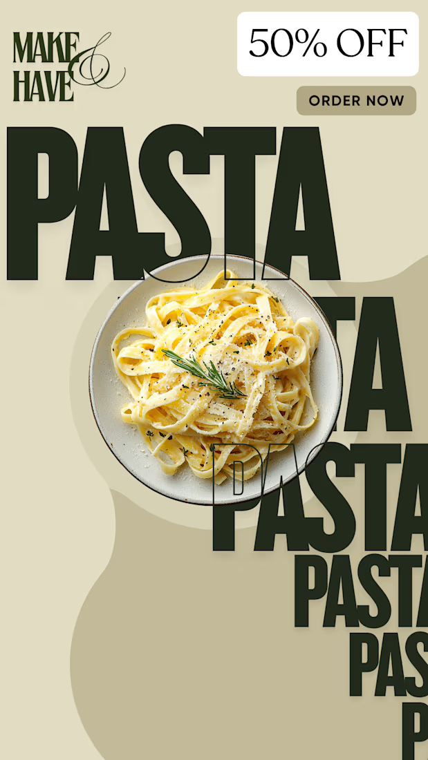

I noticed the oversized typography overlaying the pasta shot really pulls the visual hierarchy, letting the 50% OFF badge stand out without overwhelming the image

Halloween is about to arrive 🎃
So, I decided to make my next project on theme 'SPOOKY SEASON'.
Designing brand identity for halloween digital products business . PART-1
Name - HAUNTIX
Niche - Halloween digital products
Tagline - 'Printable Curiosities for your Haunted Home'
Check below and tell me how is it ?

The tagline does a lot of the work here, "printable" tells me the product before the logo does. How are you planning to handle the wordmark against the busy cobweb corners in the other applications? A bit of clear space around HAUNTIX could keep it readable at small sizes.

I'm about to go on a #30days Personal Content Creations Challenge about my NoCode stack with @Contra till I get my first client on contra
Content will be available in my post feed, You can afford to miss it
Rooting for myself 😎, Daily update will be drop here.
Cheers 🥂🥳


