The network for creativity
Join 1.25M professional creatives like you
Connect with clients, get discovered, and run your business 100% commission-free
Creatives on Contra have earned over $150M and we are just getting started
Back to feedPost

Had a great time exploring what Google Stitch
For this project, I picked Duolingo as my inspiration and challenged myself to go beyond recreating a landing page. I wanted to see if Stitch could help me break down an existing product, understand its visual language, and turn it into both an interactive experience and a reusable design system.
I started by studying Duolingo's branding, colors, typography, illustrations, and interaction patterns. After gathering references, I prepared assets for animations and planned out the sections I wanted to build before moving everything into Stitch.
From there, Stitch became the center of the workflow.
Using detailed prompts, I generated the initial layouts and refined them through multiple iterations. Being able to quickly regenerate sections, adjust layouts, and experiment with different directions made the process feel much more fluid than a traditional design workflow.
The final result consists of two connected projects:
>An animated Duolingo-inspired landing page with motion-rich sections and interactive elements.
>A complete design system and brand kit containing colors, typography, buttons, components, progress indicators, and reusable UI patterns.
Features I used during the project:
• Prompt-based UI generation
• Rapid design iteration and refinement
• Motion-rich interface design
• Design system creation
• Netlify export and deployment
Feedback on Stitch:
What impressed me most was how quickly Stitch helped me move from an idea to a polished interface. Instead of spending hours building layouts from scratch, I could focus on exploring ideas and improving the experience. The iteration speed made experimentation feel natural, and it was easy to test multiple directions before settling on the final design.
The Netlify export workflow was also surprisingly smooth, making it simple to turn the project into a live experience.
If there's one thing I'd love to see in future updates, it would be more granular control over interactions and animations directly inside the editor. That would make the jump from concept to production-ready experience even faster.
Overall, Stitch felt less like a tool for generating screens and more like a collaborative design workspace that accelerated the entire creative process.
@stitchbygoogle
#GoogleStitch #UIDesign #DesignSystems #WebDesign #BuildWithAI


Nice approach. Reverse engineering a product's visual language and turning it into a design system feels more valuable than simply recreating the UI.
I've been experimenting with a different concept:
https://on.contra.com/pnfJBQ
Happy to swap feedback if you're open to it.

on.contra.com
Introducing Voya: Revolutionize Your Travel Planning Experience
Connect with next-gen talent and tools to get work underway. Hire more independents. Start more projects. Get more creative.

Super clean, super sharp, super well done.

You didn't just understand the assignment, you rewrote it! Brilliant job.

The network for creativity
Join 1.25M professional creatives like you
Connect with clients, get discovered, and run your business 100% commission-free
Creatives on Contra have earned over $150M and we are just getting started




Related posts

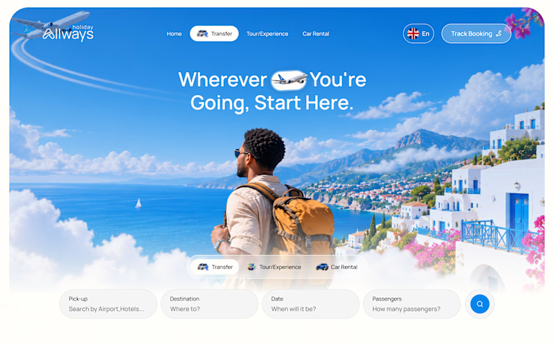
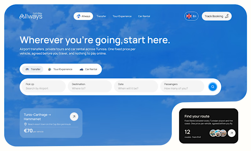
I missed an important detail in th first design direction, and the client rejected it.
After revisiting the feedback, I came up with another directiona nd it got approved
Both designs serve the same product, which one do you think got accepted for a web application?
Direction 1
Direction 2

9 voted
69%
4 voted
31%
13 votes
Closed

Dir 2 for sure!

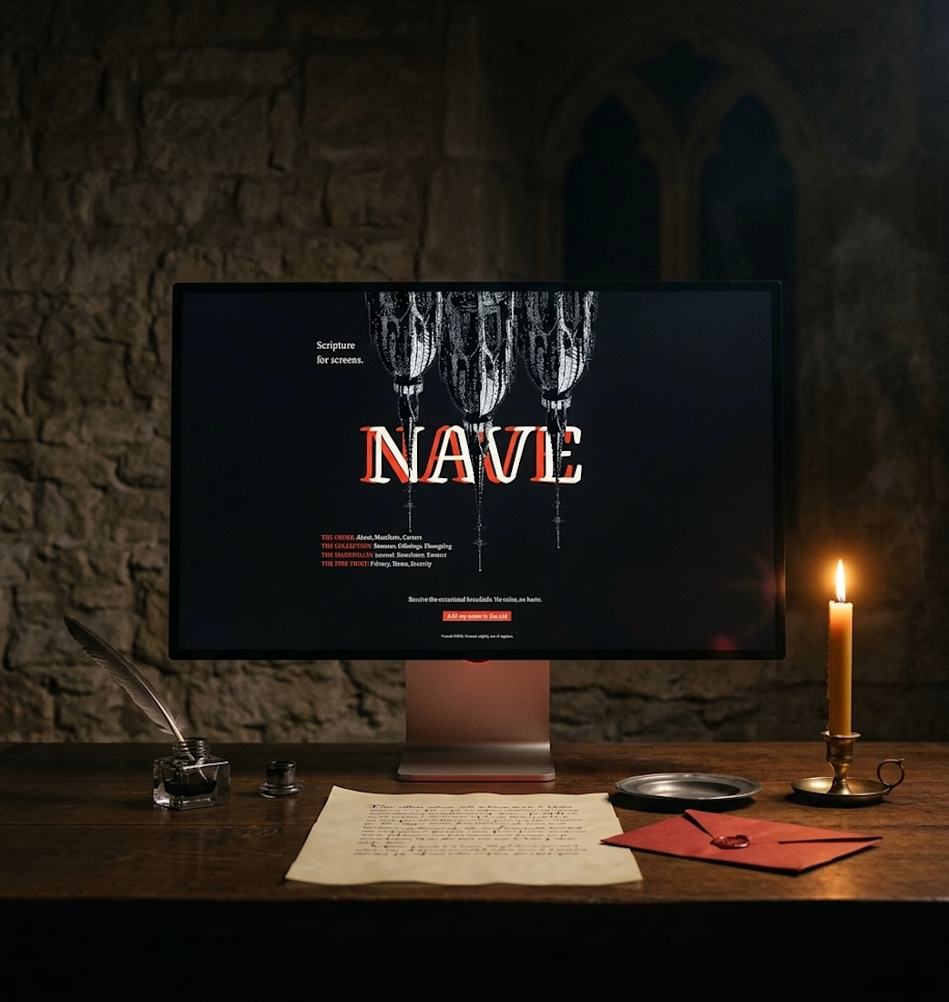
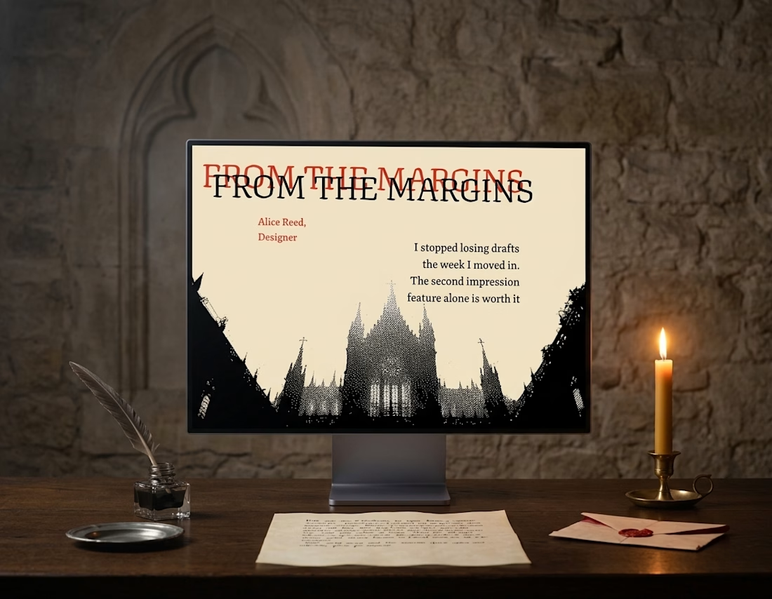
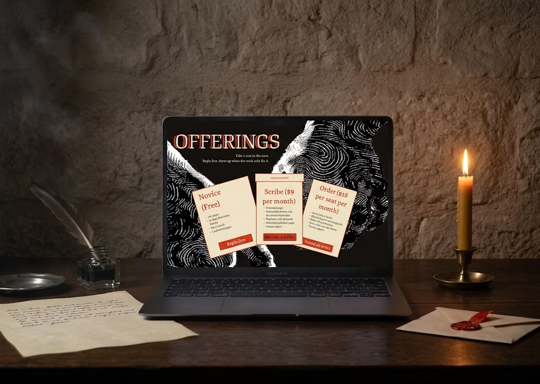
Nothing here is rushed.
Nothing here is dead.
Ink on vellum.
Light on glass.
Nave, out soon

Dope

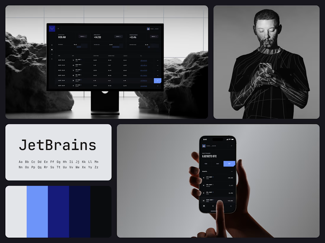
Crypto Trading Dashboard
Gains and losses read apart here without any red or green.
Cards for portfolio value, unrealized P/L and projected growth show how the account is doing. Below them, each position gets one row with its entry price, current price, liquidity and a small P/L bar chart. The figures sit in a monospaced face, so every digit takes the same width and the columns stay even.
In the phone wallet, a negative change reads in gray beside white gains. Blue fills the selected row's arrow button and the Buy button, both with a clipped corner.
The palette runs from black through navy to one light blue, the only bright color on the screen.
Designed by the Hue & Machine team.
#Crypto #Fintech #TradingPlatform #DashboardDesign #DataVisualization #DarkUI #UIDesign #WebApp #MobileDesign #FigmaDesign