The network for creativity
Join 1.25M professional creatives like you
Connect with clients, get discovered, and run your business 100% commission-free
Creatives on Contra have earned over $150M and we are just getting started
Back to feedPost

Had a lot of fun branding Strato Lab, a SaaS for asphalt and road engineering labs.
Not the most obvious “cool” category, which is exactly what made it interesting. The goal was to take something that could feel technical and dry and turn it into a brand that’s sharp, structured and actually attractive, even outside the niche.
Here’s how it turned out.


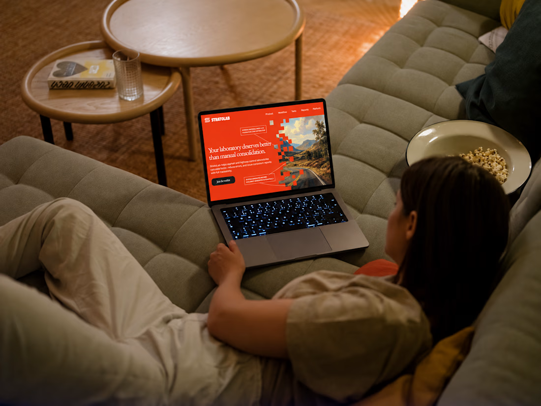
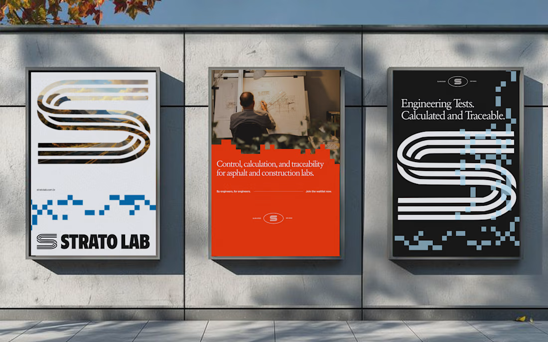
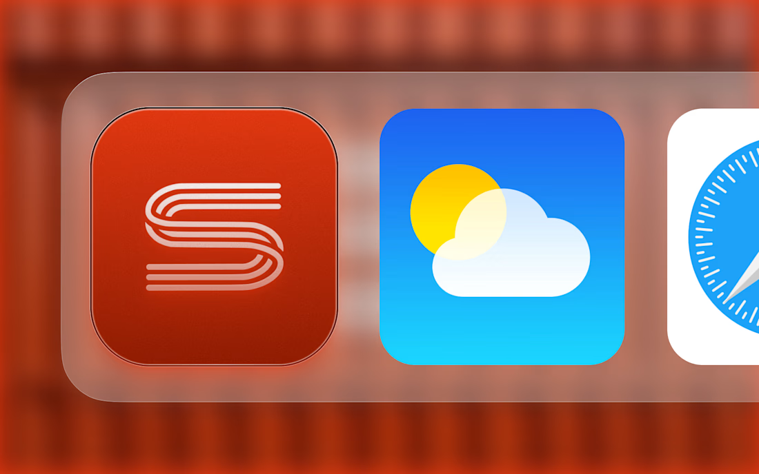


Bold choice taking the least cool category and making it sharp. Strato Lab works because the S reads like a road marking, so the logo is the industry. Contrarian take: boring niches are the best briefs, nobody has done the obvious thing yet and clients pay for that clarity.
The network for creativity
Join 1.25M professional creatives like you
Connect with clients, get discovered, and run your business 100% commission-free
Creatives on Contra have earned over $150M and we are just getting started

Related posts

A brand built on the daily walk.
For Patta, a Brazilian pet-lifestyle brand, the wordmark leans like a pair walking side by side, and dog-tag shapes frame everything from packaging to Barkz, its collectible charms.
Pet brands: cute, or bold enough to wear?



I like it!🔥 Best one since morning.

Solvana is a self initiated brand identity for a boutique yoga studio, built to feel calm, grounded and premium without the usual wellness clichés. The project

Great concept and a very strong visual direction.

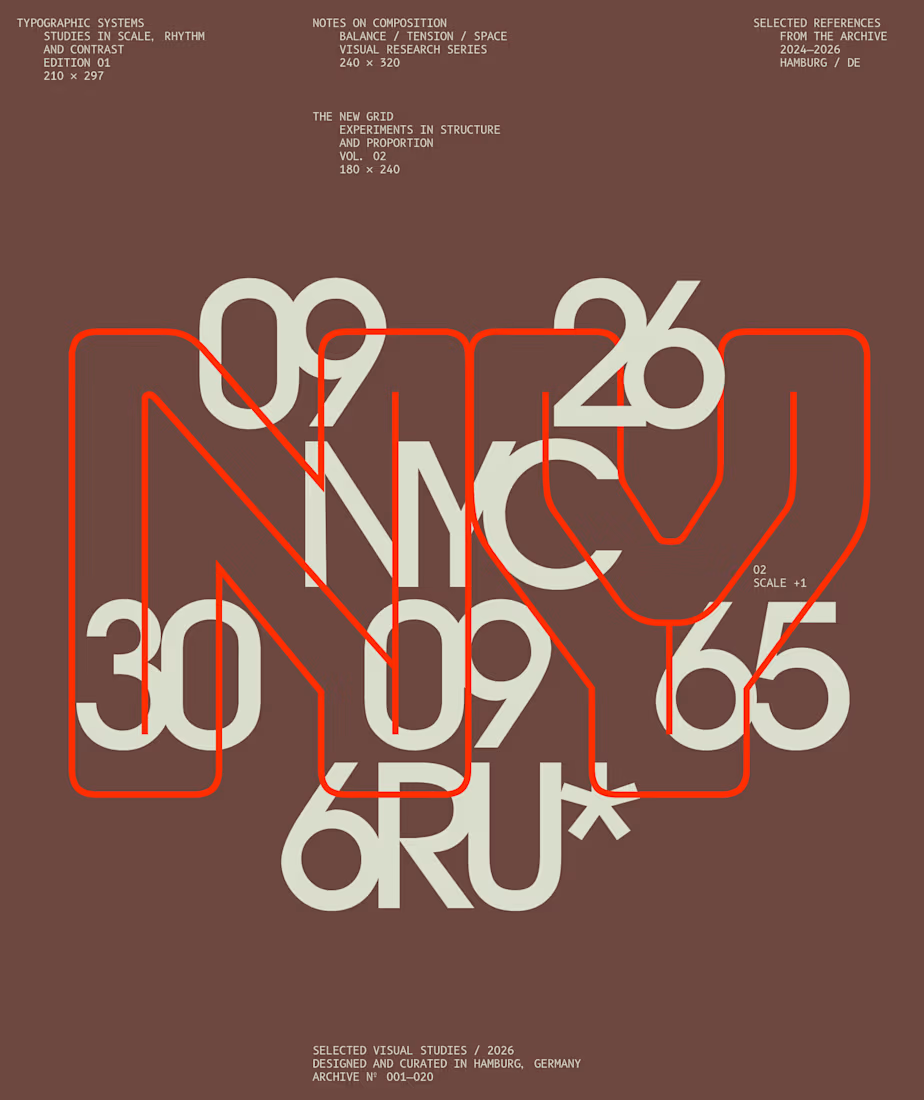
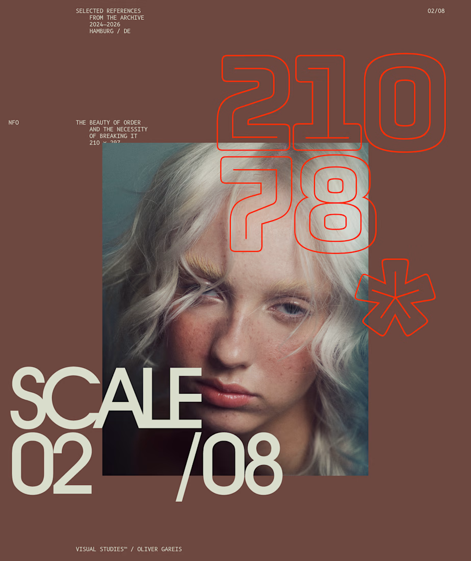
I designed these typographic layouts as part of my ongoing visual series on scale, grid and rhythm
↳ Master typography & layout - The foundation of timeless web design. Join 350+ designers inside my 13-hour online course https://typomonday.com/course


Beautiful wo