The network for creativity
Join 1.25M professional creatives like you
Connect with clients, get discovered, and run your business 100% commission-free
Creatives on Contra have earned over $150M and we are just getting started
Back to feedPost
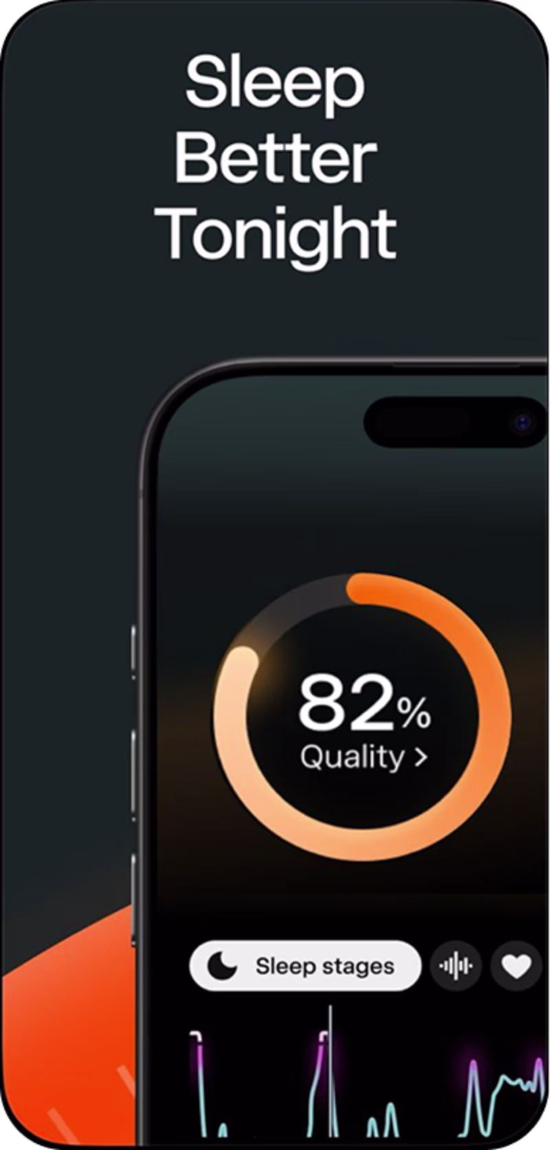
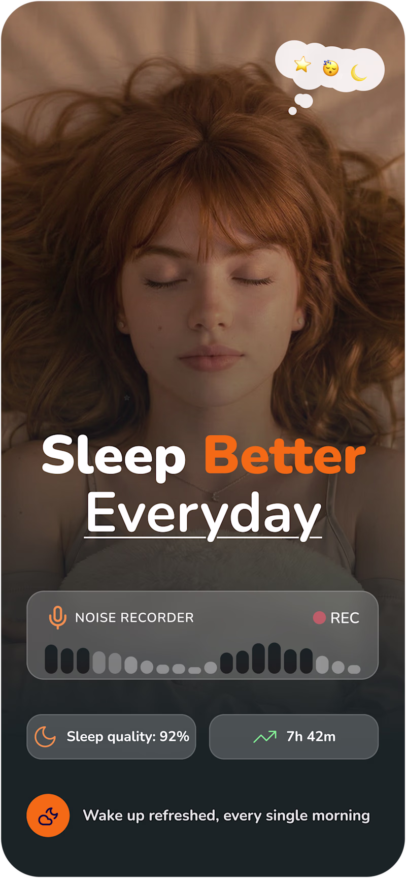
Taste Test

Redesigned this sleep app screenshot for @sleepcycle and I think the difference speaks for itself.
Curious, which option feels best to you ?
30 votes
Ends in 1d
Thanks for your vote, kindly leave a comment about your thoughts on the designs, personally, I think one of the designs tells a story of what the app can do for users, while the other shows feature, techy.
LMK what you think. Gracias

Looks good!
Appreciate the feedback


Love love this
Thank you so much

This new design feels so much better.

Really did a great job! @Peace Ukutegbe
The revised version explains the concept and is definately louder in explaining the purpose here.

Love the After 🙌

Second option do feel good. I feel that if there would be no emojis it would look perfect as it will not clash with the brand personality which is leaning towards modernity.
The network for creativity
Join 1.25M professional creatives like you
Connect with clients, get discovered, and run your business 100% commission-free
Creatives on Contra have earned over $150M and we are just getting started
Related posts

THE LAST LETTER
I built this because sometimes we don’t need another productivity app.
We need a moment to breathe. To write. To release.
This is my small attempt at turning a digital interaction into something that feels real.
Made with heart for the #FigmaMakeathon
https://indigo-aroma-01546841.figma.site/


how brilliant it is
I loved this after trying

When was the last time an app felt like a place?
Not a feed.
Not a task.
A space.
Introducing Shelter, my submission for the #FigmaMakeathon.
Scroll infinitely left and right to move through time.
Scroll up and down to shift the weather.
A two-axis interaction that turns your screen into a living environment, responsive across desktop and mobile.
Bring the rain.
Watch the light change.
Switch from nature to city.
Pet the cat.
Built using Figma Make + Claude.
Step away from the noise:
https://muse-stylus-25204574.figma.site
🎧 Sound on

This is sooo cute and relaxing ☺️


We built ssshtill because the world is losing touch. Not metaphorically. Literally.
We reverse-engineered ssshtill from the most human starting point — the feeling of touch.
Solo mode uses haptic pulses and ambient visuals for anxiety, pain, and sleep.
Shared mode connects two devices in real time through synchronized breath, touch, and rhythm.
Figma Make let us prototype touch, timing, and sync as core mechanics — not afterthoughts. Emotion became interaction.
#FigmaMakeathon
X: @aftonandseb
NOTE: Haptic is not available on iOS web browsers. ssshtill is best experienced on mobile devices.


This is absolutely INSANE!!!
Trending
maxearnings
The next frontier of payments is live on Contra. How are you maximizing revenue?
freelancerlife
Freelancer life is wins, pivots, and everything in between. What’s yours right now?
aidesignflow
AI tools are redefining how designer work. What does your workflow look like?
micrographics
Micrographics started as utility - barcodes, packaging, instruction labels. How would you use them?
aivideo
AI video tools are moving at warp speed. What tools are you using?