The network for creativity
Join 1.25M professional creatives like you
Connect with clients, get discovered, and run your business 100% commission-free
Creatives on Contra have earned over $150M and we are just getting started
Back to feedPost

Simple doesn’t have to mean ordinary.
A clean and simple website can still look professional, modern, and engaging — when the design is focused on the right details.
I created this website with a simple approach:
→ Clean layout
→ Clear visual hierarchy
→ Easy navigation
→ Professional look
→ Attractive without over-designing
Good design isn’t always about adding more. Sometimes, it’s about knowing what to keep simple.
This is a small example of how I turn simple ideas into polished digital experiences.
Have a website idea in mind? Let’s build something clean, professional, and made for your goals.
#WebDesign #WebsiteDesign #UIDesign #WebDevelopment #Contra #FreelanceDesigner #FSDIGITALIZE

The network for creativity
Join 1.25M professional creatives like you
Connect with clients, get discovered, and run your business 100% commission-free
Creatives on Contra have earned over $150M and we are just getting started





Related posts


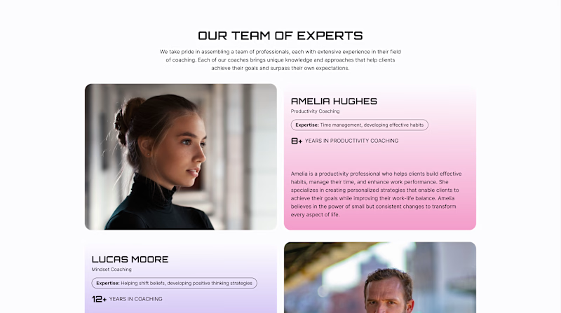
Team Sections: Professional Only or Professional + Personal?
A team section can build trust in different ways.
Version A - Professional. Focuses on the coaches’ professional experience - their expertise, years of practice, and approach to working with clients.
Version B - Professional + Personal. Keeps this information but adds a Weekend Mode with personal photos, interests, and small stories about life outside work.
For a coaching website, both sides matter: expertise shows competence, while personality helps visitors feel a human connection.
Which version would make you more likely to choose a coach?
22 voted
61%
14 voted
39%
36 votes
Closed

Upgoating version B


Have you ever gone this bold on a 404? ⚡
Back to our latest poll: y'all voted Black (60%). We shipped Pink anyway.
Our client's call, not ours - and once you see her brand, you'll get why. Feminine-led, bold, unapologetic - Pink was never really up for debate on her end. 💗👠
See it live: https://productionportugal.com/404
404pagecreativewebsitewebdesignCreative Design Motion DesignWeb DesignAdobe After EffectsFigmaWebflow


You nailed the overall mood here. The details just reinforce it nicely.

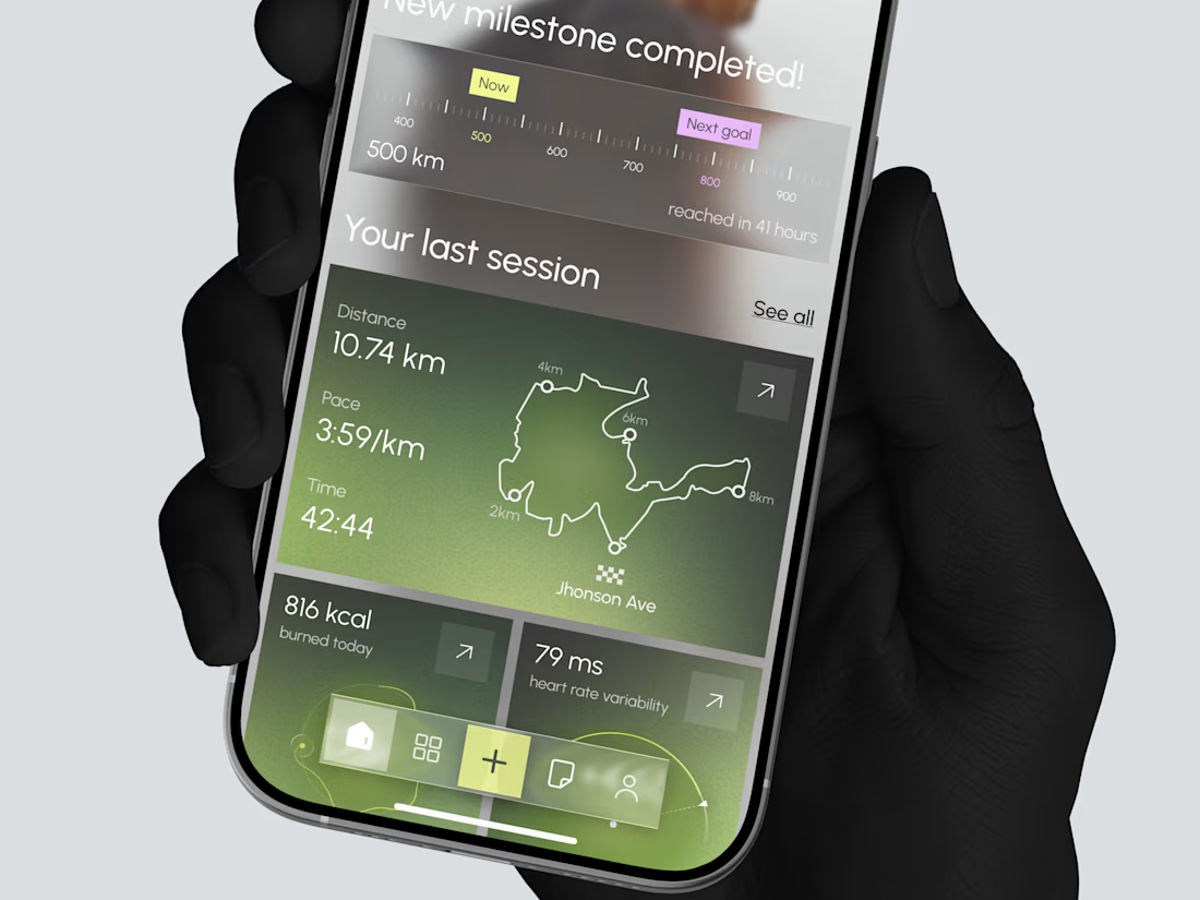
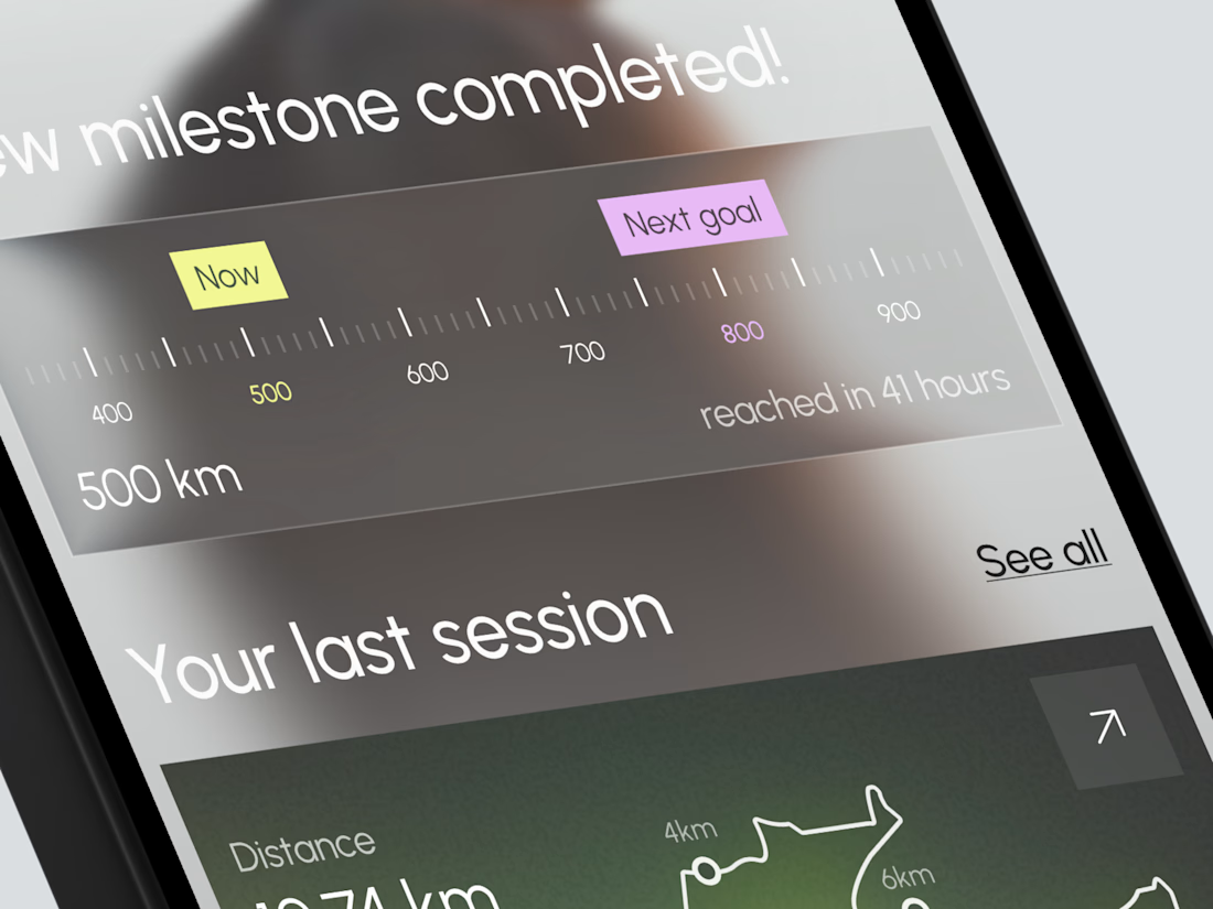
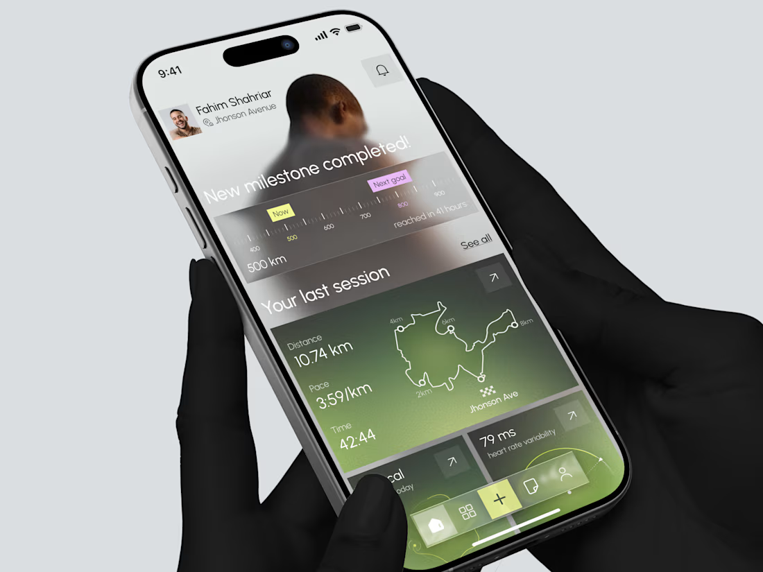
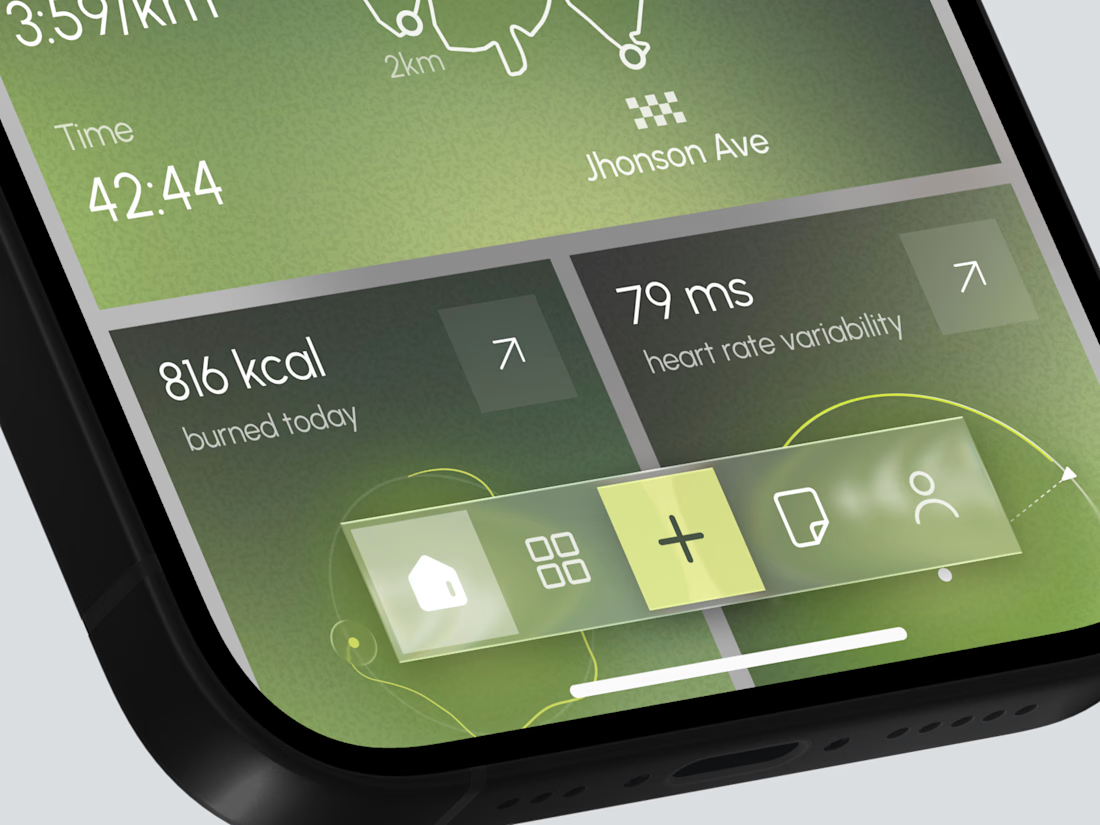
Designed a modern Fitness Tracking Mobile App.
Clean and motivational UI with milestone progress, last session map, distance, pace, calories, and heart rate insights for better running performance.


TOP!!