The network for creativity
Join 1.25M professional creatives like you
Connect with clients, get discovered, and run your business 100% commission-free
Creatives on Contra have earned over $150M and we are just getting started
Back to feedPost

🚀 Your Shopify product page shouldn’t make mobile shoppers work to buy.
For this sports nutrition brand, the goal was simple: make mobile shopping faster, smoother, and more conversion-focused.
I rebuilt the product page with a custom, app-free Shopify 2.0 experience:
• 📱 Premium mobile media gallery — custom 1+2 split-grid layout with synced image previews
• 🛒 Sticky Add-to-Cart — persistent mobile ATC with variant selection and dynamic pricing
• ⏱️ Smart delivery engine — calculates delivery expectations using cutoff times, localization, and country-specific weekend rules
• 🔔 Back-in-stock flow — replaced generic “Sold Out” buttons with a Notify Me lead-capture experience
• ⭐ Smooth review navigation — frictionless scrolling directly to social proof
• ⚡ App-free implementation — lightweight custom Liquid + vanilla JavaScript for a faster experience
The result: a premium, SaaS-style mobile product page designed around one thing — reducing friction between “I want this” → “I’m buying this.”
I love projects where Shopify’s standard theme limitations aren’t enough and the solution needs to be engineered around the brand, UX, and conversion goals.
Need a custom Shopify product page that converts better on mobile? Let’s build it.
#Shopify #ShopifyDeveloper #Shopify2 #ShopifyLiquid #CRO #Ecommerce #ShopifyDesign #UXDesign #ConversionRateOptimization #DTC


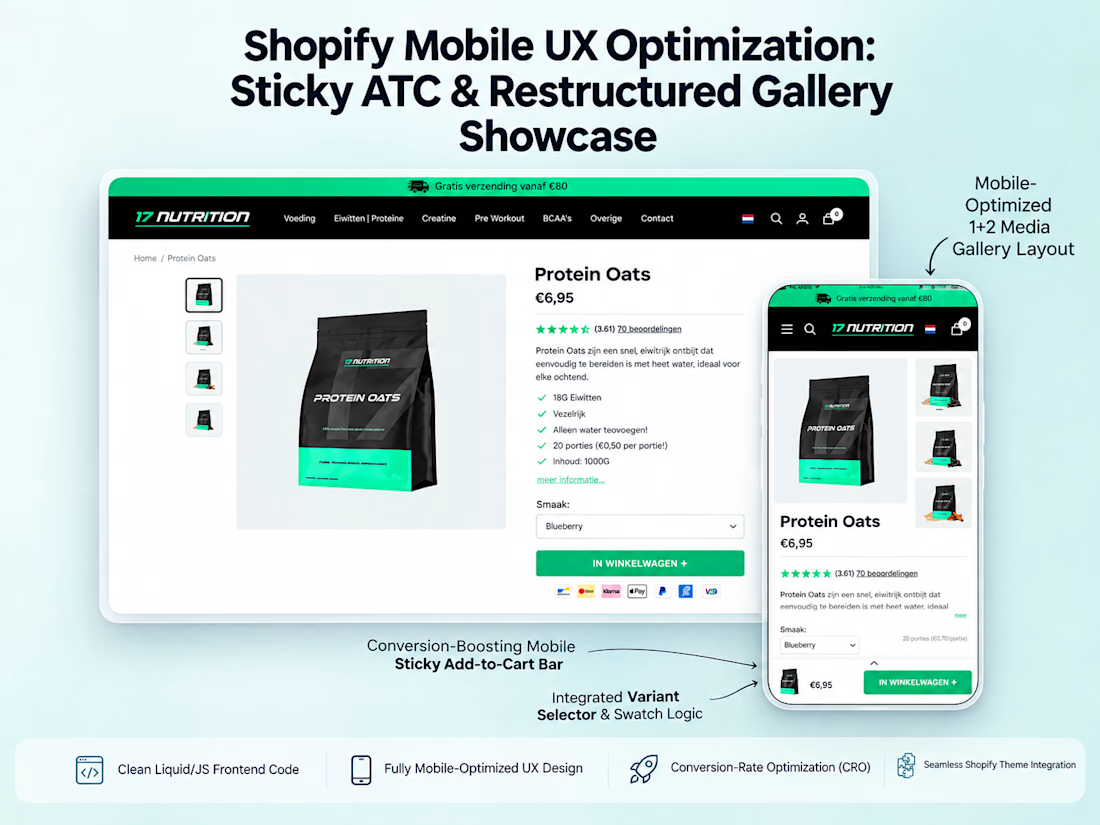

Moving to a 1+2 gallery layout on mobile instead of one image at a time means the variant swatches stay visible while you're still scanning photos - you don't lose your place picking a color.
The network for creativity
Join 1.25M professional creatives like you
Connect with clients, get discovered, and run your business 100% commission-free
Creatives on Contra have earned over $150M and we are just getting started



Related posts

A fashion storefront needs to show the outfit and make its individual pieces easy to find.
For FORM, I paired a warm, editorial lookbook with clearly grouped product names, prices, and size choices.
Cream surfaces, charcoal typography, and consistent product cards connect the homepage with the desktop and mobile screen concepts.
One useful design principle from this project: give campaign imagery and shopping details their own readable zones. The collection can have a strong visual presence while the next product decision stays clear.
Explore the complete design case study:
https://contra.com/p/rNPRqooQ-form-fashion-e-commerce-website-design
When exploring a clothing collection, what helps you most: a styled outfit or an individual product grid?

Adorable

What if sending money felt a little more like giving a gift?
For Nova, I explored a banking app that brings payments, cards, and a bit of personality together. You can check your balance, browse recent transactions, send or request money, top up, and pay bills.
My favorite part is the digital postcard feature. Before sending a transfer, you can add a little illustrated card—a heart, a birthday greeting, or a playful character. A simple way to make birthday money or a thank-you feel more personal.
I carried that same 3D character into onboarding, pairing it with bold red gradients and large, clear payment details. There’s room for play, while the recipient and amount stay easy to check.
Would you add a postcard to a transfer? I’d love to know what occasion you’d use it for.






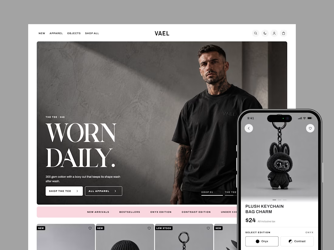
How do you design a store when every product is black? That was the challenge behind VAEL, a brand selling 15 pieces in two editions: Onyx and Contrast.
With no colour to guide shoppers, the design had to do it. Bold condensed type sets the tone, clean outlines show what's selected, and one soft pink highlights sales and rewards.
I designed 20 screens for desktop and mobile, in light and dark mode, from the homepage all the way to checkout.
The result is a store as sharp as the product, and easy to shop. Live demo: https://claude.ai/code/artifact/4e953fd5-47c5-4429-ae8f-e6550690f47b
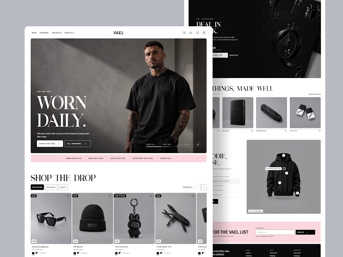
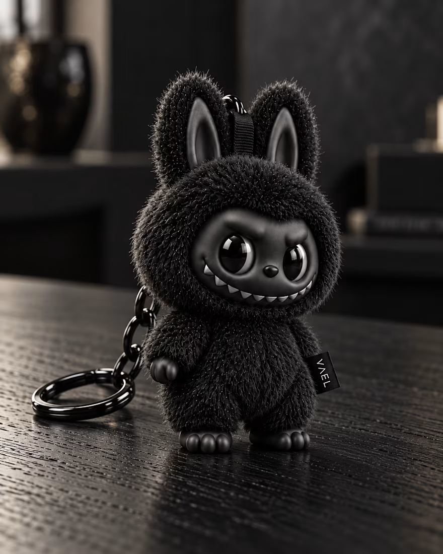
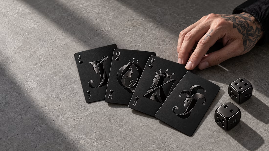

The single pink accent against an all-black catalog does the guiding really well. How did you pick that one color, and did you test other options?