The network for creativity
Join 1.25M professional creatives like you
Connect with clients, get discovered, and run your business 100% commission-free
Creatives on Contra have earned over $150M and we are just getting started
Back to feedPost
3 silent mistakes that keep a small business invisible on Google 👇
1️⃣ No website — only a social page. Google can't rank an Instagram profile the way it ranks a real website.
2️⃣ No booking or WhatsApp button. Visitors who can't act in 10 seconds… leave.
3️⃣ Slow, outdated pages. If your site still looks like 2018, customers assume your business is closed.
The good news? All 3 are fixable, and usually the first fix is small.
At Techi Thrive I start with a FREE audit — you see the problems first, then decide.
DM "AUDIT" 💬
— Muniba Nisar, Co-CEO at Techi Thrive | WordPress & Shopify Developer
Portfolio: https://www.behance.net/munibanisar59


no booking or whatsapp button is the big one imo

Exactly this! Most owners don't realise how many bookings that one missing button quietly costs them. Thanks for the follow 🙏 — Muniba, Co-CEO at Techi Thrive
The network for creativity
Join 1.25M professional creatives like you
Connect with clients, get discovered, and run your business 100% commission-free
Creatives on Contra have earned over $150M and we are just getting started








Related posts


Fresh case study 🚀🚀🚀
Brand identity for Peak, an all-in-one website builder for WordPress that I design and build. A four-letter mark, a warm paper-and-ember palette and one system that runs from the favicon to the packaging.


A four-letter mark that has to hold from favicon to packaging is a tough constraint. Did you draw one letterform first and build the other three from it, or design them together as a set from the start?

Finished the Shopify site for BIVERSE, an Australian faithwear brand.
We built the store around its personalised pieces, with a custom verse field on the product page and an editorial design that carries across desktop and mobile.
Resonate Creatives handled the website design and custom Shopify build. A few screens from the finished site below.
View the site: https://biverse.com.au/

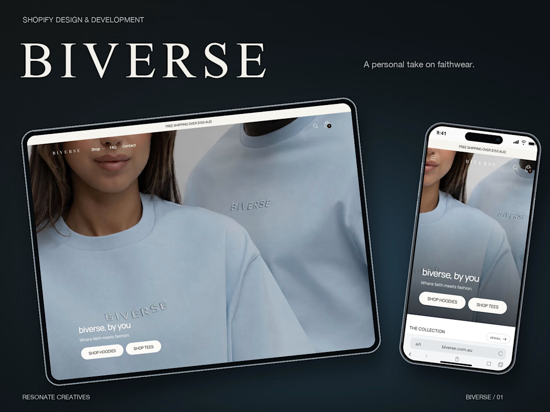
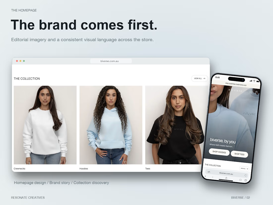
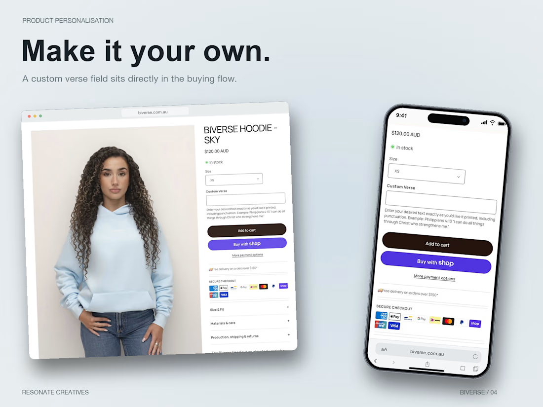
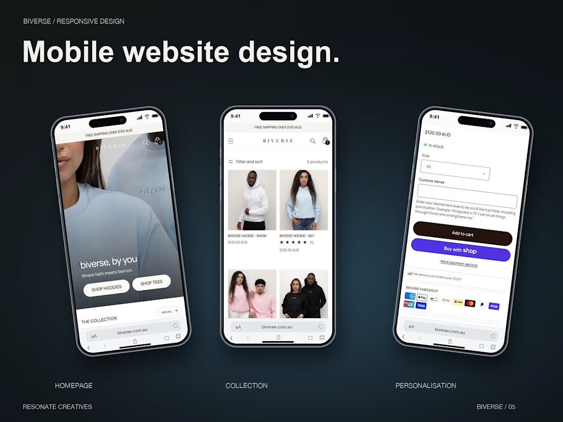

Nice one. A custom verse field is where personalised stores win or lose: the text has to make it into the cart and the order so fulfilment never has to chase the customer for it. Did you show a live preview of the verse on the product, or keep it as a text field only?

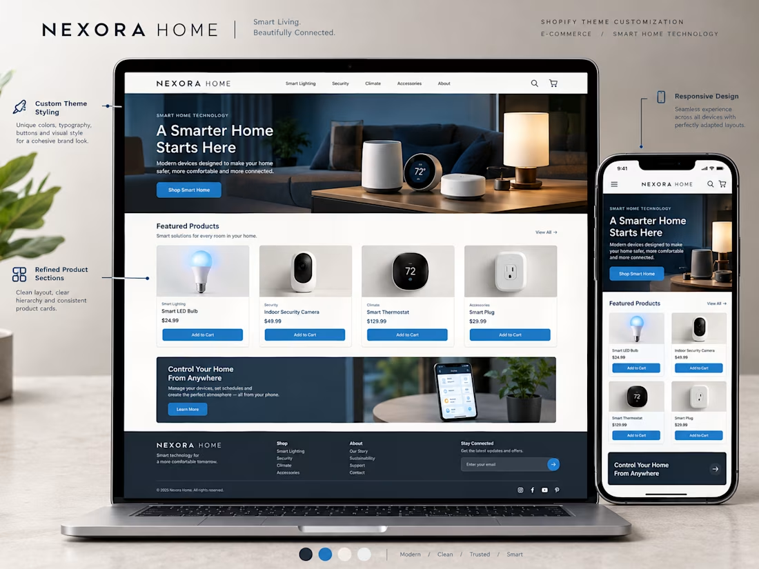
A Shopify theme gives a store its starting point, but customization helps make the experience fit the brand.
For this concept, I focused on how small design decisions can work together to create a more cohesive storefront.
→ Brand aligned colors and typography
→ A clear homepage structure
→ Consistent product cards
→ Refined buttons and section layouts
→ Better visual hierarchy
→ A responsive mobile experience
The goal isn't to change everything just for the sake of being different.
It's to make thoughtful adjustments that help the store feel consistent, professional, and easy to navigate.
Good theme customization brings the brand and the shopping experience together.
What would you customize first when adapting a Shopify theme for a new brand?


I'd start with the typography and colors. They set the tone for the entire storefront.


