The network for creativity
Join 1.25M professional creatives like you
Connect with clients, get discovered, and run your business 100% commission-free
Creatives on Contra have earned over $150M and we are just getting started
Back to feedPost

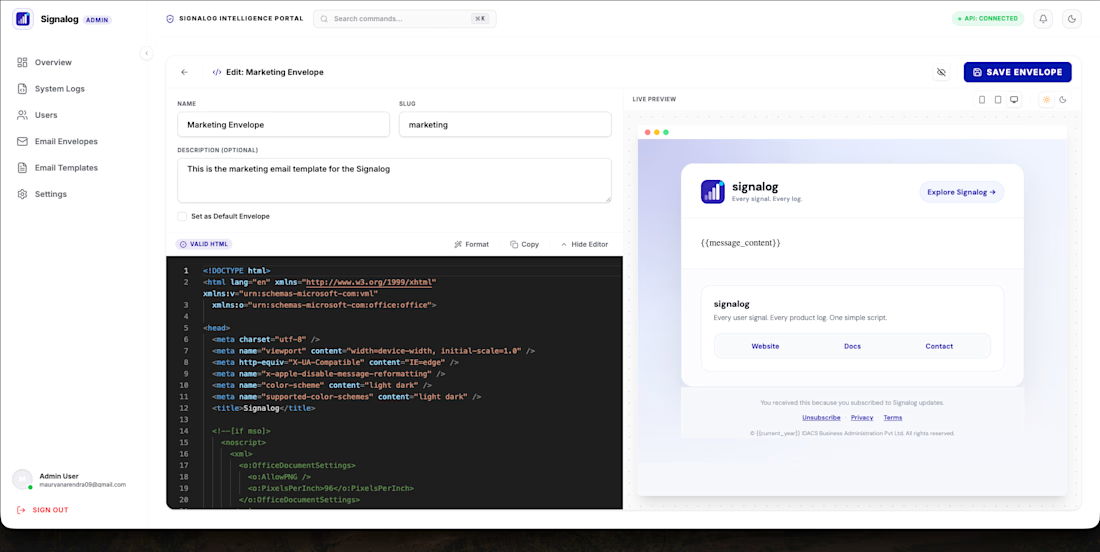
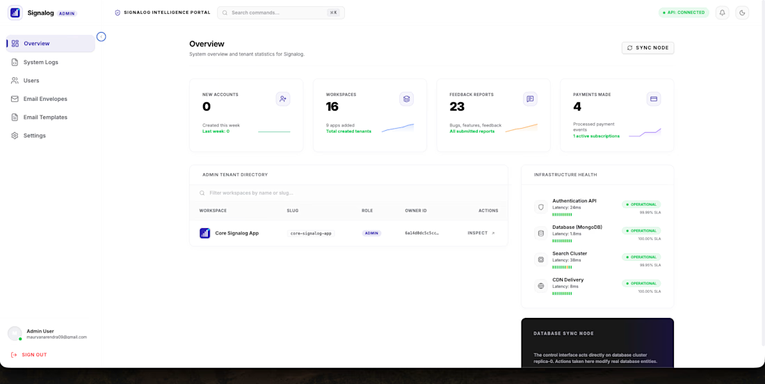
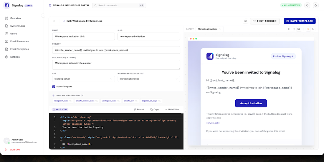
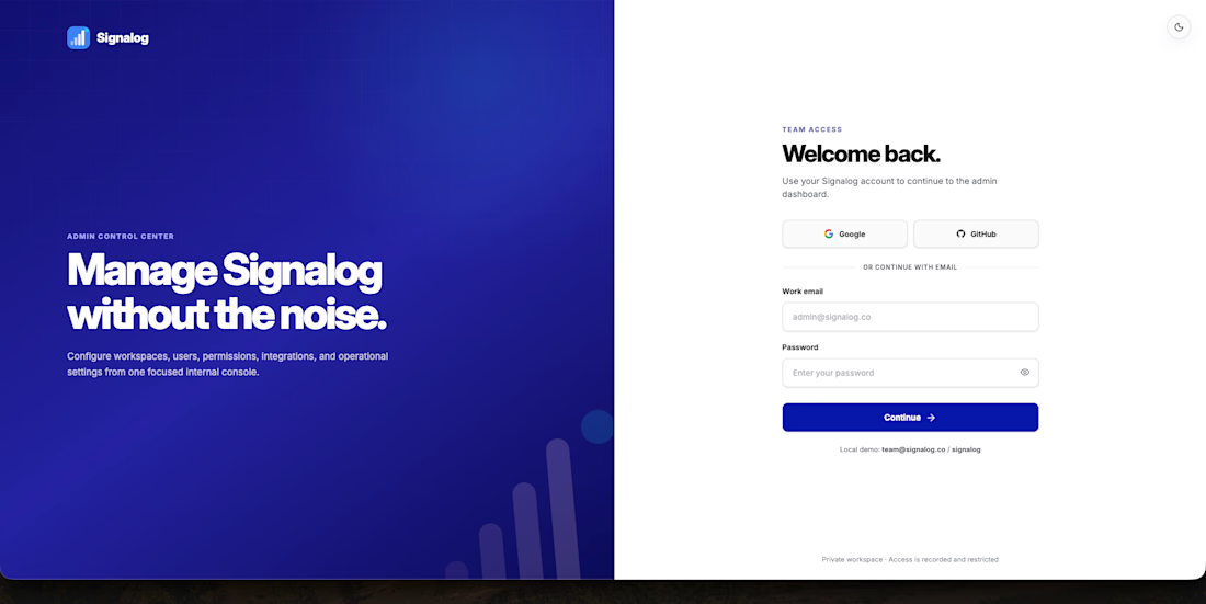
Signalog Admin — Internal Team Access & CMS Management Platform


The network for creativity
Join 1.25M professional creatives like you
Connect with clients, get discovered, and run your business 100% commission-free
Creatives on Contra have earned over $150M and we are just getting started



Related posts


Crenaly: a booking SaaS I designed and built end-to-end for appointment-based businesses in France: salons, barbers, beauty and wellness.
The core idea: when a client cancels, the freed slot is automatically offered to clients who asked for an earlier time. The first to accept gets it, their appointment moves in place, and the slot they leave is offered next. No double booking, no manual work.
Around it, a full product:
→ Branded booking page for each business, embeddable on their own site
→ Mobile-first booking flow, no account needed
→ Agenda, client management, team roles & permissions
→ Verified reviews, analytics, Stripe billing
Product, UX/UI, frontend and backend.
Next.js · TypeScript · NestJS · PostgreSQL · Redis


Automatically offering a cancelled slot to the next client is such a practical feature for salons and barbers. Designing and building Crenaly end to end must have made those flows much tighter.

Watch this website build itself.
The Sicura homepage, replayed in seconds from the live site: wireframe, layout, content, live.
Sicura automates STIG and CIS compliance for security and infrastructure teams at federal agencies and Fortune 500 companies. I built their Webflow site with a clean, technical look.
What's on the site:
• Product, regulated industries and cloud & hybrid pages
• Why Sicura and customer stories
• Blog, glossary and FAQ on Webflow CMS
• Free trial and book-a-demo paths
A white hero and one big diagram: for a technical product, the clearest picture wins.
Stack: Webflow, Webflow CMS, Figma
Live: sicura.us
Diagram or screenshot: what sells a technical product better?
Liked watching this one come together? Tomorrow's build is already in the queue. Follow along.
Follow for more videos: instagram.com/sellwrightstudio · youtube.com/@sellwrightstudio


Diagram in the hero, screenshot one scroll later. The diagram answers "what does this do?" in two seconds, but technical buyers don't trust it until they see the real UI. On the SaaS sites I've shipped, putting a real product screenshot right under the hero made more people book demos than either one alone. Calm, precise build.

Billboard Brokerage & Consulting Website Design & Development