The network for creativity
Join 1.25M professional creatives like you
Connect with clients, get discovered, and run your business 100% commission-free
Creatives on Contra have earned over $150M and we are just getting started
Back to feedPost

LP Grid — Immersive Private Markets Lattice (Interactive Concept)
"How do you visualize the complex, high-friction web of global private equity without overwhelming the user?"
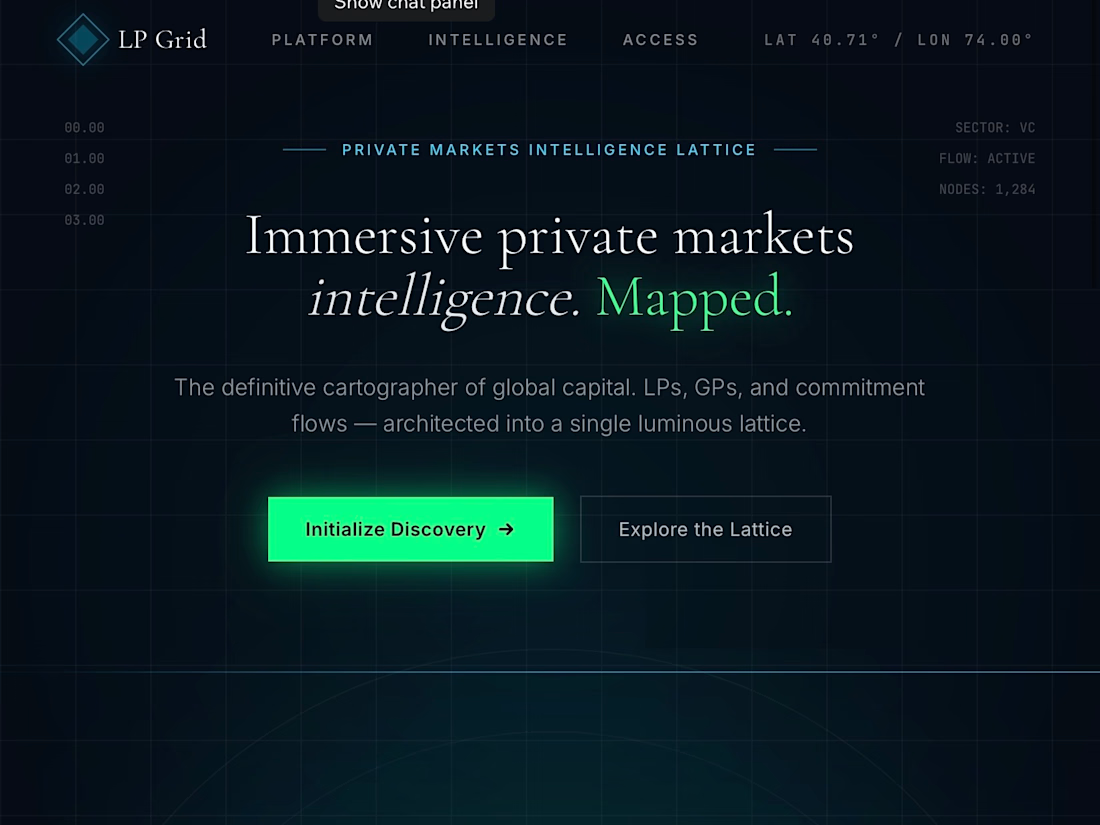
This interactive web prototype is a cinematic, dark-mode experience designed for LP Grid (a private markets intelligence platform). Built through the lens of Somatic UX, it translates dense institutional datasets—such as investor discovery, relationship mapping, and advanced capital filtering—into a calm, low-stimulation, and highly engaging interactive system.
🎥 The Hero: Live Interaction Walkthrough
🎨 The Design Philosophy: "Enterprise Calm"
Standard fintech and private equity dashboards are notoriously cluttered with chaotic data tables, aggressive red/green tickers, and overwhelming information hierarchies.
For LP Grid, I architected a Digital Sanctuary for allocators. By utilizing a deep, immersive space-navy backdrop (#050b14), ultra-thin gridlines, and strict spatial layout rules, the interface feels deeply secure, premium, and authoritative. Crucial data points are highlighted not with loud warnings, but with a highly intentional, luminous dual-color ecosystem:
Neural Blue (#00d2ff) for GP network paths, interactive system inputs, and synchronizations.
Cyber Emerald (#00ff87) for active LP nodes, successful data flows, and primary call-to-actions.
🛠️ Key Interface Features Built
1. The Interactive Relationship Lattice (Section 01)
The Problem: Traditional relationship lists fail to capture the multi-dimensional connections between investors.
The Solution: A live-rendered visual network mapping out Limited Partners (LPs) and General Partners (GPs). Users can visually map out connected funds (e.g., Sequoia Capital, Endowment Forge, Sovereign Wealth Alpha) with glowing connection vectors that pulse dynamically on selection.
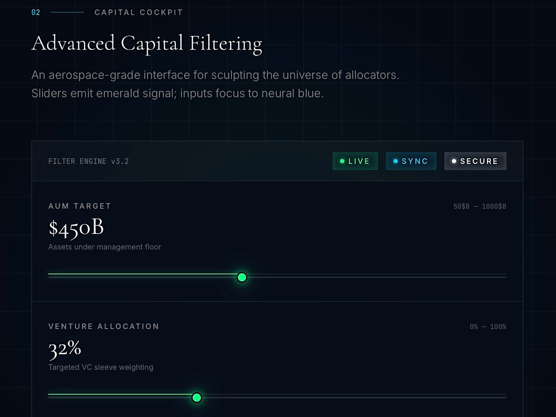
2. Aerospace-Grade Capital Filtering Cockpit (Section 02)
The Problem: Complex financial database queries feel tedious and technical.
The Solution: An elegant control panel mimicking a luxury cockpit. I built custom tactile slider states for filtering huge financial ranges—such as AUM Targets (up to $1,000B), targeted VC sleeve weightings, and liquidity horizons—giving the user physical, visual feedback as they narrow their search.
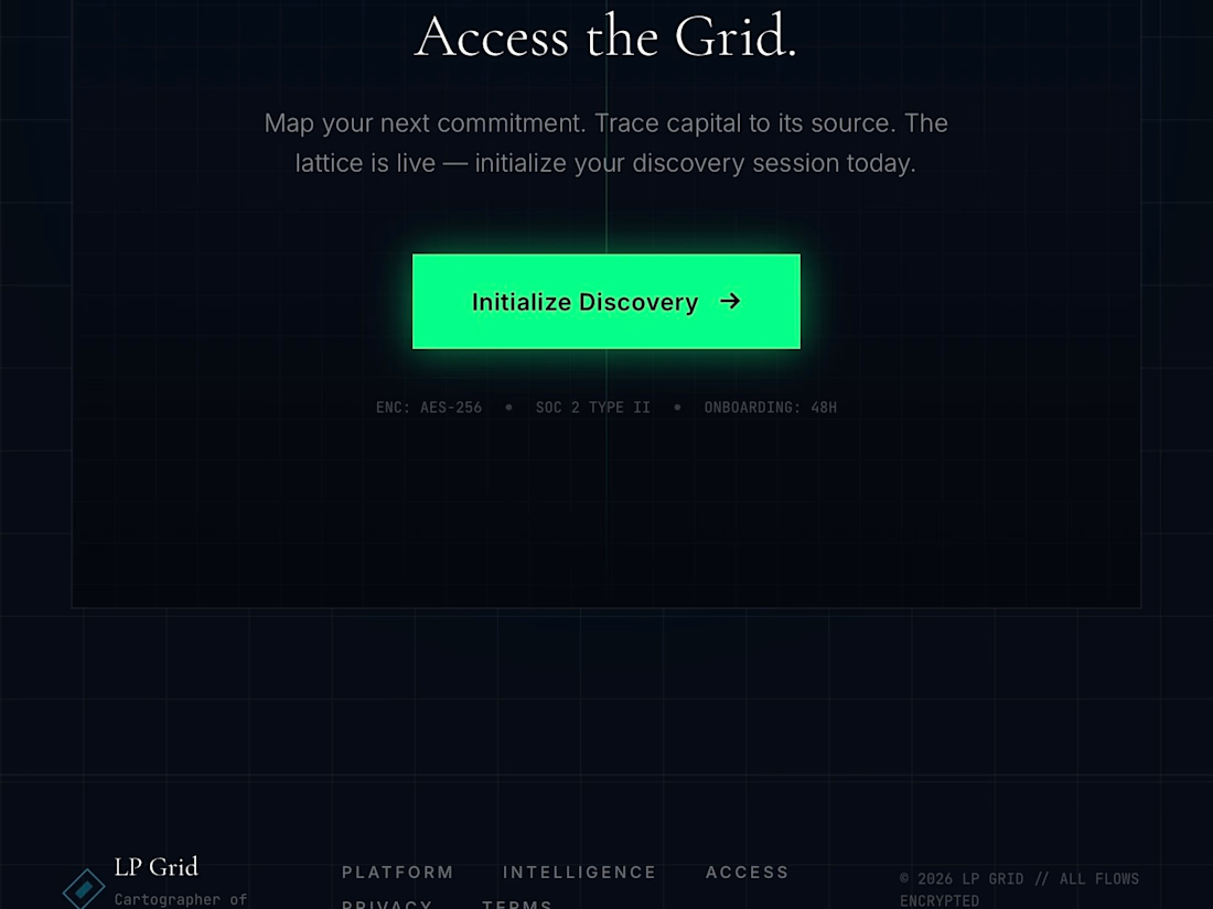
3. High-Contrast "Initialization Gate" (Section 03)
The Goal: Drive conversions securely.
The Solution: A high-conversion sign-up gate featuring clean, high-contrast typography and a prominent glowing primary CTA button, anchored by clear security, SOC 2 compliance, and encryption metrics.
💻 The Tech Stack
To achieve this extreme level of aesthetic precision, responsiveness, and performance:
Framework: React / Next.js
Styling: Tailwind CSS (for the high-end spatial utility system)
Prototyping Environment: Base44
Typography: Playfair Display (Luxury Editorial Serif) paired with Inter (Clean, Geometric Sans-Serif for interface metrics).


The network for creativity
Join 1.25M professional creatives like you
Connect with clients, get discovered, and run your business 100% commission-free
Creatives on Contra have earned over $150M and we are just getting started
Related posts

For the #GiveItAGlow challenge, I built a complete corporate event planning website in Base44 for. A real local business that helps companies plan AGMs, company retreats, team building events, executive meetings, award ceremonies, and employee appreciation events.
The goal was not just to redesign the website visually, but to create a useful digital system that helps the business attract, qualify, and manage corporate event inquiries.
The new website includes a premium, mobile-responsive homepage, detailed service pages, case studies, a blog section, an FAQ experience, and a clear event planning flow for potential clients.
I also added business automations to make the site more useful:
Visitors can submit their event details through an event brief builder. The system then captures the lead, organizes the inquiry, calculates planning complexity, and creates a structured event brief for the business owner.
The site also includes an AI FAQ chatbot that answers questions about services, event types, timelines, venue support, catering, AV, pricing process, and next steps. It helps guide visitors toward the right service and encourages them to submit an event brief.
For the business owner, I added an admin dashboard to view new inquiries, check event details, update lead status, review generated briefs, and manage follow-ups.
This makes the website more than a landing page. It becomes a working lead capture and event inquiry management system for the business.
Built with @Base44 for #GiveItAGlow.
Live site: [https://independent-apex-event-flow.base44.app ]


make sure your submission meets all requirements here!

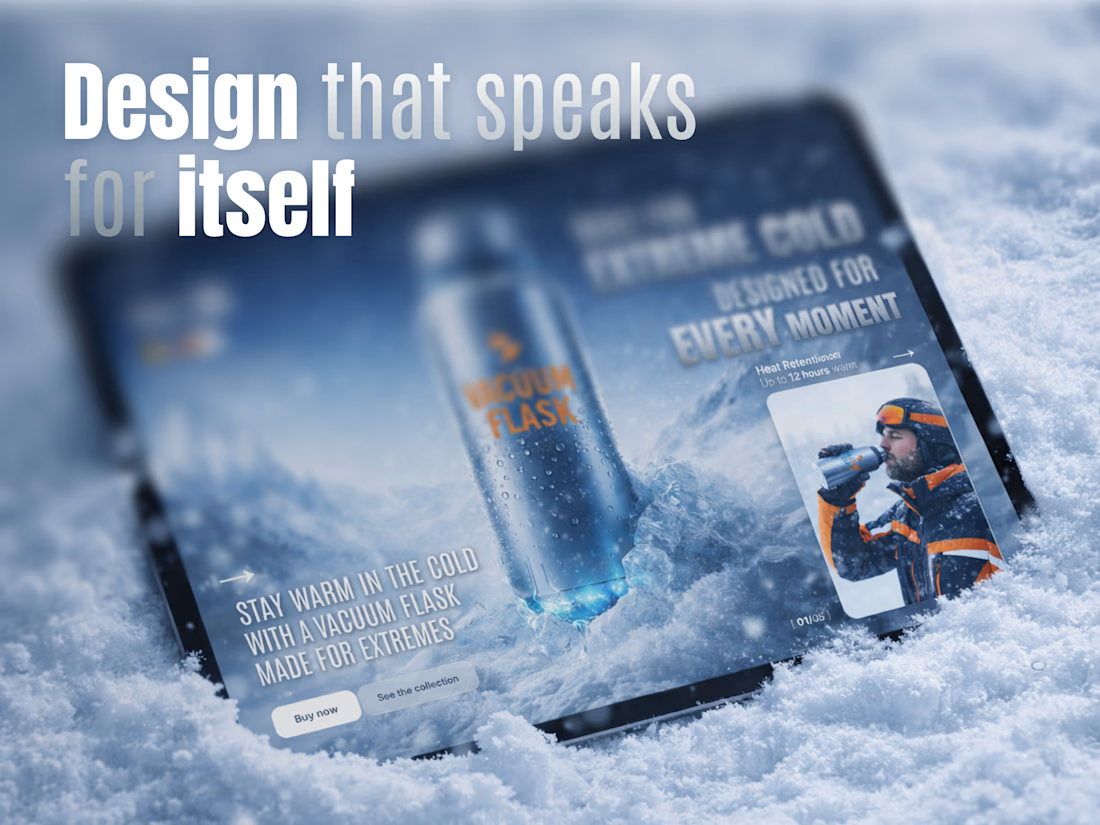
Vacuum Flask — Product Landing Page for Extreme Outdoor Gear ❄️🔥
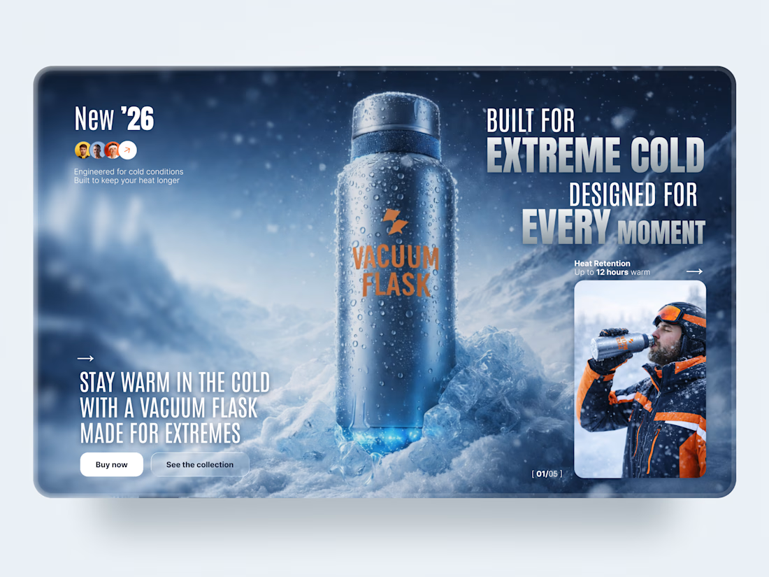
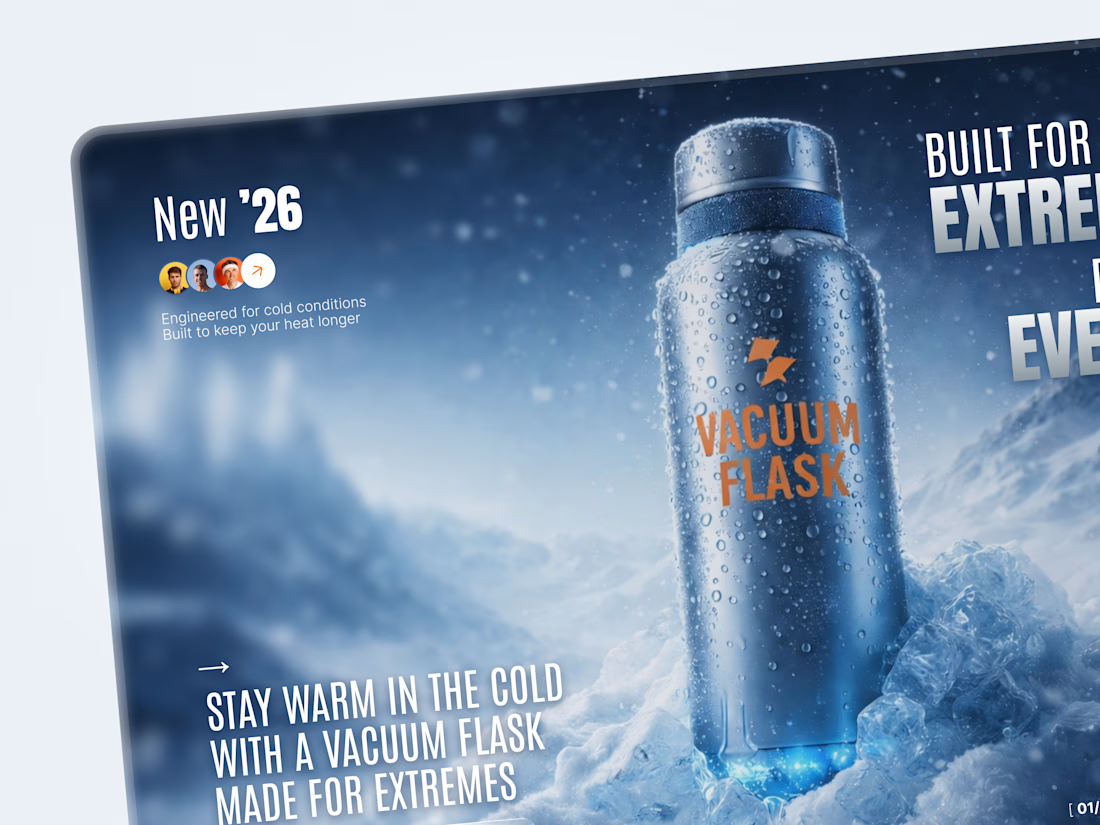
We designed a cinematic landing page concept for Vacuum Flask 🧊 — a durable outdoor product built for extreme cold, long adventures, and everyday performance.
The goal was to make a simple product feel powerful, reliable, and ready for harsh conditions. Through dramatic product-focused visuals, bold typography, icy atmosphere, and clear conversion actions, we created a landing experience that feels closer to a premium outdoor campaign than a standard product page.
Special attention was given to:
• a high-impact hero section that makes the product the main visual focus;
• bold campaign-style typography designed to communicate strength and performance;
• immersive winter atmosphere with snow, ice, and cold-weather lifestyle imagery;
• clear product benefits, including heat retention and outdoor durability;
• conversion-focused CTAs for “Buy Now” and “See the Collection”;
• premium visual direction suitable for outdoor, sports, lifestyle, and DTC product brands.
The result is a strong product landing experience that helps an everyday item feel memorable, premium, and built for adventure — turning functionality into desire.
Looking to design a bold landing page for your product, e-commerce, outdoor, or lifestyle brand? Let’s create something that sells the feeling, not just the product 🏔️



Nice work

Design Duel ⚡
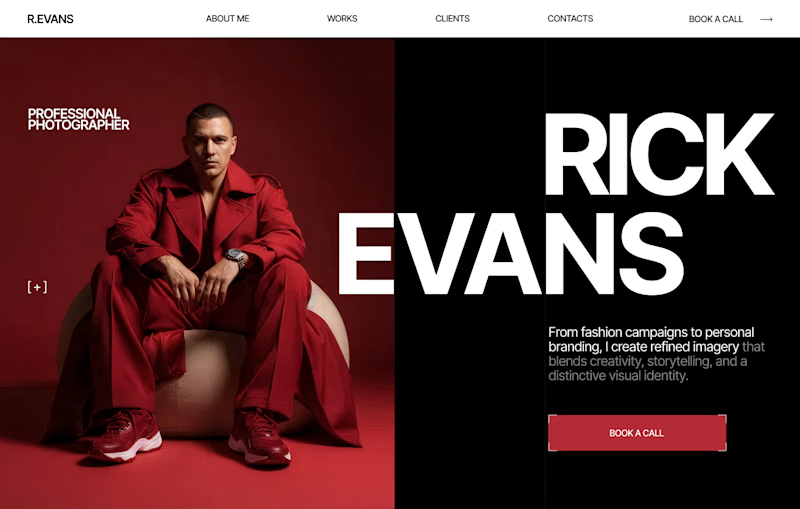
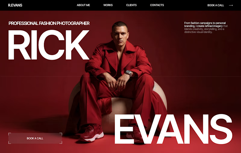
Two hero concepts. One fashion photographer.
🅰️ Structured split layout 🅱️ Full-screen editorial experience
Which one would you choose for your portfolio? Vote A or B and tell me why.

6 voted
20%
24 voted
80%
30 votes
Closed

I love your designs so much! 😍






Trending

Claude
Claude has entered the design space. How are you using Claude Design?

Contra University
Learn from expert creatives how to earn more using next-gen AI tools.
fifaworldcup2026
The World Cup is here and the whole world's watching. How are you designing for the world stage?
creativeaiflow
Creative AI workflows are evolving. What tools do you use, and what are their strengths and weaknesses?
freelancerlife
Freelancer life is wins, pivots, and everything in between. What’s yours right now?