The network for creativity
Join 1.25M professional creatives like you
Connect with clients, get discovered, and run your business 100% commission-free
Creatives on Contra have earned over $150M and we are just getting started
Back to feedPost

I've spent the last few weeks exploring how AI fits into creative direction.
One thing has become clear:
AI doesn't replace taste.
It doesn't replace strategy.
It doesn't know which tiny detail will make a hotel feel luxurious, a healthcare brand feel trustworthy, or a website feel effortless.
What it does do is help me explore more ideas, faster.
Instead of spending hours creating first-round concepts, I can spend that time making better creative decisions—the part clients actually hire me for.
After 20 years in branding and creative direction, I'm excited to keep combining strategic thinking with AI-enhanced workflows to help brands create stronger, more memorable experiences.
I'm especially interested in connecting with companies and agencies looking for senior creative leadership as AI becomes part of the creative process.

The network for creativity
Join 1.25M professional creatives like you
Connect with clients, get discovered, and run your business 100% commission-free
Creatives on Contra have earned over $150M and we are just getting started
Related posts

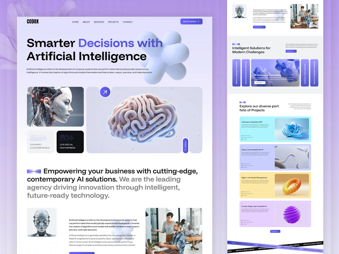
🤖 Smarter Digital Experiences Start with AI-Driven Design
Artificial Intelligence is shaping the future of business. A powerful website helps communicate that vision.
Introducing a modern AI Agency Website Design concept by OrdainIT, featuring a futuristic visual style, clean layouts, bold typography, and engaging interactive elements.
✨ Design highlights:
Modern AI agency landing page
Futuristic 3D visuals and creative layouts
AI services and solutions showcase
Project portfolio with engaging presentation
Clear content hierarchy and CTAs
Clean, responsive website experience
Designed to help AI startups and technology companies present their innovation with confidence.
At OrdainIT, we combine creative UI/UX design and website development to build digital experiences for ambitious businesses.
💬 What makes an AI agency website stand out — innovative visuals or a clear presentation of its services?
#AIWebsite #AIAgency #WebDesign #UIUXDesign #SaaSDesign #WebsiteDevelopment #OrdainIT



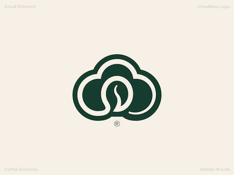
Human Design vs. AI: CloudBean Logo Concept ☁️☕️
When building a brand identity, execution and detail make all the difference. I put together two concepts for CloudBean—one crafted by hand (forest green) and another generated with AI.
The Handcrafted Version (Forest Green): Features a refined, balanced monogram seamlessly integrating the cloud shape with a coffee bean, complete with thoughtful typography styling and a polished mark.
The AI Version (Brown Gradient): Offers a quick interpretation, placing a tilted bean inside an open cloud outline with a standard gradient.
Which direction feels stronger for the brand? Let me know your thoughts in the comments! 👇
#Branding #LogoDesign #DesignProcess #VisualIdentity #Contra
3 voted
100%
0 voted
0%

3 votes
Closed

love this branding design


Looks super polished! love it