The network for creativity
Join 1.25M professional creatives like you
Connect with clients, get discovered, and run your business 100% commission-free
Creatives on Contra have earned over $150M and we are just getting started
Back to feedPost

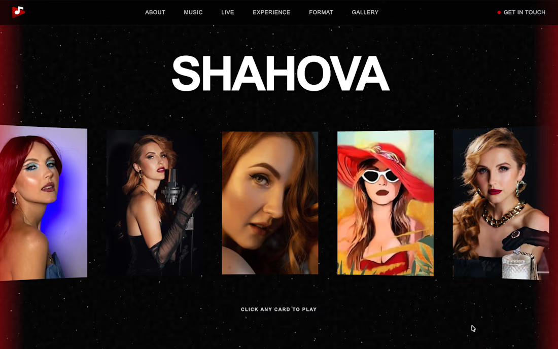
SHAHOVA — Artist Portfolio Website
A bold, immersive portfolio website designed and developed for SHAHOVA, a professional vocalist and performing artist. The experience combines a cinematic visual style with interactive music, video, and gallery sections to showcase her work and live performances.
Built with Next.js, React, Tailwind CSS, and Framer Motion, featuring a custom 3D music carousel, interactive video content, animated transitions, canvas-based star effects, and a persistent audio player for a seamless browsing experience.


The network for creativity
Join 1.25M professional creatives like you
Connect with clients, get discovered, and run your business 100% commission-free
Creatives on Contra have earned over $150M and we are just getting started

Challenges
View all


Related posts


Another exciting project wrapped up! ✨
This time, we worked on Olympian by Design – a premium one-on-one coaching brand focused on personal transformation and high performance.
Our goal was to create more than just a beautiful website. We wanted the entire client journey to feel connected – from the first landing page visit to purchasing the program and going through the coaching experience.
We designed three custom pages from scratch, built them in Kajabi, created a branded member area, set up the coaching program, and refreshed the app with new onboarding screens.
All wrapped in a bold, dark, luxury-inspired design.
Because great design shouldn't stop at checkout. It should follow the client through the entire experience.


Great project


Same animation, one detail changed.
Motion blur or clean.
Which one feels better? 👇
16 voted
53%
14 voted
47%
30 votes
Closed

Blure is more focused and better ❤️❤️


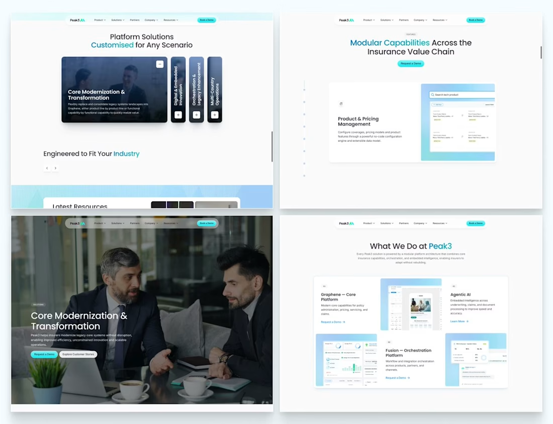
Our Peak3 website build covered 17 page templates and six CMS collections. At that scale, the questions about publishing deserve as much attention as the finished pages.
A blog post, a whitepaper and a careers entry need different information. Making them editable is only part of the design problem. The person adding the next entry also needs to understand what is missing and what happens when they publish it.
Here’s a hypothetical review I’d run before a CMS handoff: create a whitepaper entry, add the title and cover, then leave out the download file.
Does the editor flag the missing file? Can someone preview what the visitor will see? If the entry can still be published, does it create a download button that leads nowhere?
I’d use that test to decide which fields must be required and which incomplete states need an explanation.

Beautifully executed work

