The network for creativity
Join 1.25M professional creatives like you
Connect with clients, get discovered, and run your business 100% commission-free
Creatives on Contra have earned over $150M and we are just getting started
Back to feedPost
VK TECH ACADEMY – Modern Educational Website UI/UX Design
Project Type: Self-Initiated UI/UX Design Concept
Role: UI/UX Designer & Visual Designer
Year: 2026
Design Tool: Figma
Project Category: Website Design | EdTech | Educational Platform
Project Overview
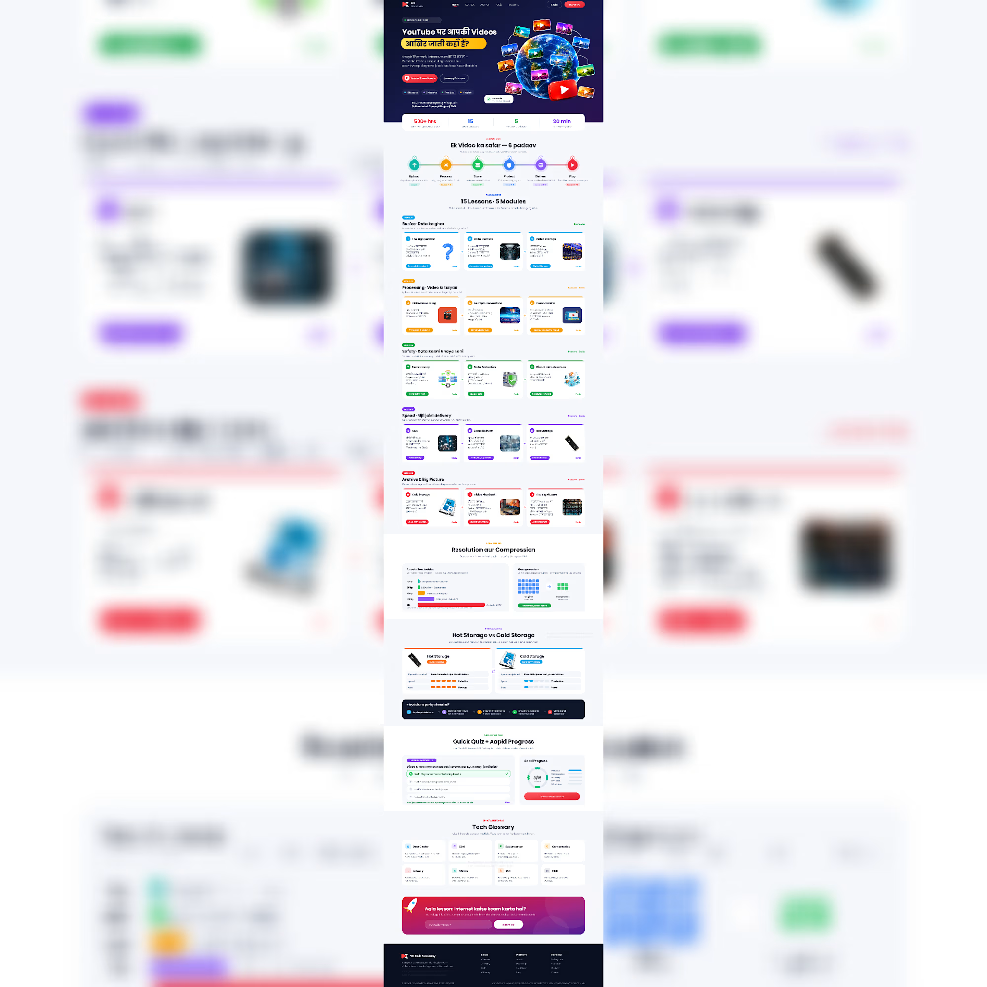
VK TECH ACADEMY is a self-initiated educational website design concept created to make complex technology topics easier to understand through structured learning, engaging visuals, and a beginner-friendly interface.
The concept focuses on explaining how YouTube's video infrastructure works, covering everything from video uploading and processing to storage, compression, security, and global content delivery.
My goal was to create a modern and visually engaging learning experience that transforms technical information into simple, understandable, and interactive content.
The Design Challenge
Technical concepts such as CDN, data centers, video compression, redundancy, and global infrastructure can be difficult for beginners to understand.
I wanted to explore how thoughtful UI/UX design, visual storytelling, and structured content organization could make these topics more accessible.
Key Features & Sections
1. Hero Section
Modern landing page with strong visual hierarchy.
Engaging headline and clear call-to-action buttons.
Global Earth and video-related visual elements.
Quick overview of learning statistics.
2. Learning Journey
Six-step visual learning process.
Upload, Process, Store, Protect, Deliver, and Play.
Simple and understandable learning flow.
3. Structured Learning Modules
15 lessons organized into five modules:
Basics – Data Ka Ghar
Processing – Video Ki Taiyari
Safety – Data Kabhi Khoye Nahi
Speed – Bijli Jaisi Delivery
Archive & Big Picture
4. Resolution & Compression
Visual comparison of video resolutions.
Simple explanation of compression.
Before-and-after visual representation.
5. Hot Storage vs. Cold Storage
Comparison of storage technologies.
Visual representation of speed, cost, and usage.
6. Interactive Learning Concept
Quick quiz section.
Learning progress dashboard.
Achievement and completion indicators.
7. Technology Glossary
Data Center
CDN
Bandwidth
Compression
Latency
Bitrate
SEO
HDD
8. Final Learning Section
Engaging final lesson banner.
Clear call-to-action for continuing the learning journey.
My Design Approach
I focused on creating a clean, modern, and user-friendly interface with:
Consistent typography and visual hierarchy.
Carefully selected color combinations.
Structured content cards and learning modules.
Clear navigation and information architecture.
Visual illustrations to simplify technical concepts.
Consistent spacing, alignment, and component styling.
Tools & Resources
Design: Figma
Visual Assets: Free stock images sourced from Unsplash.
Design Focus: UI/UX Design, Web Design, Visual Communication, Layout Design, and Information Architecture.
Project Outcome
This concept demonstrates how complex technical subjects can be presented through a structured and visually engaging educational website.
It also allowed me to explore educational interface design, content organization, visual storytelling, and user-friendly digital experiences.
Credits & Ownership
Designed by Vikalp Jain
Self-Initiated UI/UX Design Concept | 2026
All UI/UX layouts and design decisions are part of my original design concept. Selected stock photographs are sourced from Unsplash and remain subject to their respective licenses.
This is an independent concept project and is not affiliated with or endorsed by YouTube or Google.


Great work on the course site.

Thank you so much, Vansita..I really appreciate your kind words. Glad you liked the course website design.
The network for creativity
Join 1.25M professional creatives like you
Connect with clients, get discovered, and run your business 100% commission-free
Creatives on Contra have earned over $150M and we are just getting started



Related posts


Branding & Visual Identity for AirCon West based in London.
Designers! Present your work with motion! It breathes life into your work and conveys your ideas in a dynamic way.
Use free online motion tools to do it.
My favorites:
https://animos.app/
https://arqe.ai/
https://orelin.app/editor
https://openvid.dev/en
(Or animate it yourself, like I did here using EffectCraft!)


Nice work!!

New case study for the brand and digital work we did for Seeper Studios.
Go Check it out


Evolving a brand with almost 30 years of history is the hard version of brand work. You have to keep what people already trust while making it feel current. Nice job balancing both.


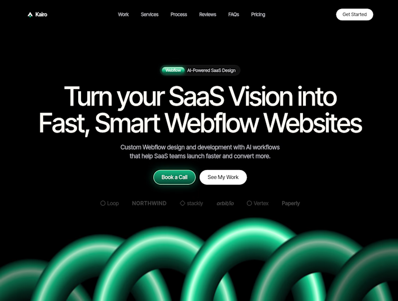
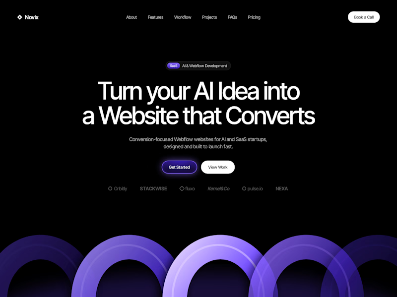

Both look great, but Violet & Black gets my vote! The purple accents give it a more modern, premium feel while keeping the design clean and focused on conversions. Amazing how a color change can create such a different brand personality. Have you tested which version performs better with visitors?


