The network for creativity
Join 1.25M professional creatives like you
Connect with clients, get discovered, and run your business 100% commission-free
Creatives on Contra have earned over $150M and we are just getting started
Back to feedPost

Find out how authors can make money beyond books sales...


The network for creativity
Join 1.25M professional creatives like you
Connect with clients, get discovered, and run your business 100% commission-free
Creatives on Contra have earned over $150M and we are just getting started
Related posts


Just launched something big on Pro Studio 🎉
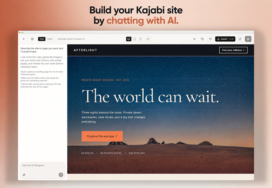
You can now build your entire Kajabi website by chatting with AI — right inside the app. No external tools, no code, no tech skills.
Describe what you want → watch it build live → edit by just asking.
Free to build and edit. You only pay when you export to Kajabi.
Try it → tryprostudio.com

Having worked in Kajabi, this solves a real pain. Getting a premium look inside its theme limits usually means stacking custom code blocks that creators can't touch later. Chat to edit keeps the owner in control after launch, which is the part most builds lose. Curious about the...


We are testing two ways to browse a large template library.
Load More
Users initially see 9 cards. After clicking the button, 9 more are added while the previous results remain visible. Browsing feels continuous, but the page gradually becomes longer.
Pagination
The catalog is divided into numbered groups. When users select the next page, the current 9 cards are replaced with a new set. They can jump to a specific part of the catalog and easily return to where they were.
Load More creates a smoother browsing experience, while pagination offers greater control.
Which option would you choose for a template library?
17 voted
68%
8 voted
32%
25 votes
Closed

Load more

My new website is live 🌓 Welcome to my Universe!
I designed it as one continuous space: real-time 3D scenes you move through, with my products and work inside them. Orbiwatch, Unveil3D, AnyRun, Dr Sophia AI, Newbold Connect and more.
I put a lot of love and care into every detail of it, and I'd love to do the same for you.
The redesign is here to show what's possible, and to connect me with the kind of businesses I want to partner with. My favourite work is on products where there's room to take care over every detail. Those details shape how people feel when they use a product, and I always want that feeling to be a good one.
Take a look and tell me what you think: vladkutepov.com


Great job