The network for creativity
Join 1.25M professional creatives like you
Connect with clients, get discovered, and run your business 100% commission-free
Creatives on Contra have earned over $150M and we are just getting started
Back to feedPost

One of my clients messaged me out of nowhere a few weeks ago.
A local business journal had seen his videos and invited him to speak at their event. In person. The next morning.
He said the videos were what got them interested.
I won't lie, that one hit different.
Because when we started working together, the brief wasn't complicated. He runs a branding company. He had a strong visual identity, a clear point of view, and real things to say on camera. My job was to make sure the videos actually felt like him.
So I didn't bring in outside b-roll or flashy transitions. I took what was already there: his presence, his brand colors, the way his website uses bold words over strong imagery, and built the edit around that. At key moments, the video stops. One phrase. His colors. Then it moves on.
Simple. But very him.
The reach numbers were solid. But honestly, a speaking invite from a business journal because someone saw the videos? That's the kind of result that reminds me why this work matters.


Nice work🔥👏👏


Really awesome work! Love how you made the videos feel so genuine and on-brand. Super inspiring!
The network for creativity
Join 1.25M professional creatives like you
Connect with clients, get discovered, and run your business 100% commission-free
Creatives on Contra have earned over $150M and we are just getting started





Related posts

What makes a true crime documentary truly engaging: the storytelling, suspense, or the editing?
This project explores how cinematic visuals, compelling pacing, and strategic storytelling can turn complex investigations into captivating documentary experiences. What's the one element you think keeps viewers watching until the very end?
#TrueCrime #DocumentaryEditing #VideoEditing #YouTubeDocumentary #CinematicStorytelling #MotionGraphics #VideoProduction #ContentCreation #AdobePremierePro #AfterEffects


This storytelling is amazing

New case study for the brand and digital work we did for Seeper Studios.
Go Check it out


Evolving a brand with almost 30 years of history is the hard version of brand work. You have to keep what people already trust while making it feel current. Nice job balancing both.

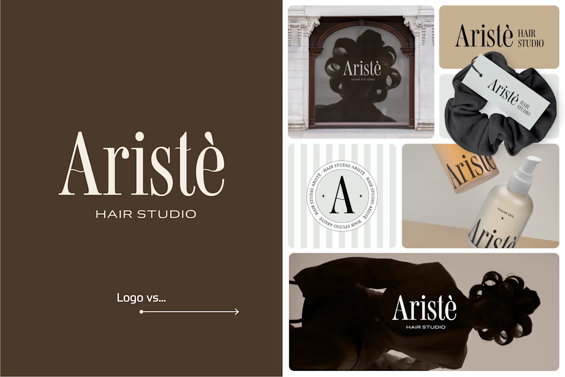
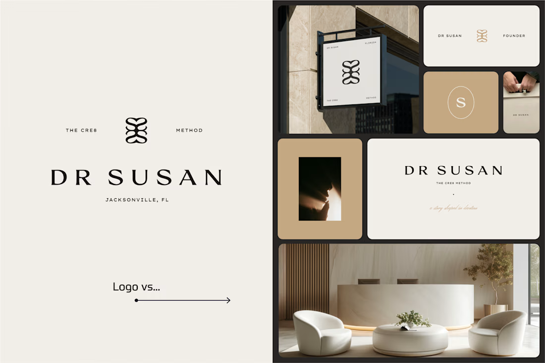
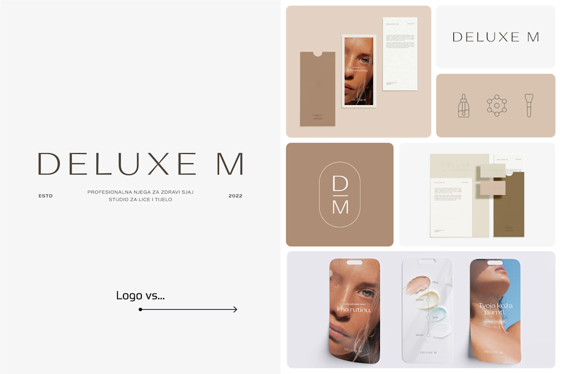
A logo is one thing. Giving it a whole personality is another. 👀
I picked a few of my branding projects to show what happens beyond the logo.
First, the logo on its own. Then, the full visual identity: colours, typography, graphic elements, patterns, packaging, and all the little details that make each brand feel like itself.
Because I don't want a logo to just look good sitting on a presentation slide. I want to see what it can become when it gets out into the real world.
Every project has a different story, personality, and visual direction. And that's probably my favourite part of brand design: figuring out how to turn one initial idea into a whole visual language.
Swipe through and meet the logos, then their bigger personalities. ;)
A logo is the starting point. The fun really begins after that.
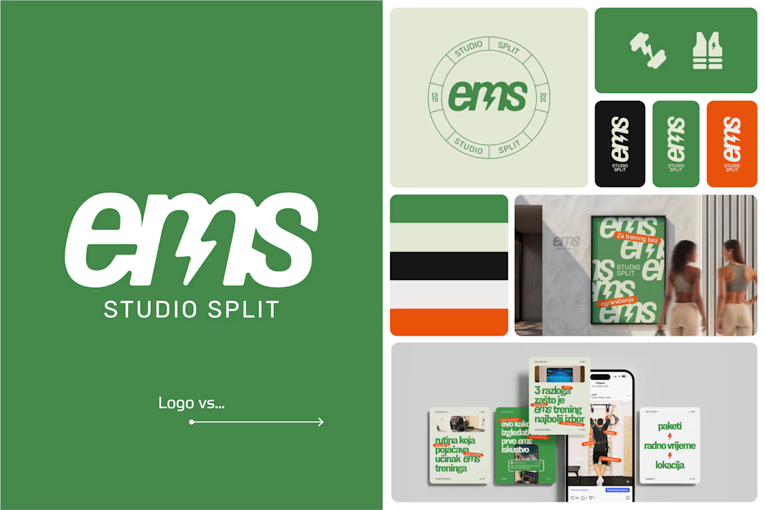

Clever use of the lightning bolt in the EMS logo!


