The network for creativity
Join 1.25M professional creatives like you
Connect with clients, get discovered, and run your business 100% commission-free
Creatives on Contra have earned over $150M and we are just getting started
Back to feedPost
I need to confess!
I love trout fishing! It's my passion, where time flies, and I can disconnect from the everyday world and reset my creative juices.
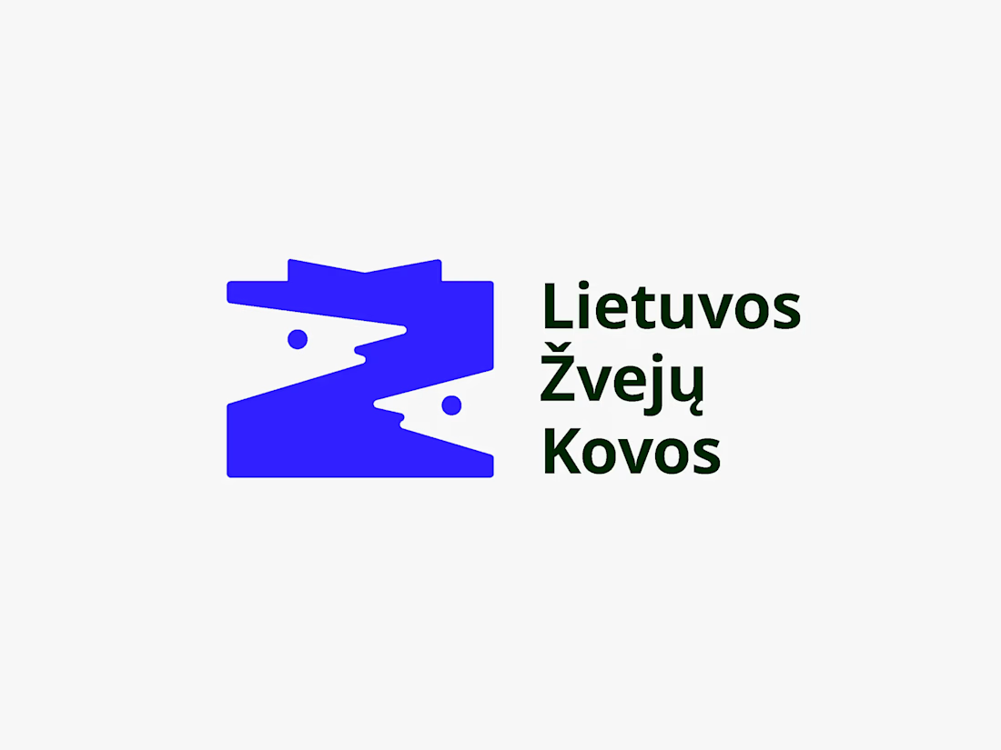
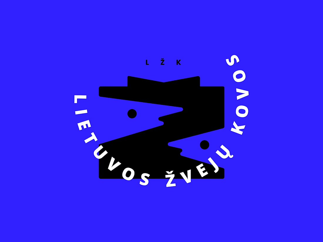
I had the chance to design a logo for a local fishing contest that my friends are running, and here are the two logo variations I came up with.
LŽK stands for "Lithuanian Fishing Battles," and the concept behind it was to combine two fish heads in the negative space to form the letter Ž, as it's the first letter of the Lithuanian word for "fish" (žuvis)
🐠 🐡 🐟



amazing

Really cool! Happy for you that you got to design for something you love! :)


Thank you, Hayley! It was an absolute pleasure! 🙌

nice one !
Ty!🙏

I don't know if it's just me but i admire when i see blue used well in designs. 👏
Blue + White is so underrated!

There's definitely something about the blue + dark combo here... satisfying!
The feeling is mutual, I love that combo so much! Thanks 🙌

The two fish heads forming the negative space Z is such a clean solve, took me a second to see it and then I couldn't unsee it. Great instinct tying the mark back to žuvis.
Thank you, Rafee. For me, using negative space to hide an object is the coolest thing in logo design 🧠

It’s a very unique logo and the colour is chef kiss
Thank you!🙌

The negative space fish heads forming the Z with the caron is such a clever detail, I didn't catch it until I read the caption. Have your friends picked a favorite between the two yet, or is it still a toss-up?
Thank you, Maty! Yeah, negative space Easter eggs are often not visible at first. That's the trick! My friends don't have to choose because both of these work. I like to create more than one logotype variation to cover more ground for future.

Really like how the fish is hidden in such a simple shape. Clever without feeling overdesigned. My pick is the left one.
Thank you, Ateeb! The one on the left is the primary logo, while the one on the right is the secondary version. Both are necessary because they work better on different backgrounds.

I love the story behind this. Using negative space to form the "Ž" is a clever concept, and it makes the logo feel much more meaningful than just a visual mark. Nice work

Love the negative space here!

Wonderful creative assistant. The automated typography pairings and style recommendation sheets are supreme.
What?

Good work!!!


Nice one 👍


👏👏
The network for creativity
Join 1.25M professional creatives like you
Connect with clients, get discovered, and run your business 100% commission-free
Creatives on Contra have earned over $150M and we are just getting started
Trending

Claude
Claude has entered the design space. How are you using it?

Contra University
Learn from expert creatives how to earn more using next-gen AI tools.
Brand Design
The best brand designers are on Contra. Scroll to see what's trending in brand design. What are you building?
creativeaiflow
Creative AI workflows are evolving. What tools do you use, and what are their strengths and weaknesses?
freelancerlife
Freelancer life is wins, pivots, and everything in between. What’s yours right now?



Related posts

Built this landing page using Figma + Claude Fable 5.
https://novaabank.netlify.app


Wow , i mean now words still cannot belive ai did this


need your eyes on this one :)
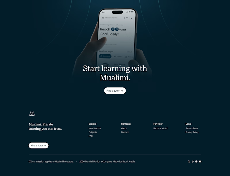
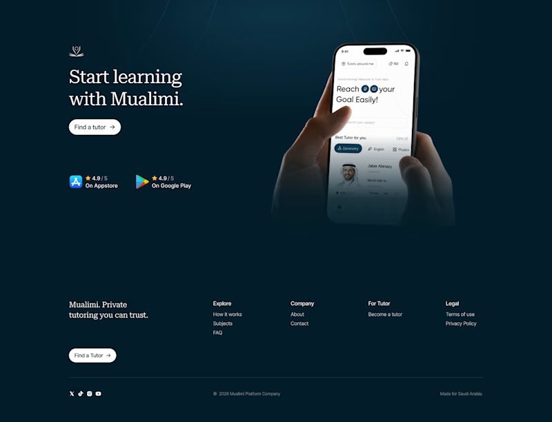
two hero options for a private tutoring platform we're working on at @effekt_design
left or right?
4 voted
15%
23 voted
85%
27 votes
Closed
Went with the right aligned version. Left aligned text is easier to scan first and the CTA doesn't have to compete with the phone mockup for attention like it does in the centered one.

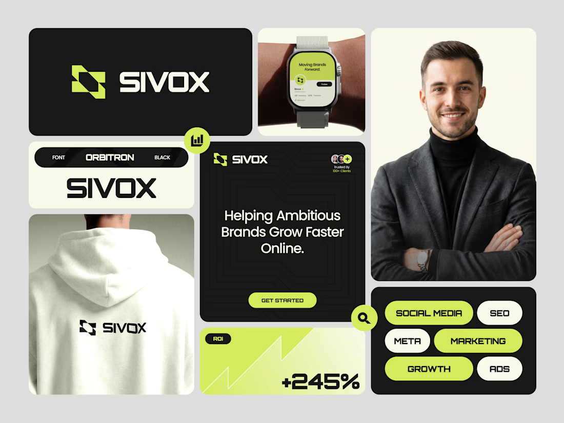
A recent brand identity exploration for Sivox, a digital marketing agency focused on helping ambitious brands grow faster online.
The logomark combines the letter S with forward-moving arrows, creating a clean geometric symbol that represents growth, momentum, and measurable results. Every element was designed to communicate progress while keeping the identity modern, bold, and highly recognizable.
From the logo and typography to the social assets and brand applications, the goal was to create a system that feels consistent, scalable, and ready for a digital-first business.
What's your favorite application in this identity: the logo, hoodie, social post, or smartwatch? 👀
Logo DesignbrandingbrandidentitydesignlogodesignBrand DesignGraphic DesignAdobe IllustratorAdobe PhotoshopEnvato



Awwsome