The network for creativity
Join 1.25M professional creatives like you
Connect with clients, get discovered, and run your business 100% commission-free
Creatives on Contra have earned over $150M and we are just getting started
Back to feedPost
SaaS Explainer Video for Talent & Production Hiring
A clean, structured 30-second explainer video showing how Kollsheet centralizes hiring for organizers, production crews, and talent.
Designed with a modern SaaS style, smooth UI animation, and clear visual storytelling.


loved it,

Thank you
Thank you
The network for creativity
Join 1.25M professional creatives like you
Connect with clients, get discovered, and run your business 100% commission-free
Creatives on Contra have earned over $150M and we are just getting started



Related posts

Explaining "unlimited development" in 30 seconds is harder than it sounds.
That was the brief from figue.ai: a subscription where startups get a dev team without hiring one. Great product, but abstract. So I skipped the buzzwords and showed what it actually feels like: you ask, it gets built, you ask again.
Every interface in the video is rebuilt from scratch, so the product feels real instead of mocked up.
Really enjoyed this one! If you're launching something that's hard to explain, that's exactly the kind of project I love.


TOP!!

Pulsix started with a question: how much of a sportswear identity can you fit on the front of a cap?
I designed the brand around an angular X with a pulse cut through its center. On a pink cap, the chartreuse X can stand alone. On a billboard, the photograph and “Future is now!” headline take the lead. In this loop, the black Pulsix logo anchors a moving grid of apparel, campaign graphics and digital layouts.
My roles: Brand Designer, Graphic Designer, Motion Designer.
Tools: Adobe Illustrator, Adobe After Effects, Figma.
Where would you try the X first: on the cap or in motion?


I'd try it on the cap first. Motion can borrow the pulse cut once the static X proves it holds up at small sizes, and the watch face already hints that it does. Did the pulse line change shape between the cap and the animated loop?


what do u collect?
i'm currently travelling the southern hemisphere, so I've been picking up loads of beautiful boarding passes, tickets and receipts from everywhere I've been.
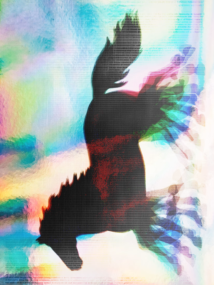
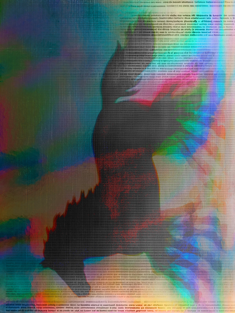
this morning i worked on these collaged animations in photoshop, inspired by the collection of receipts growing in my wallet + by this lovely holographic ticket animation by SHIROTA.
lots of texture + type always make for the prettiest animations.

Very nice