The network for creativity
Join 1.25M professional creatives like you
Connect with clients, get discovered, and run your business 100% commission-free
Creatives on Contra have earned over $150M and we are just getting started
Back to feedPost
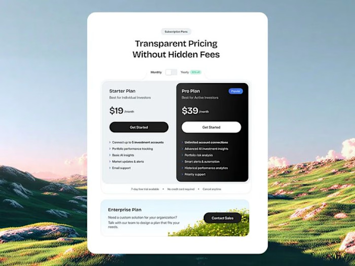
Pricing Section Design 🧹
💸Conversion value -
I believe your pricing section Is more important or If not as important as your Hero Section as most probably your visitors are comparing THE SAME EXACT PRICING SECTION of your competitors 1:1.
This is OUR opportunity show you show QUALITY and superiority of our product/service.



Pro design 🤩

Thanks 🙌

The pricing comparison lands well—the hierarchy makes the plans easy to scan while the landscape imagery keeps the section from feeling too rigid. Nice example of making a conversion-focused block still feel designed.
It's like you read my intentions with the design, thank you sm🙌
The network for creativity
Join 1.25M professional creatives like you
Connect with clients, get discovered, and run your business 100% commission-free
Creatives on Contra have earned over $150M and we are just getting started

Challenges
View all


Related posts

Bland is a choice.
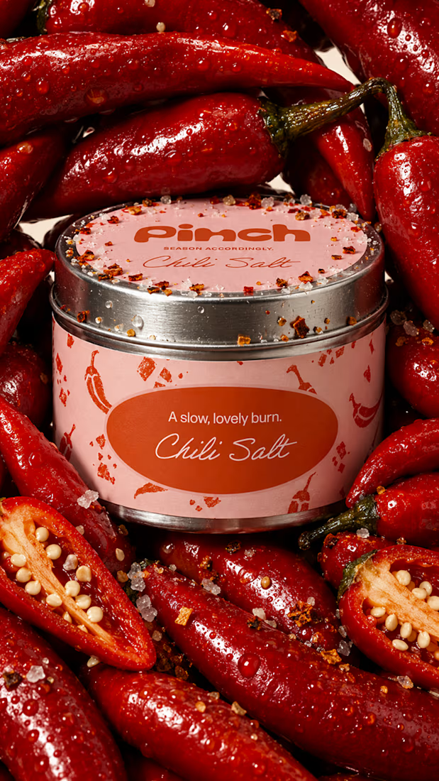
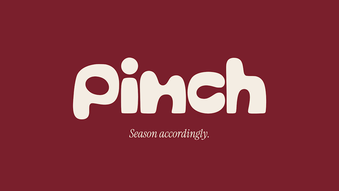
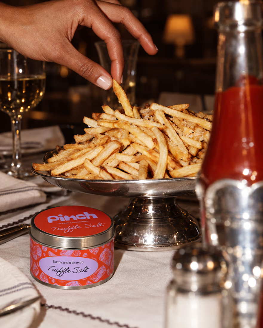
Pinch is a concept brand for a mid-high salt line made to live on the counter, not in the cupboard. Five flavors, five two-color tins, one refillable keepsake people leave next to the bar cart.
I built the full identity: wordmark, lid lockups, hand-stamped pattern system, tone of voice, and art direction.
More from the system coming soon.



Cool work 🔥


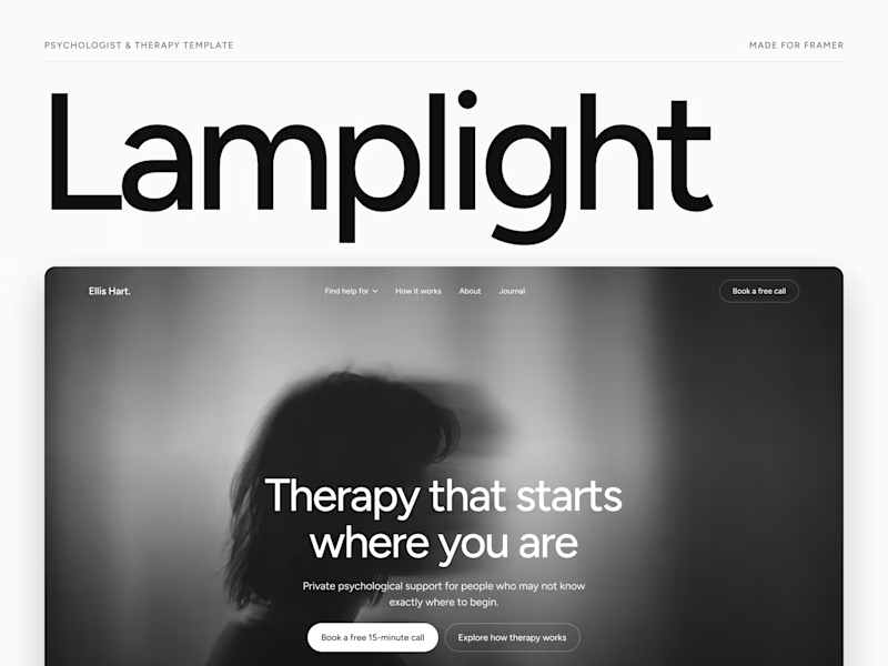
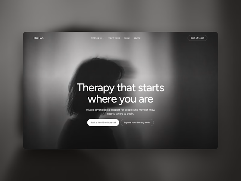
Which one grabs your attention and should be the main visual for a framer template thumbnail?
7 voted
50%
7 voted
50%
14 votes
Closed

Both works are great; it's hard to choose
Just launched Lamplight - Best @framer Template for Psychologists & Therapists
Remix Link: https://framer.link/tj4w3W3
A calm, editorial website template with 2 CMS-powered concern pages, a journal, and FAQs copy that actually sounds human.

Amazing!