The network for creativity
Join 1.25M professional creatives like you
Connect with clients, get discovered, and run your business 100% commission-free
Creatives on Contra have earned over $150M and we are just getting started
Back to feedPost

Woop Print — Brand Concept & Visual Identity
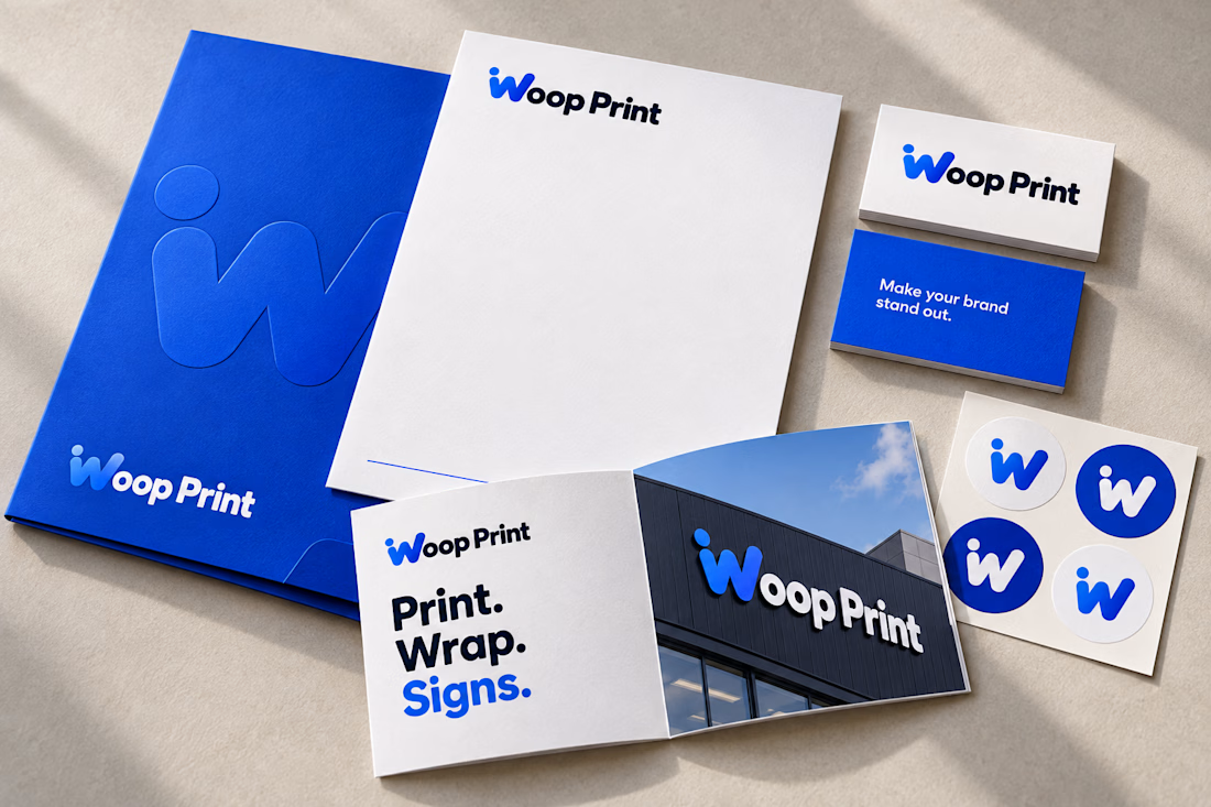
Woop Print’s identity explores the relationship between creative expression and physical presence—how a business becomes recognizable through the materials, spaces, and vehicles that carry its name.
The concept, “Make your brand stand out,” informs a visual system built around visibility and clarity. The distinctive “W” is integrated directly into the wordmark, giving the name its own recognizable signature. Its rounded form introduces an approachable character, while the detached dot creates a visual accent that extends into patterns, stickers, and digital icons.
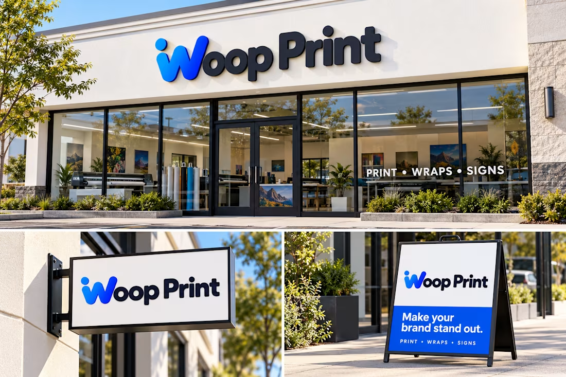
Electric blue brings energy to the identity, balanced by deep ink tones and generous white space. Bold typography and restrained compositions keep the brand legible across different scales, from a browser favicon to storefront signage.
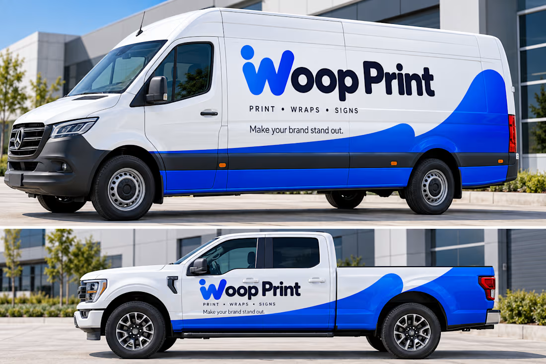
The project brings this system to life through print collateral, vehicle wrap concepts, signage, and digital assets, supported by guidelines for consistent application.
Concept, visual identity, and art direction by Branco Dev


The network for creativity
Join 1.25M professional creatives like you
Connect with clients, get discovered, and run your business 100% commission-free
Creatives on Contra have earned over $150M and we are just getting started











Related posts


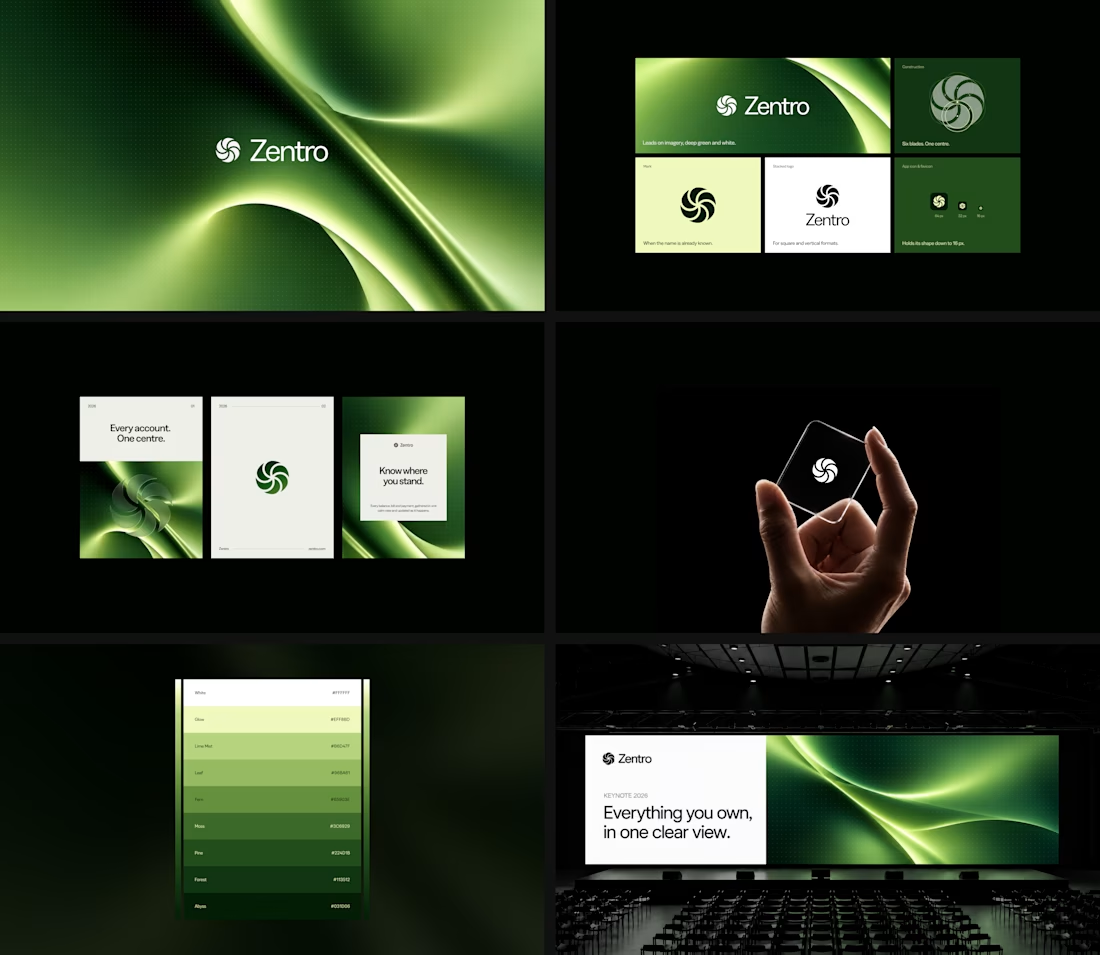

Clean and confident work! The green gradient with the mark feels very modern for fintech - trustworthy but not boring. The app screens look really polished. Curious how you landed on this mark, does it represent growth / movement?

Pulse Athletics... Branding & App design✨
Check it out
#app #sport #productdesign #uiuxdesign #uidesigner #uxdesigner #pulse #branding #brandidentity #brandstrategy #brandguidelines #logo #homepage


That's really stunning app design🔥🔥🔥
Great job Ziva🎉🎉🎉

Same design. Which palette? 👀
You picked your favorite preview last time. This time, I’m putting the colors to the vote.
One body-care packaging concept, with the same typography and composition:
A · Rose Cream, Strawberry Sorbet + Plum Jelly
B · Lime Mousse, Coconut Cream + Plum Jelly
Which would you choose and what does it make you feel about the brand?
Both palettes use colors and matching ingredient textures from DCS 654, my library of 654 dessert-inspired colors.
Take a closer look: dcs.mariya.design
7 voted
44%
9 voted
56%
16 votes
Closed
B is absolutely stunning 🎉🎉🎉🎉
Great job Mariya❤️


