The network for creativity
Join 1.25M professional creatives like you
Connect with clients, get discovered, and run your business 100% commission-free
Creatives on Contra have earned over $150M and we are just getting started
Back to feedPost

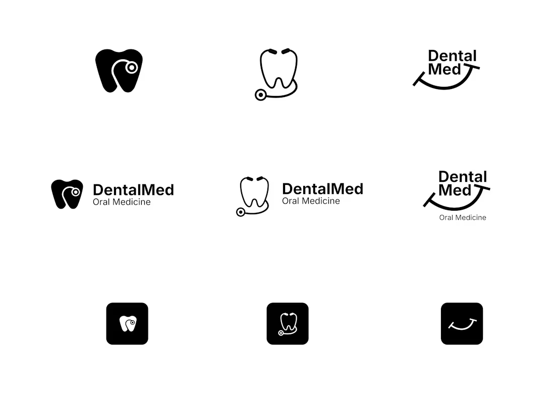
Logo exploration for DentalMed, an oral medicine brand.
I tried three directions here. A tooth mark, a stethoscope mark, and a wordmark with a smile built into it. Each one comes with a full lockup and an app icon version, so you can see how it holds up at small sizes too.
I like brand design to be minimal and meaningful. A logo should not need an explanation. It should just click. So instead of picking the direction that looked the coolest on its own, I picked the one that made the most sense for a dental brand at first glance.
Can you guess which one made it to final delivery?
The network for creativity
Join 1.25M professional creatives like you
Connect with clients, get discovered, and run your business 100% commission-free
Creatives on Contra have earned over $150M and we are just getting started

Challenges
View all


Related posts



One brand, very different variety products. 👀
BASYX is one of my favorite projects because the packaging had to work across categories, from skincare to food, while still feeling like one cohesive brand.
That’s the fun challenge of multi-product brands: creating a visual system flexible enough to grow without losing its identity.

wow amazing

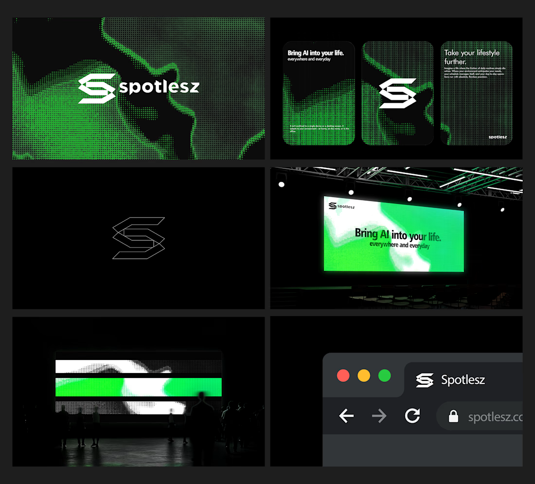
Branding identity completed for Spotlesz in just few days!