The network for creativity
Join 1.25M professional creatives like you
Connect with clients, get discovered, and run your business 100% commission-free
Creatives on Contra have earned over $150M and we are just getting started
Back to feedPost
One rider. One bike. One forest. One uninterrupted 30-second take.
I wanted to push Seedance 2.5 beyond a beautiful AI shot and test whether it could maintain character identity, bicycle geometry, environment, physics, and complex camera movement throughout one continuous sequence.
From macro drivetrain tracking and high-speed trail movement to a 360° bullet-time orbit and landing — the goal was simple:
Make the impossible camera feel completely real.
Created with Seedance 2.5 for the #ContraSeedanceChallenge.


Amazing

Thanks

It's great!
Overall feeling is so amazing and thrilling.
That's what one-take is!
Really thanks man!

That 360 slow motion is crazy. I genuinely forgot this was ai generated
Thank you

wow


great work
Thank you


Thank you!😊

The camera continuity is insanely clean. This feels like a real high-budget bike commercial.
Appreciate it! Thank you so much~ 💐

Awesome work, Congrats!
Appreciate it! Thanks man a lot

🚀👏🏻
Thank you~ 😎

Appreciate it! Thank you~

Looks amazing!!
Really thanks

no way, this is sleek
Appreciate it! Thank you very much~

Well done! 🧡
Really thanks!

The combination of slow motion and camera rotation looks really smooth. Great job!
Thanks man a lot!

I want this too
Appreciate it! Thanks~ 😇

Cool 😎
Thanks you!

Hi Guoshuai, this is a really impressive piece of work. I especially like how you maintained consistency in the character, bike, environment, and camera movement throughout the sequence.
Appreciate it. Thank you very much!

whooaaa

this is really cool!
Appreciate it! Thank you~


Great one
Thanks man a lot!

This is seriously impressive! 🔥 The continuity between the rider, bike, environment, and camera movement makes the whole sequence feel incredibly polished. That 360° bullet-time orbit especially takes it to another level. Great execution! 👏
Thank you very much! 😊

Insane camera work and continuity! 🔥
Thanks man a lot 😊

The final wheel-level shot is such a strong ending. Feels like a real sports ad.
Thanks man a lot
The network for creativity
Join 1.25M professional creatives like you
Connect with clients, get discovered, and run your business 100% commission-free
Creatives on Contra have earned over $150M and we are just getting started







Related posts

VAPE STORE × AI CINEMATIC CONCEPT
What if a vape store could be presented like a cinematic brand commercial?
I created this AI video concept to explore how cinematic visuals, creative direction, and visual storytelling can bring a brand’s identity to life and transform an ordinary product showcase into a more engaging visual experience.
The goal isn't simply to show products.
It's about creating a visual story around the brand, the atmosphere, and the overall experience, using AI-powered filmmaking techniques to explore new possibilities in commercial video production.
A creative experiment in AI video production, cinematic storytelling, and the future of brand visuals.
#AIVideo #AICinematic #AICommercial #AIContentCreation #AIFilm #CinematicVideo #VisualStorytelling #AIMarketing #GenerativeAI #AIAdvertising #CreativeAI #DigitalContentCreation #CinematicAdvertising #BrandStorytelling #ProductVideo #CommercialVideo #AIProduction #VideoMarketing #DigitalMarketing #CreativeDirection #AIVideoCreator #FutureOfAdvertising #CinematicArt #AIVisuals #BrandIdentity:


This looks too good to be done using ai. May I know which ai platform you used
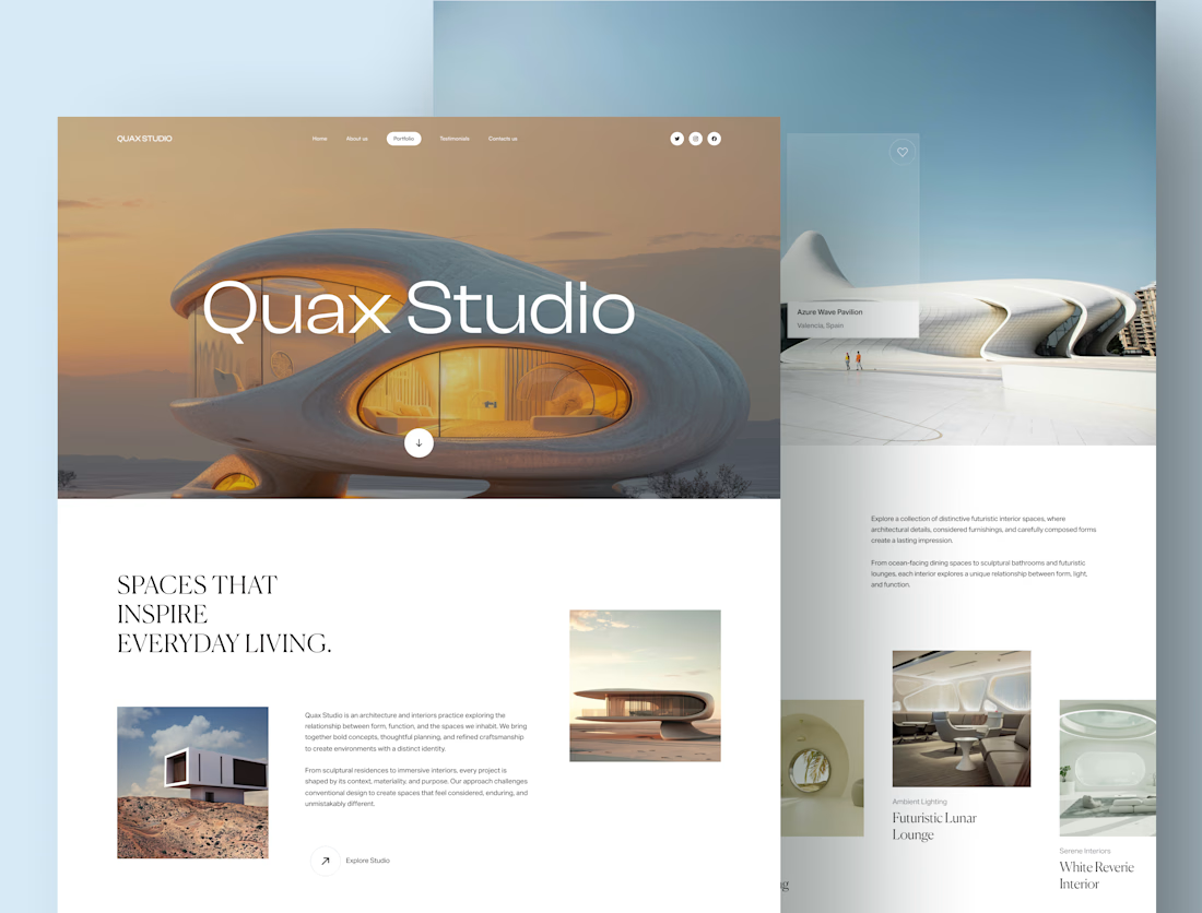
Meet Quax Studio, a stealth-mode architecture and interiors studio based in Australia, specialising in highly modern, futuristic spaces.
The brief was simple: no generic architecture website. The projects had to take centre stage, with minimal copy, a clean white aesthetic, and modern typography that lets the visuals speak for themselves.
So, I built the experience around:
1- Minimal layouts with plenty of breathing room
2- Refined typography and a clean visual hierarchy
3- Project-led storytelling, with less content and more focus on the work
The architectural imagery currently uses visuals from HD images platforms while the studio’s project photography is being finalised.
Would you explore a futuristic architecture studio through a minimal website like this?


Excellent work @gayathri p great balance of colors and visual hierarchy


Follow for More Job posts!

Great opportunity


