The network for creativity
Join 1.25M professional creatives like you
Connect with clients, get discovered, and run your business 100% commission-free
Creatives on Contra have earned over $150M and we are just getting started
Back to feedPost
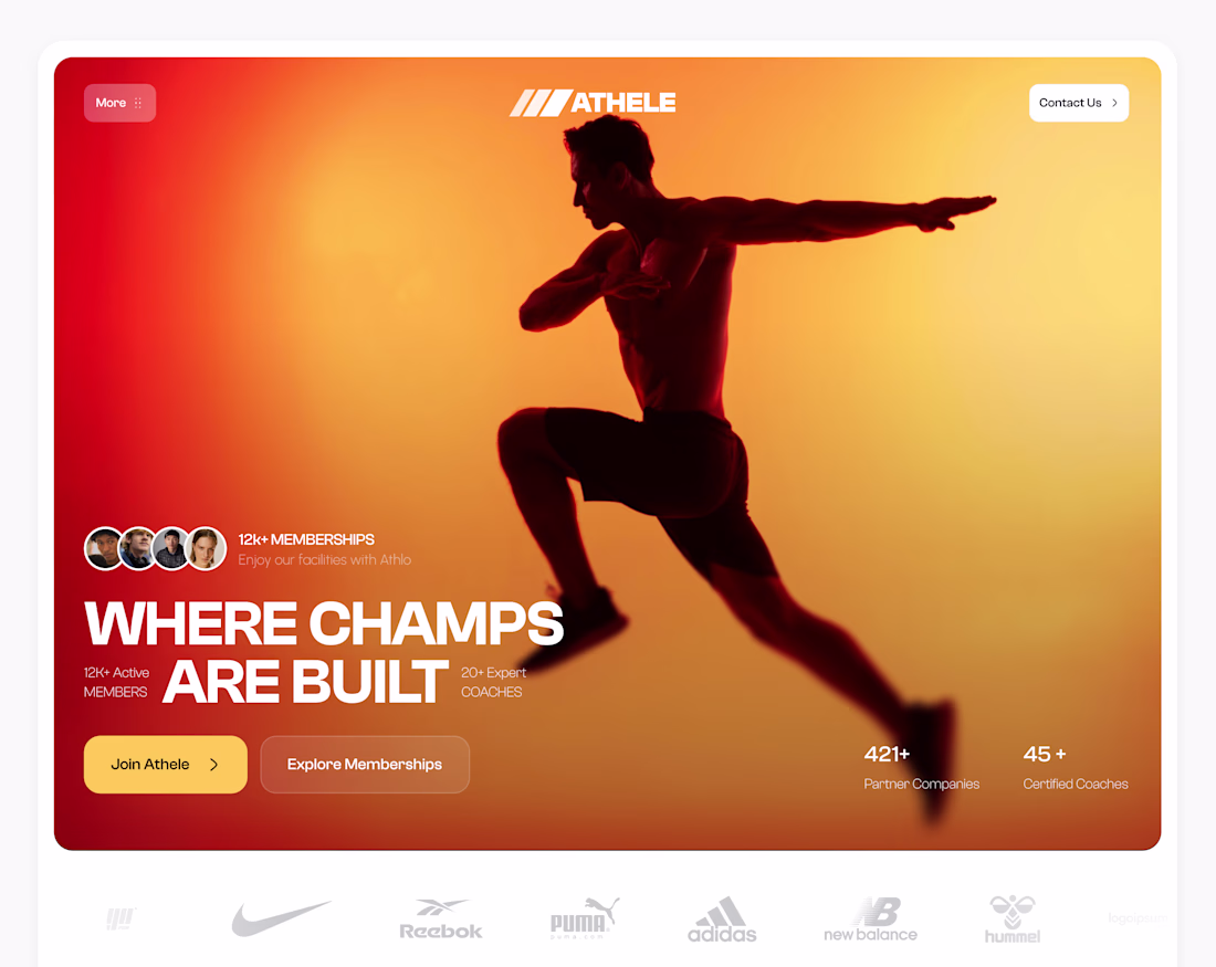
Most fitness landing pages lose potential members in the first 3 seconds.
I fixed it by engineering a hero section built on instant authority and clear action.In an era of generic, template-driven gym sites, bold brand identity paired with strategic social proof is the ultimate differentiator.
1️⃣ Front-loaded Trust: I placed the 12k+ member count, coach stats, and top-tier partner logos (Nike, Adidas) immediately above the fold so users don't have to scroll to feel secure.
2️⃣ Emotional Visuals: Instead of a cluttered gym photo, we used a dynamic, high-contrast silhouette to drive an emotional connection and draw the eye straight to the copy.
3️⃣ Action Driven Hierarchy: I created a clear visual distinction between the primary "Join Athele" CTA and the secondary "Explore Memberships" button to seamlessly guide the user's journey.
What’s the one thing you look for before joining a new gym or platform? Let me know below! 👇
This is great work
Thanks 😊
The network for creativity
Join 1.25M professional creatives like you
Connect with clients, get discovered, and run your business 100% commission-free
Creatives on Contra have earned over $150M and we are just getting started
Related posts


looks awesome !!
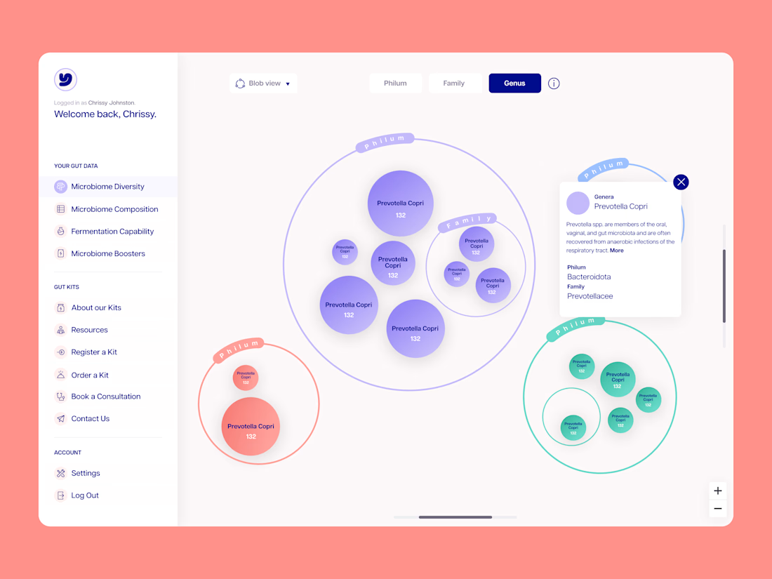
A little throwback to some Dashboard/Data work I was doing for Myota a while back! Still love the side nav
Good work
Weekly Recap
Here's our 'Weekly Shots Recap' from @OrbixStudio, showcasing some of our recent product designs. From intuitive mobile apps to powerful dashboards and creative illustrations, we're passionate about crafting exceptional experiences.
Which one caught your eye the most? Let us know in the comments! 👇
The dashboard work stands out—clean, sharp, and very usable.
Trending
Claude
Claude has entered the design space. How are you using Claude Design?
Contra University
Learn from expert creatives how to earn more using next-gen AI tools.
creativeaiflow
Creative AI workflows are evolving. What tools do you use, and what are their strengths and weaknesses?
portfolioreview
The best portfolios tell a story, not just show a grid. Share yours for feedback.
freelancerlife
Freelancer life is wins, pivots, and everything in between. What’s yours right now?