The network for creativity
Join 1.25M professional creatives like you
Connect with clients, get discovered, and run your business 100% commission-free
Creatives on Contra have earned over $150M and we are just getting started
Back to feedPost

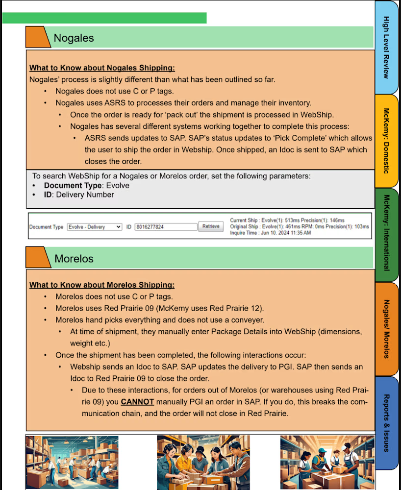
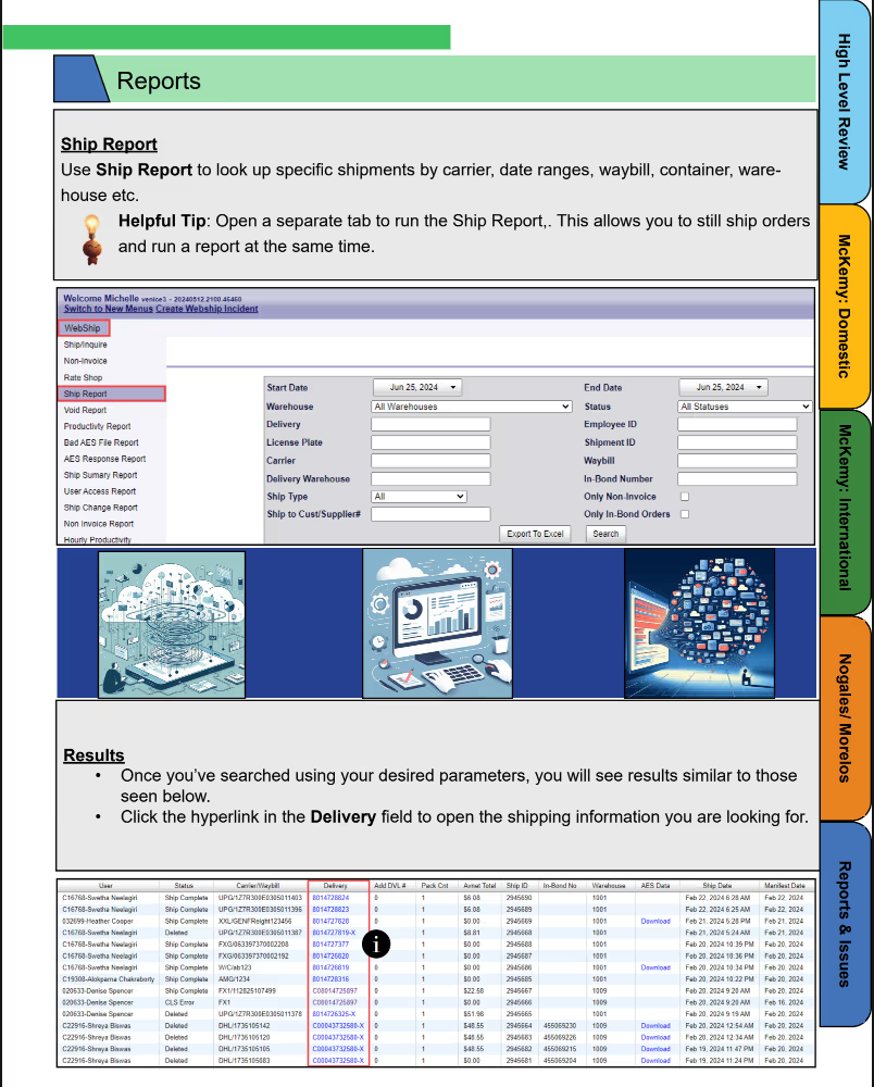
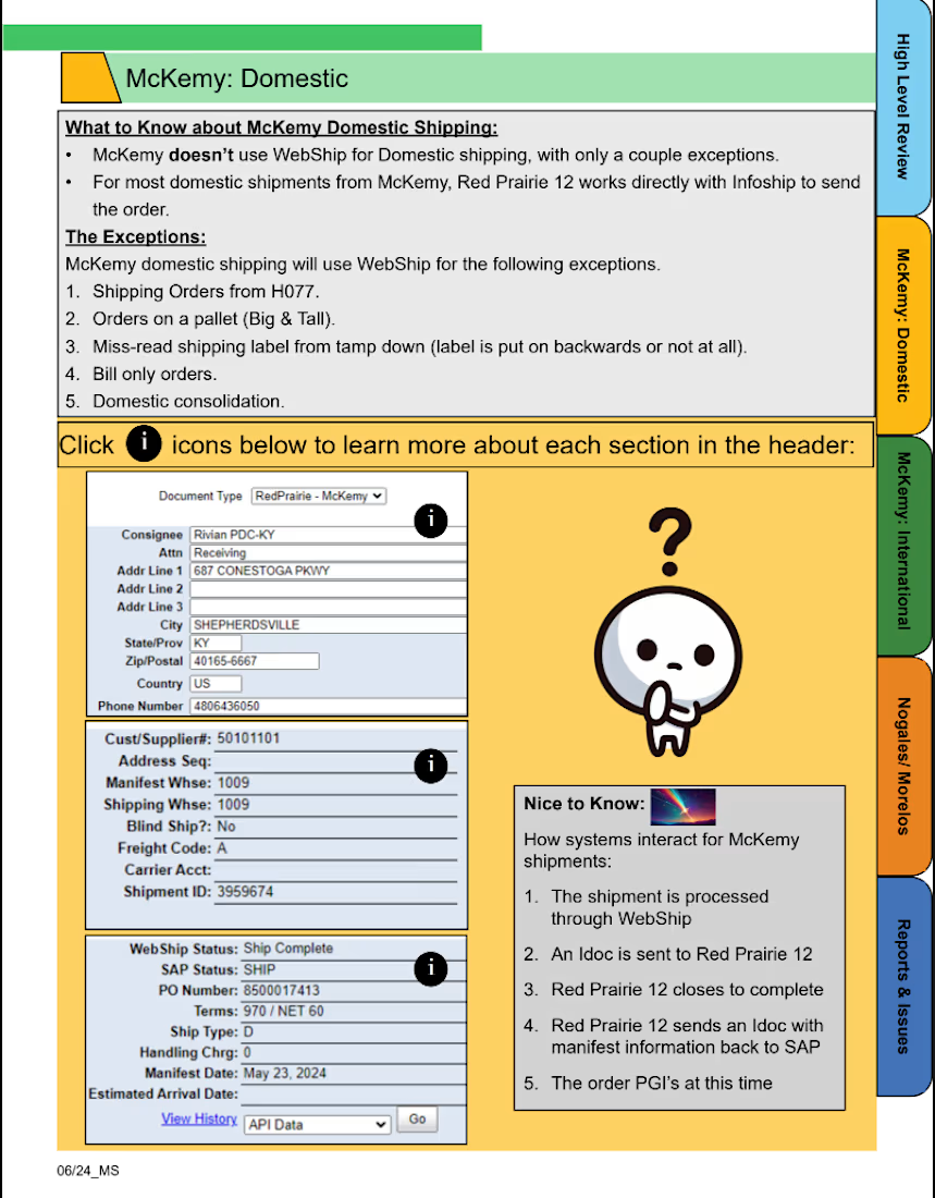
This project was to create an interactive job aid that covered the 'how to' of a specific software. Each tab and 'i' icon is click-able and interactive.


The network for creativity
Join 1.25M professional creatives like you
Connect with clients, get discovered, and run your business 100% commission-free
Creatives on Contra have earned over $150M and we are just getting started
Related posts

What if your favorite skincare brand got a Halloween makeover? 🕷️
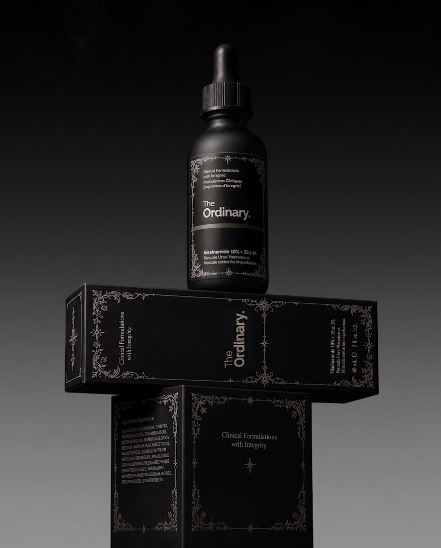
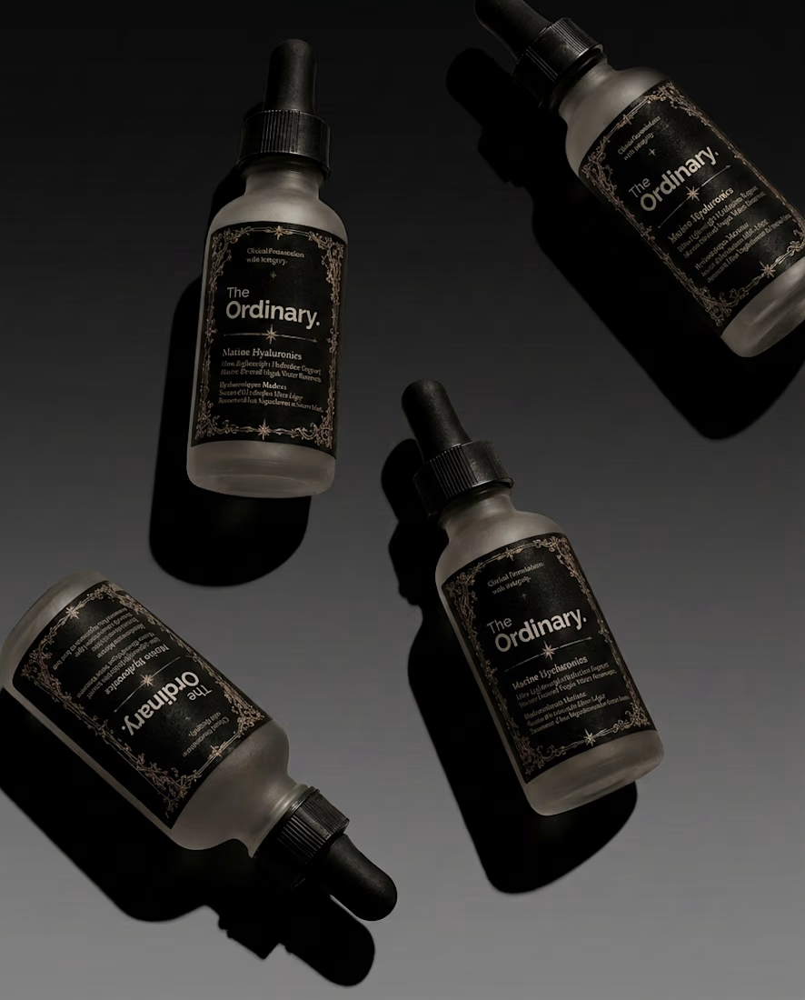
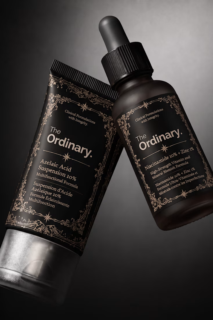
For this little experiment, I’m giving The Ordinary a 𝔤𝔬𝔱𝔥 alter ego.
The challenge was keeping the things that make the brand instantly recognizable: its straightforward logo and typographic editorial layout, clinical packaging, and no-nonsense aesthetic.
Instead of turning it into a completely different brand, I wanted to push those same elements into darker territory with 𝔢𝔢𝔯𝔦𝔢 tones🕸️ , gothic details, and a more mysterious product presentation.
Even in costume, you should know exactly who you're looking at.
Which brand would you love to see get a Halloween makeover next? 👻

Keeping the logo untouched and only changing the mood works really well. Glossier next?

Two directions for Mira, an AI astrologer you talk to by voice.
Only one made it past the client. Which one would you ship, and why?
12 voted
75%
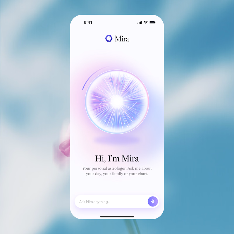
4 voted
25%
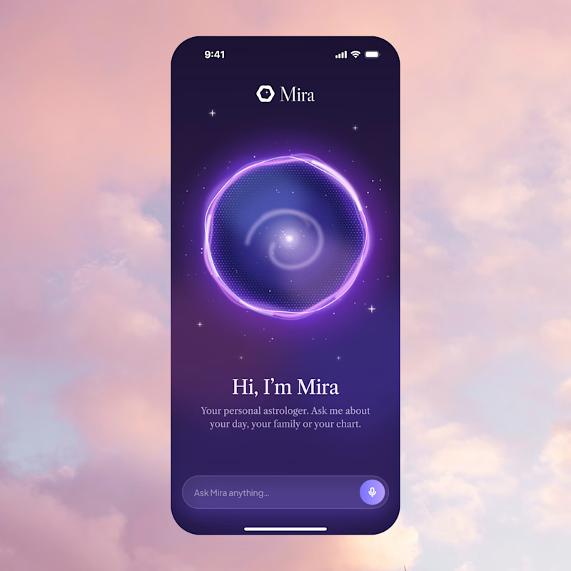
16 votes
Closed

A is better if you can make a dark version of it thats incredible