The network for creativity
Join 1.25M professional creatives like you
Connect with clients, get discovered, and run your business 100% commission-free
Creatives on Contra have earned over $150M and we are just getting started
Back to feedPost


Imagining a different experience for claiming vault rewards. Built with blender.

The network for creativity
Join 1.25M professional creatives like you
Connect with clients, get discovered, and run your business 100% commission-free
Creatives on Contra have earned over $150M and we are just getting started






Related posts


Nice work!


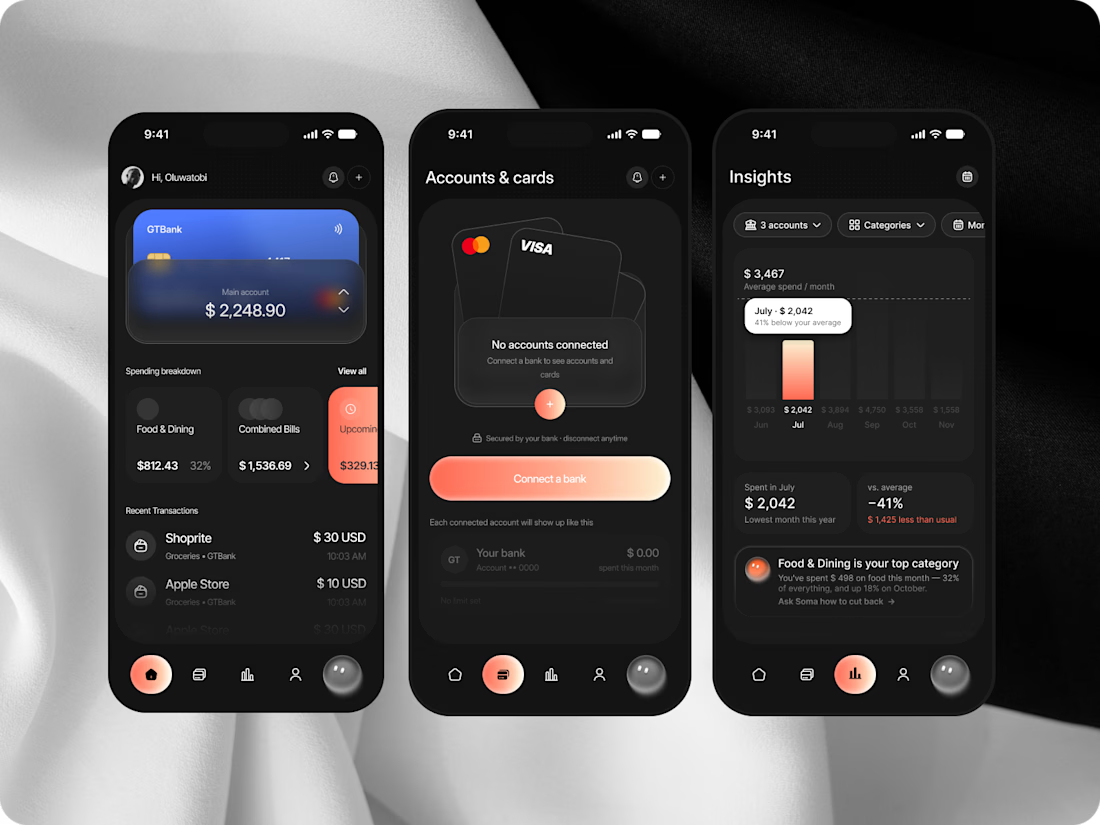
Creditr is a personal finance app that brings transactions from multiple bank accounts into one place, helping users understand and manage their spending.


Letting the coral accent carry everything on the dark UI works well: the active bar in Insights and the main action on the Accounts screen are the only warm things on screen, so the eye lands there first. In the combined transaction list, how do people tell which account a payment came from, bank logo or colour?