The network for creativity
Join 1.25M professional creatives like you
Connect with clients, get discovered, and run your business 100% commission-free
Creatives on Contra have earned over $150M and we are just getting started
Back to feedPost

Creative recap from Feb.
Been diving deep into brutalism, minimalism, and Swiss design creating structure, bold type, and cleaner systems.
What do you guys think?


Strong direction. The Swiss structure gives it clarity, while the brutalist typography adds tension. The contrast between rigid grid and bold type feels intentional. Curious how you’re balancing personality vs system consistency as you refine it?
Thanks a lot for such a lovely and detailed feedback, Abhiram. I’m trying to keep the core grid consistent while allowing the typography and imagery to bring some personality into the layout. Still exploring that balance, but the goal is to let the system guide the structure...
That makes a lot of sense. When the grid holds the structure, it gives you room to push personality through typography and imagery. Curious to see where you take it next.

Ammmazing! 👍
Thanks a lot
The network for creativity
Join 1.25M professional creatives like you
Connect with clients, get discovered, and run your business 100% commission-free
Creatives on Contra have earned over $150M and we are just getting started
Related posts

If you could only pick 1 interaction for your website...
What would you pick?
22 voted
76%
7 voted
24%
29 votes
Closed

I’d go with the dark/light toggle. It’s simple but adds real value to user experience, especially for accessibility. Flashlight hover looks cool, but usability always wins for me.

I need your help, which one would you choose A or B?
My only concern with B would be too much white space in the default state 🤔

44 voted
49%
45 voted
51%
89 votes
Closed

B looks like a much better animation with easing, A reminds me the early days of pure CSS hover effects, then designers needed to use javascript plugins/codes to create smoother animations, now it's a few clicks in Framer :))

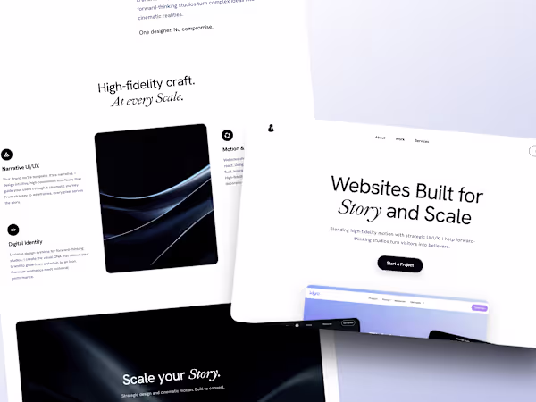
The case study for my new web site is up.
I am so happy with how it came out, it really feels like me and something i am proud of!
https://contra.com/p/cvNUUPEv-repositioning-for-story-and-scale-a-portfolio-redesign?referralExperimentNid=DEFAULT_REFERRAL_PROGRAM&referrerUsername=alexis_pilon_wtikezbh


Quite impressive!


Trending


Notion
Notion isn’t just where you work, it’s starting to work for you. What agents are you building?
portfolioreview
The best portfolios tell a story, not just show a grid. Share yours for feedback.
brandguidelines
Brand guidelines are becoming living systems, not static documents. What are you building for your clients?
aivideo
AI video tools are moving at warp speed. Which ones are you experimenting with?
freelancerlife
Freelancer life is wins, pivots, and everything in between. What’s yours right now?