The network for creativity
Join 1.25M professional creatives like you
Connect with clients, get discovered, and run your business 100% commission-free
Creatives on Contra have earned over $150M and we are just getting started
Back to feedPost

I built a structured social media management system designed to turn content into consistent brand growth.

I built a structured social media management system designed to turn content into consistent brand growth.
From content strategy and monthly planning to scheduling, community management, and performance analysis, I created a workflow that keeps every part of the brand’s social...

The network for creativity
Join 1.25M professional creatives like you
Connect with clients, get discovered, and run your business 100% commission-free
Creatives on Contra have earned over $150M and we are just getting started








Related posts


Fresh case study 🚀🚀🚀
Brand identity for Peak, an all-in-one website builder for WordPress that I design and build. A four-letter mark, a warm paper-and-ember palette and one system that runs from the favicon to the packaging.


A four-letter mark that has to hold from favicon to packaging is a tough constraint. Did you draw one letterform first and build the other three from it, or design them together as a set from the start?

New case study added!
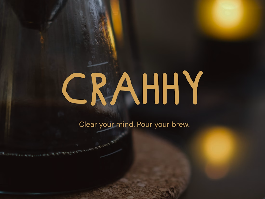
Crahhy is a speciality coffee brand rooted in the relatable human psychology of coffee cravings.
The objective was to design a brand that is minimal on the outside yet delightfully chaotic on the inside, blending specialty coffee aesthetics with honest, humorous storytelling.


minimal outside chaotic inside is the right brief for coffee

I am working on my latest products and the more I experiment with what will be the background for a new series of 2027 products, the more I don't know which would be best, so can you please help me choose? 🫰💗
3 voted
27%
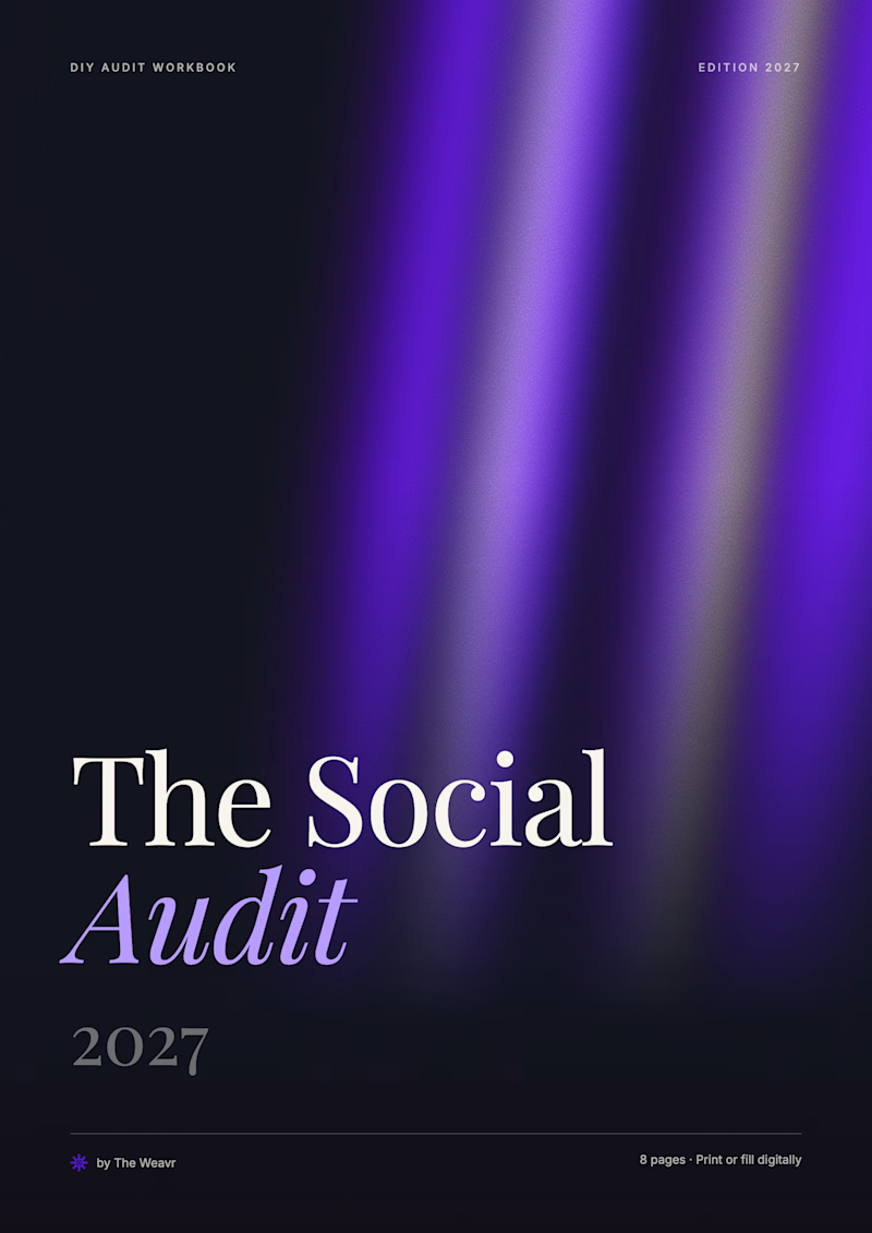
8 voted
73%
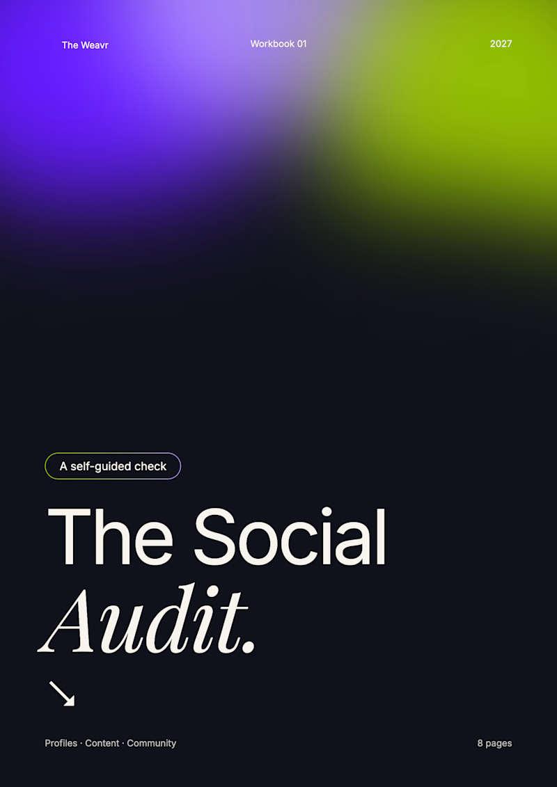
11 votes
Closed