The network for creativity
Join 1.25M professional creatives like you
Connect with clients, get discovered, and run your business 100% commission-free
Creatives on Contra have earned over $150M and we are just getting started
Back to feedPost
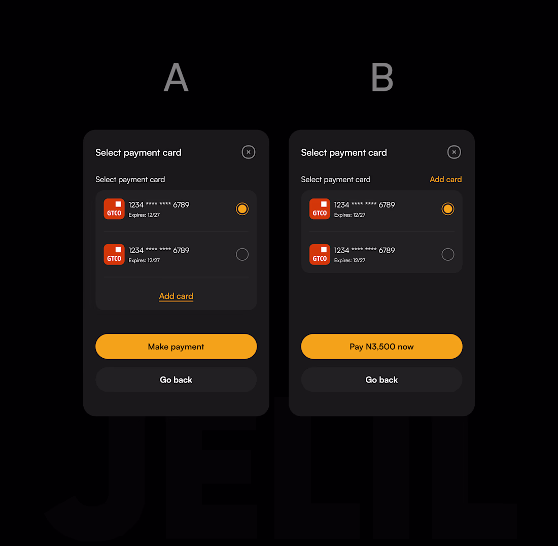
Payment screen micro-copy redesign — A vs B
The difference between A and B isn't visual. It's psychological.
Version A:
→ CTA: "Make payment" — tells the user what to do
→ "Add card" buried at the bottom, disconnected from context
Version B:
→ CTA: "Pay ₦3,500 now" — confirms the amount, creates confidence
→ "Add card" moved inline, next to where cards are listed
Why it matters:
At the payment confirmation step, users aren't unsure how to pay. They're unsure whether to pay. That's a trust problem, not a UI problem.
Showing the exact amount on the CTA removes the last moment of doubt. It answers the user's real question "is this right?" before they have to ask it.
This kind of micro-decision is what separates a screen that looks good from a flow that actually converts.
Available for fintech and SaaS projects. DM or book a call below.
The network for creativity
Join 1.25M professional creatives like you
Connect with clients, get discovered, and run your business 100% commission-free
Creatives on Contra have earned over $150M and we are just getting started
Related posts
I just noticed i crossed over the 500 follower mark on this platform - thanks for everyone who's been following along :D
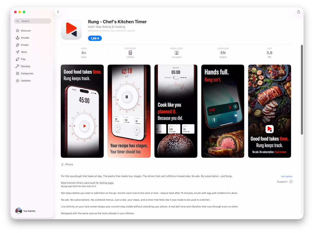
Over the years I've designed many mobile apps for clients.
This one is different. It's mine.
- Two weekends.
- Figma for the design (it's hand-made)
- Claude for the code, App Store research and strategy and everything related to the app submission.
- 1 rejection from Apple, sorted out in a few minutes this morning, resubmitted for review and we're now live.
It's nothing world changing - just a kitchen timer. But it's on the App Store and I built it as a designer with zero coding skills. Gotta wrap up a case study for this soon.
P.S. Feels a bit odd to have "Developer" label above my name 🤣
Cool stuff Ivo, congrats on the lunch 😃 . You probably got this request before haha, do you mind sharing more behind the scenes of this project? For example, did you start first in Claude then doing visual refinements in Figma or the other way around?
Thanks 🫡
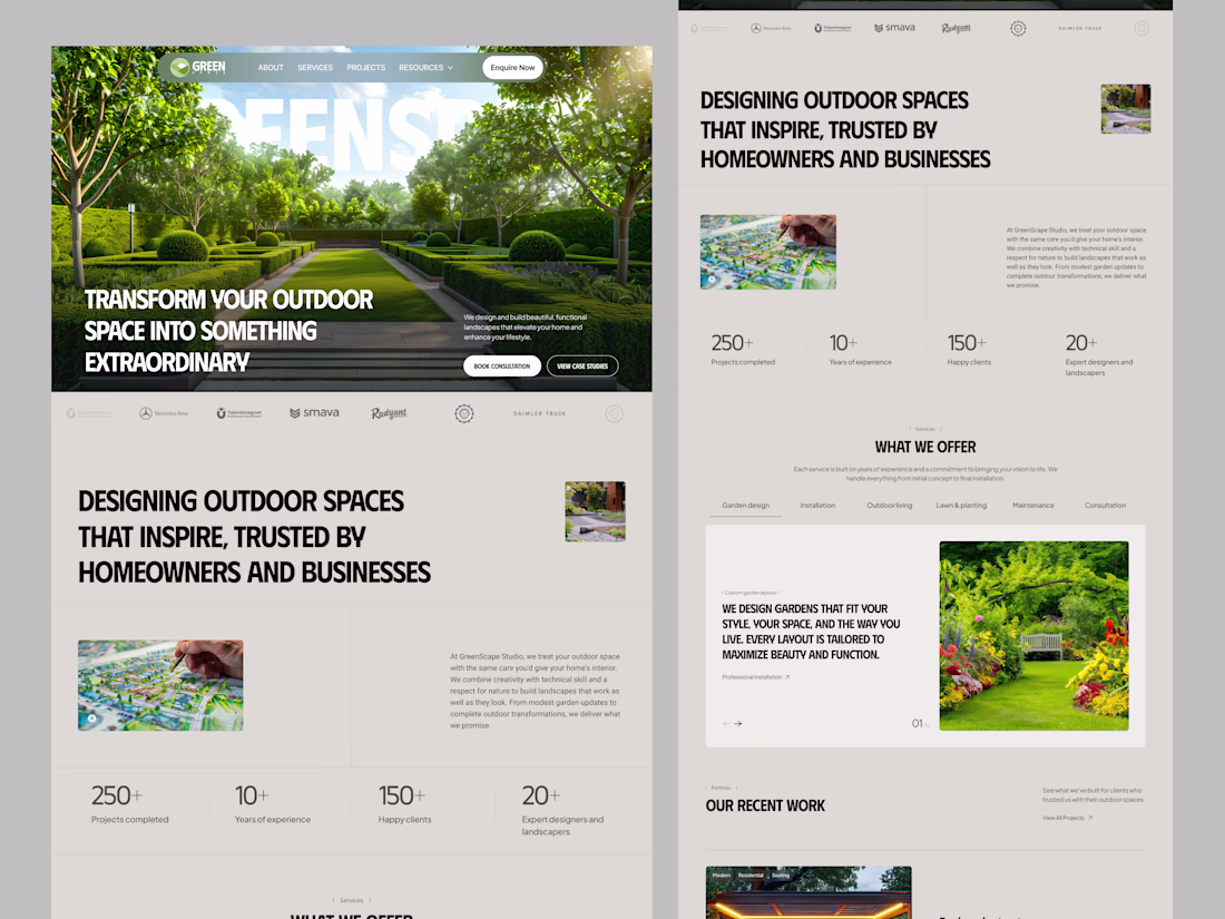
A modern, clean, and conversion-focused landing page for a landscape design studio. The goal was to create a premium outdoor brand experience that balances nature, structure, and usability.
This concept focuses on clear hierarchy, strong visual storytelling, and a seamless user journey — from inspiration to consultation booking.
✨ Design Highlights
• Minimal and elegant layout with strong whitespace
• Nature-inspired color palette (green, neutral tones)
• Clear CTA structure to drive conversions
• Project showcase with visual-first approach
• Service sections designed for quick scanning
• Mobile-friendly and responsive layout
To design a visually appealing and user-friendly experience that helps users explore services, build trust, and easily take action.
Excellent work! Like how you used the muted bg, doesn't feel too boring.
Trending
Runway
AI video generation is exploding. What are you dreaming up in Runway?
Contra University
Learn from expert creatives how to earn more using next-gen AI tools.
creativeaiflow
Creative AI workflows are evolving. What tools do you use, and what are their strengths and weaknesses?
portfolioreview
The best portfolios tell a story, not just show a grid. Share yours for feedback.
freelancerlife
Freelancer life is wins, pivots, and everything in between. What’s yours right now?