The network for creativity
Join 1.25M professional creatives like you
Connect with clients, get discovered, and run your business 100% commission-free
Creatives on Contra have earned over $150M and we are just getting started
Back to feedPost
A motion piece showing a complete ordering flow I designed: menu, allergy filters, item options, live tracking, cart, pickup slots, scan-to-pay, booking, grid view.
Three specific questions, answer any one:
At real phone size, is the small text (allergens, meta labels) legible or did I go too fine?
Warm paper + near-black + one forest green for all actions - premium hospitality, or unfinished?
Which one of the 9 screens is the weakest? I'll redesign it.
Roast away.

Warm paper + near-black + one forest green reads as restraint, not incompleteness - the risk isn't the palette, it's the allergen text. That's the screen someone reads under time pressure with a hungry line behind them; widen it before touching the color system.

Good catch, it needed more room. Bumped it today, and in the real app it's now its own full-width line instead of a tiny tag. Thanks for the honest note!
The network for creativity
Join 1.25M professional creatives like you
Connect with clients, get discovered, and run your business 100% commission-free
Creatives on Contra have earned over $150M and we are just getting started
Trending
retrofuturism
Share your favorite designs from the past exploring the distant future. Or your own take on the aesthetic 🚀
halftone
Dots. Texture. Grain. Let's see your designs using the halftone technique.

Midjourney
Creatives are showing off what they're making with Midjourney.
colorgrade
Video editors sound off: How do you enhance the mood of your video in color grading?
Related posts

Kogy — AI Companion Toy / UI/UX Design
Designed the landing page for Kogy — a plush, keychain-sized AI companion that learns, plays, and keeps you company throughout the day.
The tricky part with products like this: lean too techy and you lose the cuteness, lean too cute and it stops feeling like a real smart device. So instead of the usual soft-pastel illustration route, I let real hero-scale photography of the plush character carry the whole page — its actual texture, its little smile, its scale as a keychain — wrapped in bold, high-contrast orange and oversized type.
A small character-selector strip (Lumi, Mochi, Poppy) hints at collectibility, and a live scrolling stat ticker at the bottom (questions answered, active companions) keeps it grounded as a real AI device, not just a toy.
Genuinely one of the more fun briefs I've worked on.


The live stat ticker (questions answered, active companions) is what sells the AI-device framing here, not the photography — a plush toy with a counter reads as a running system, not a static product shot.

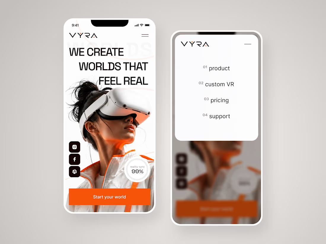
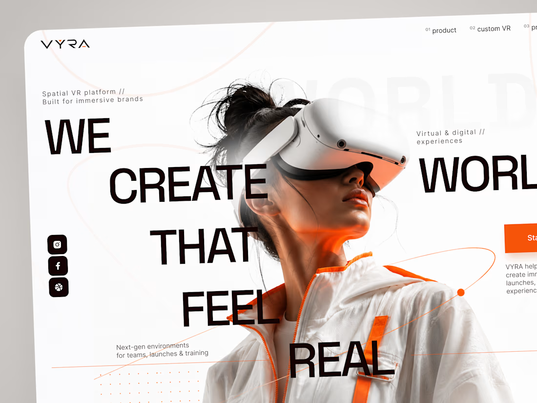
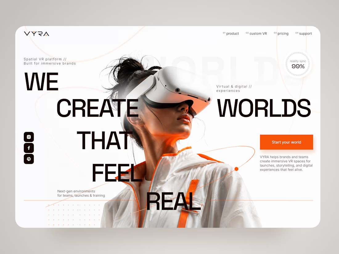
VYRA — Immersive VR Experience Landing Page 🥽✨
VYRA is a futuristic landing page concept for a spatial VR platform that helps brands and teams create immersive digital environments for launches, storytelling, training, and interactive experiences.
The goal was to translate the feeling of entering another world into a clean, premium digital interface. The visual direction combines oversized typography, immersive photography, minimal UI, and vibrant orange accents to create a strong sense of technology and motion.
Special attention was given to:
• a cinematic hero composition that immediately introduces the VR experience;
• oversized typography integrated with the main visual to create depth and movement;
• a minimal black, white, and orange palette that keeps the interface futuristic without feeling overly technical 🟠;
• subtle orbital graphics and supporting details that reinforce the idea of spatial environments;
• a clear “Start your world” CTA that connects naturally with the brand message;
• supporting metrics and micro-elements that add a sense of technology and precision;
• responsive mobile layouts that preserve the visual impact while simplifying the composition 📱;
• a clean mobile navigation experience that keeps product, custom VR, pricing, and support easy to access;
• a flexible visual system suitable for VR products, immersive platforms, and emerging technology brands.
The result is a bold digital experience that makes spatial technology feel premium, accessible, and exciting — turning the website itself into the first step toward an immersive world.
Looking to create a memorable website for your VR, AR, AI, or emerging technology product?
Let’s build a digital experience that feels like the future 🚀



Amazing

Attention is your strongest currency.
Most people never ask what they’ve been funding with it. Tithe is the first app built for the people who finally set the price.
Onboarding isn't for instructions it's for setting the tone.
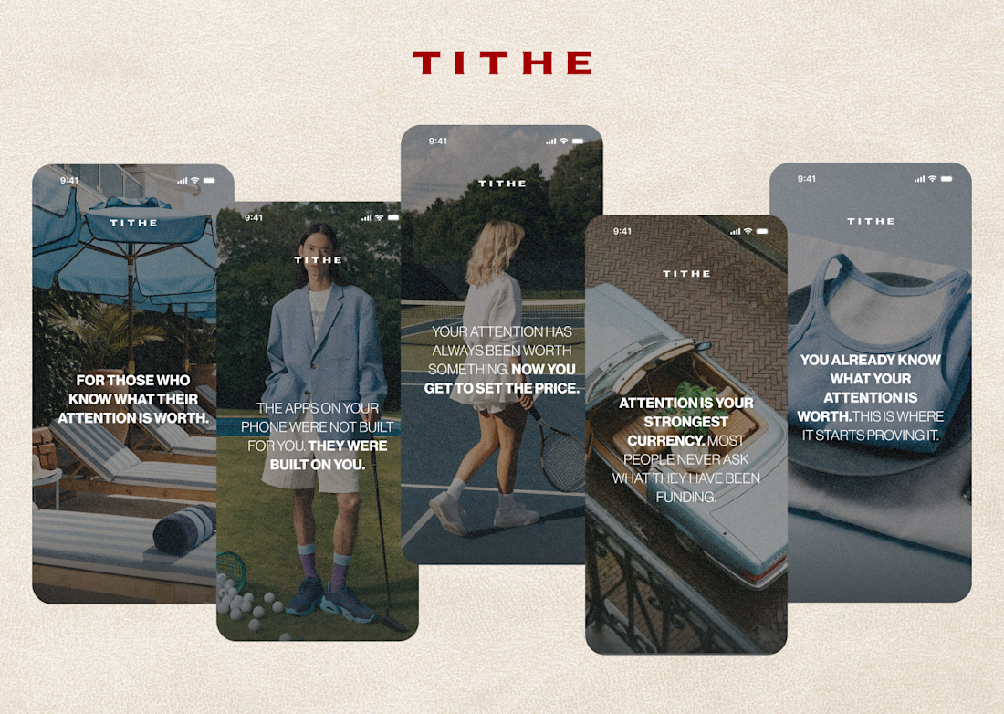

This is a really strong approach to onboarding. The raw imagery combined with that bold copy makes it feel much more like a manifesto than a standard app tutorial.