The network for creativity
Join 1.25M professional creatives like you
Connect with clients, get discovered, and run your business 100% commission-free
Creatives on Contra have earned over $150M and we are just getting started
Back to feedPost
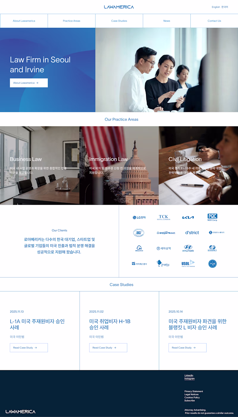
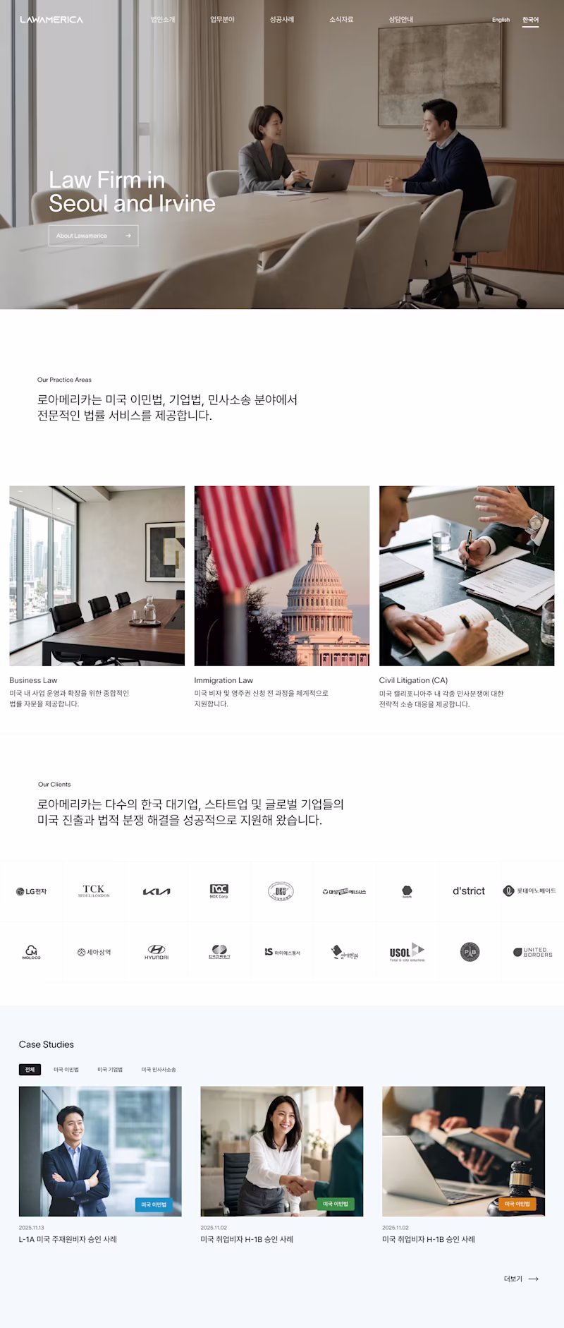
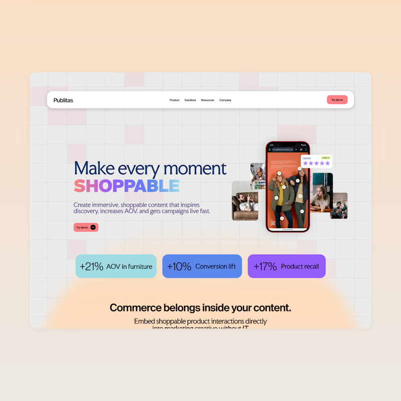
Taste Test


I prepared two landing page designs for the client: one is grid and blue (using their color), and second is more BW and clean.
I did this because making a full-screen AI video wasn't high quality enough – and also using grid everywhere was hard. Which one is better?
1 vote
Ends in 1d


The network for creativity
Join 1.25M professional creatives like you
Connect with clients, get discovered, and run your business 100% commission-free
Creatives on Contra have earned over $150M and we are just getting started
Related posts

Hero concepts for a new website, which one are we going with?
84 voted
68%
40 voted
32%
124 votes
Closed


blue all the way, brother

Designers, we can finally move past building sections and layouts. Threejs is getting easier to make, and we can focus on becoming creative directors.
Using ThreeJS & AI & PeachWeb Builder. I made 3 visual remixes in 1 hour. Just focusing on the brand identity and creative direction. Does that sound like fun?


amazing work done 🔥.

I had fun designing my first dashboard. It will be used for case study I am making.


this is amazing work , well details


Trending
aivideo
AI video tools are moving at warp speed. Which ones are you experimenting with?
illustration
Handcrafted illustration is bubbling up across the web. What are you drawing lately?
aidesignflow
AI tools are redefining design work. What's your current workflow?
returntonature
Spring is a reset for creativity. What’s inspiring you outside the screen right now?
freelancerlife
Freelancer life is wins, pivots, and everything in between. What’s yours right now?