The network for creativity
Join 1.25M professional creatives like you
Connect with clients, get discovered, and run your business 100% commission-free
Creatives on Contra have earned over $150M and we are just getting started
Back to feedPost

Color theory in branding is less about picking your favorite color and more about shaping how people feel. Blue can suggest trust, red can create urgency, and green often feels natural or balanced—but context matters. The strongest brand palettes don’t just look good; they support the message and make the brand easier to recognize.

The network for creativity
Join 1.25M professional creatives like you
Connect with clients, get discovered, and run your business 100% commission-free
Creatives on Contra have earned over $150M and we are just getting started





Related posts


A color palette with six swatches and no hierarchy is just a list. You need to know which color carries the brand, which one carries information, which is for emphasis, and which stays in the background.
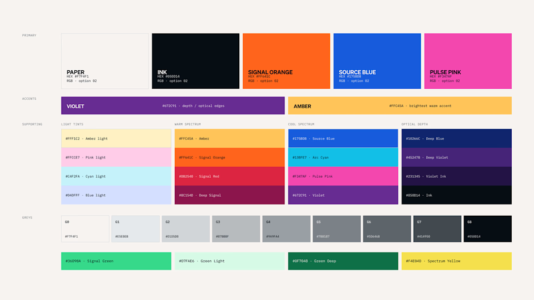

I like the top and bottom ones and it depends on what I will work on


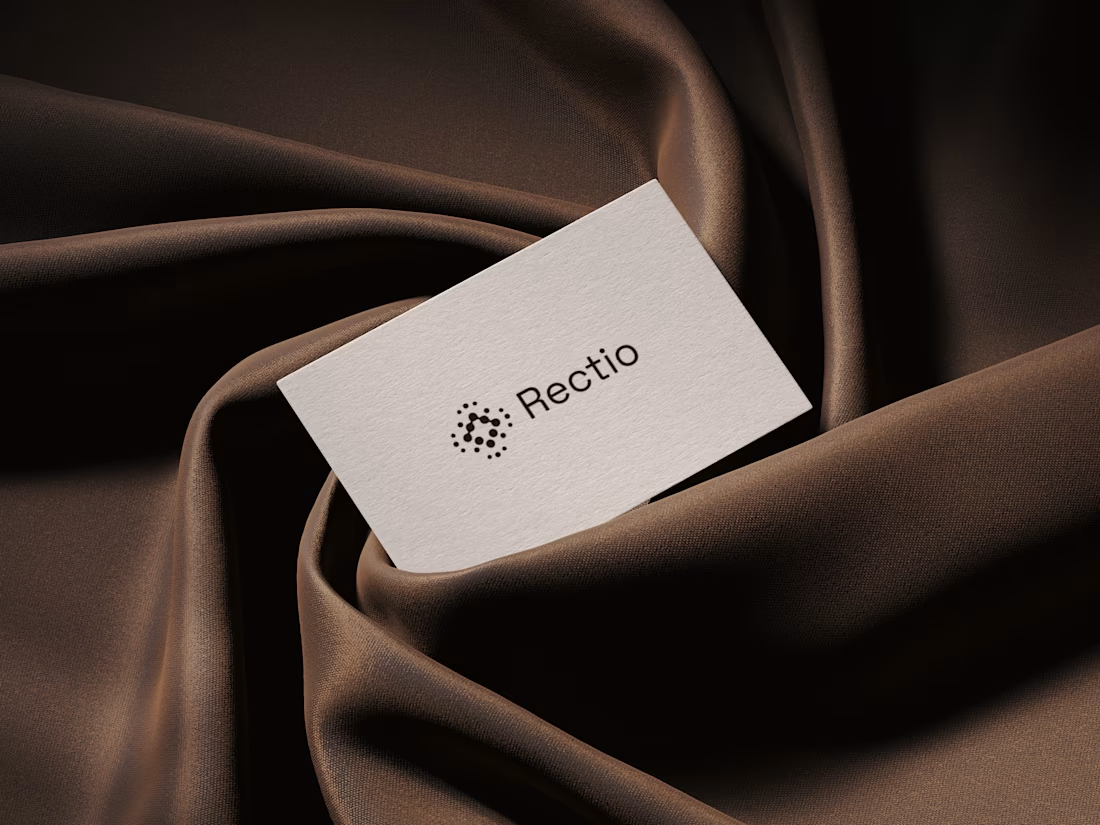
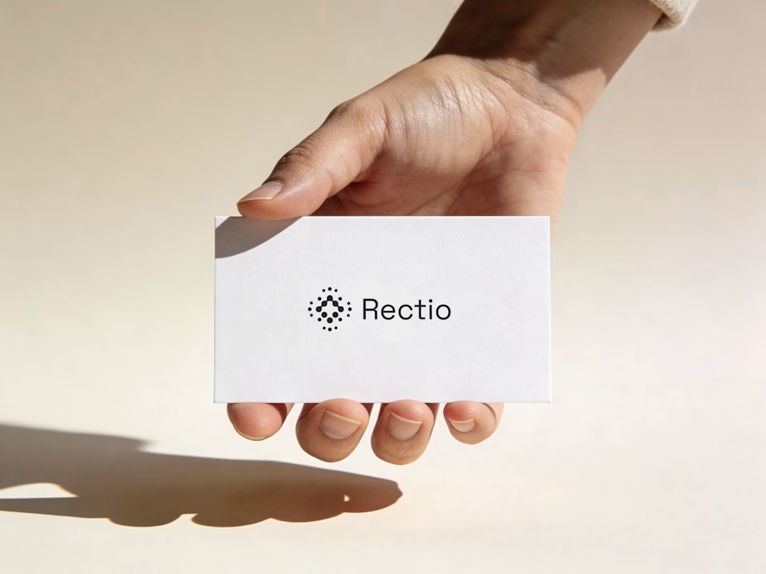
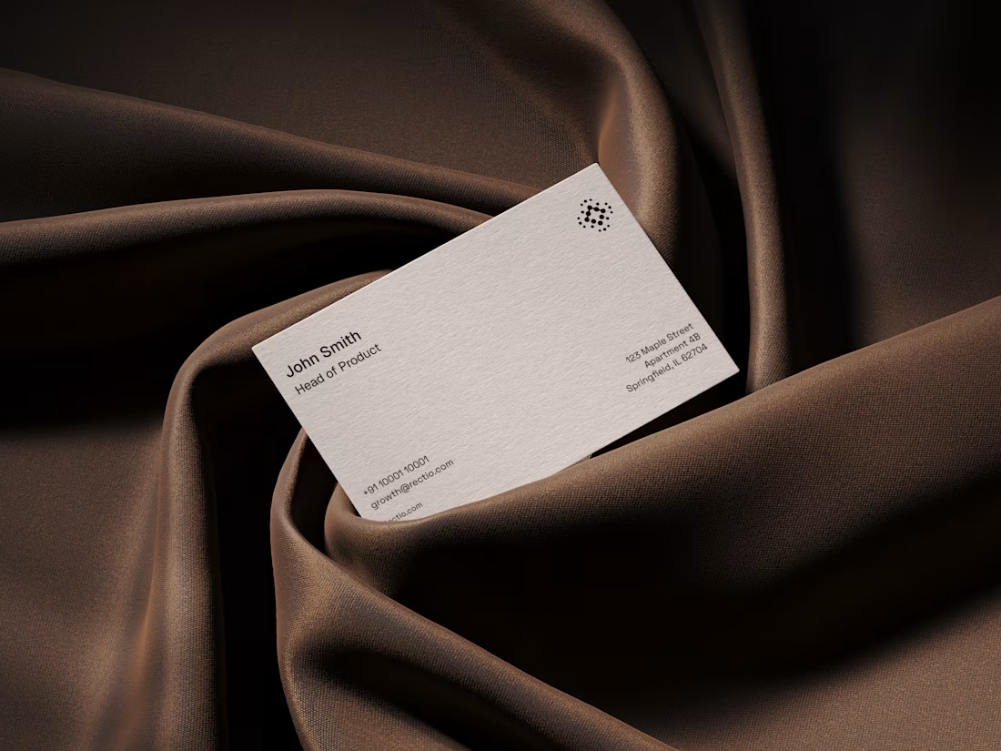
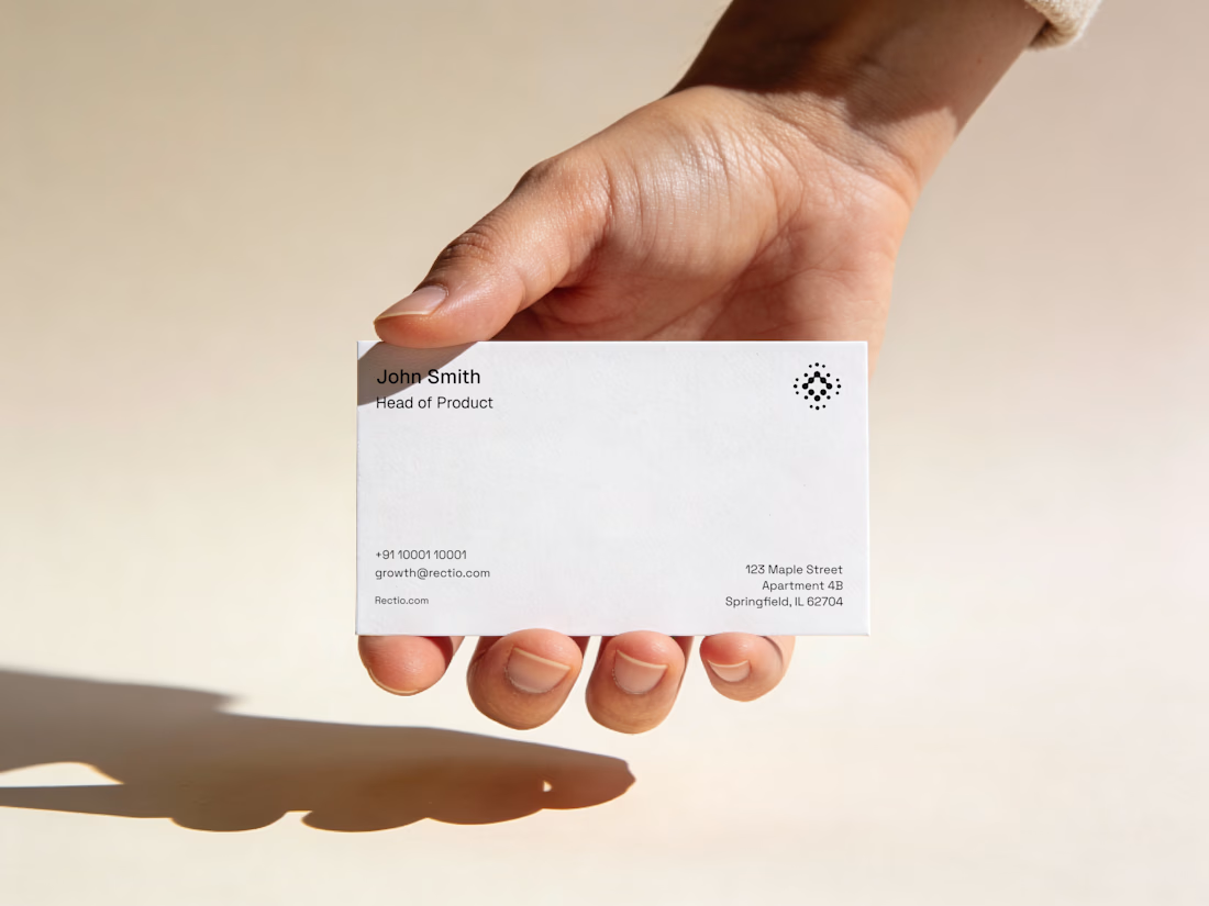
Rectio — Brand Identity
Brand Identity • Visual Direction • Business Cards • Mockups
A modern and minimal branding direction for Rectio, from visual identity to business card applications.
Created by Artonest Design Studio — artonest.design




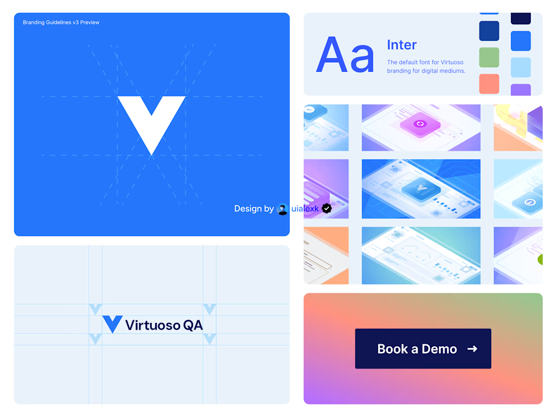
Branding v3 for Virtuoso
This design evolution, made an impact to the brand growth's by:
- Increasing website conversions
- Having consistent brand presence across digital mediums
- Increase brand awareness
See full case study here

One of the best designs I’ve seen today. Really solid work