The network for creativity
Join 1.25M professional creatives like you
Connect with clients, get discovered, and run your business 100% commission-free
Creatives on Contra have earned over $150M and we are just getting started
Back to feedPost
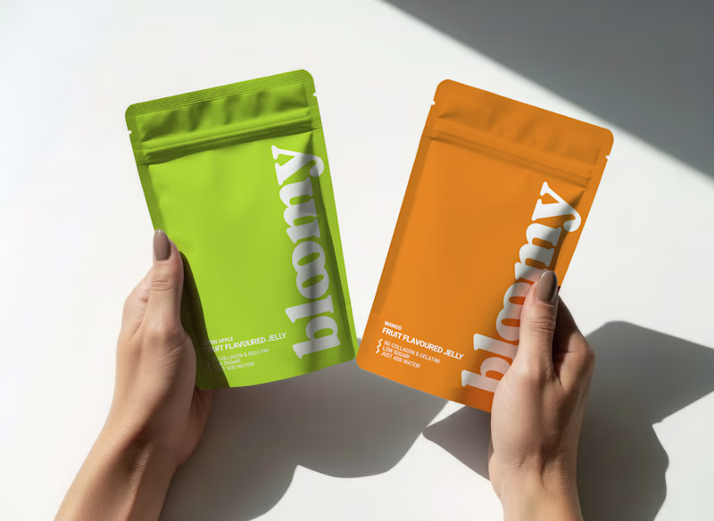
Taste Test
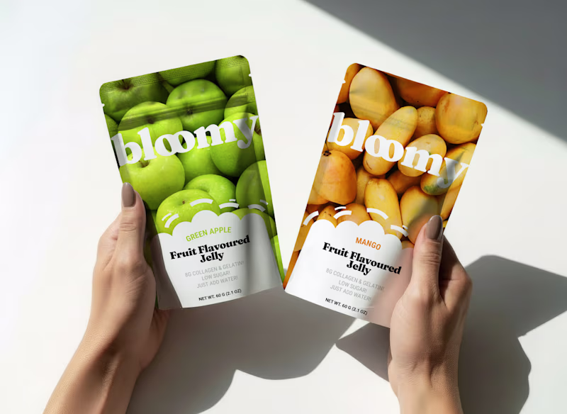
I'm finding the right to be more visually interesting 😊 I do think more contrast is needed for the logo to stand out more, though!
Thank you for your feedback, and that’s a valid point about the contrast between the logo and the background. One solution would be to filter out a bit of the bright light areas in the photo so the logo stands out more clearly.
Tricky! Because as a designer I would pick A, however B tells me more about the product and it would take less time to make a choice.
Yes, the left one looks better in real life, the mockup doesn’t show how strong the lime and orange pantones really are :)
But the left version works better for an already established brand, like Coca-Cola. Since this is a startup, I’m also leaning more toward B with the same argument as yours!
Thank you for reasurring!
The network for creativity
Join 1.25M professional creatives like you
Connect with clients, get discovered, and run your business 100% commission-free
Creatives on Contra have earned over $150M and we are just getting started
Related posts
Help me choose, A is richer and more hands-on. B is quieter and more intentional.
2 voted
33%
4 voted
67%
6 votes
Closed
Well done boss🙌 , option b is cool maybe you can have the copy and maximize icons on it also
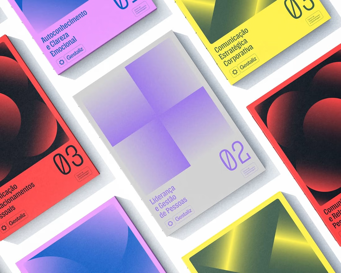
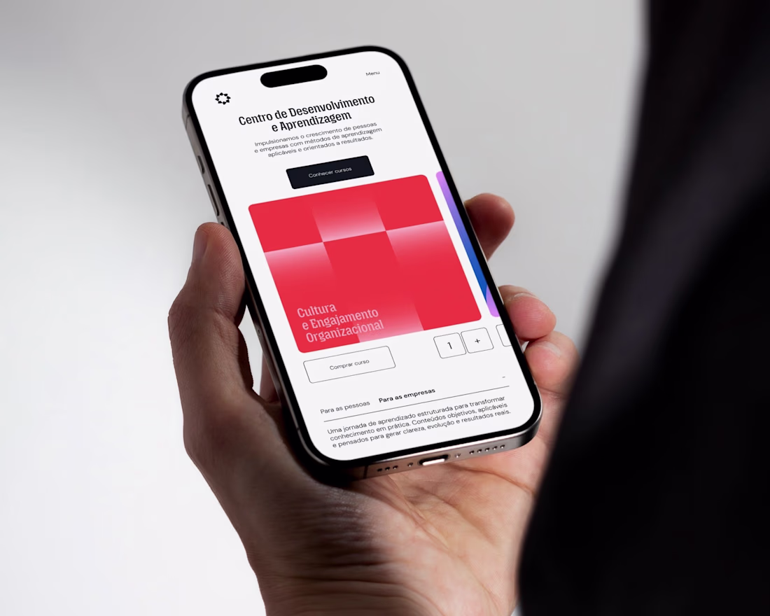
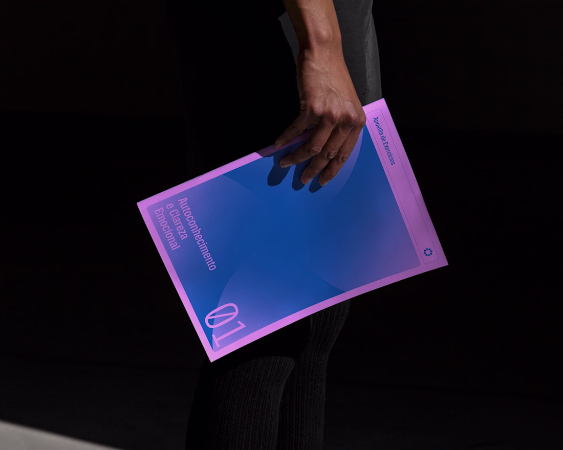
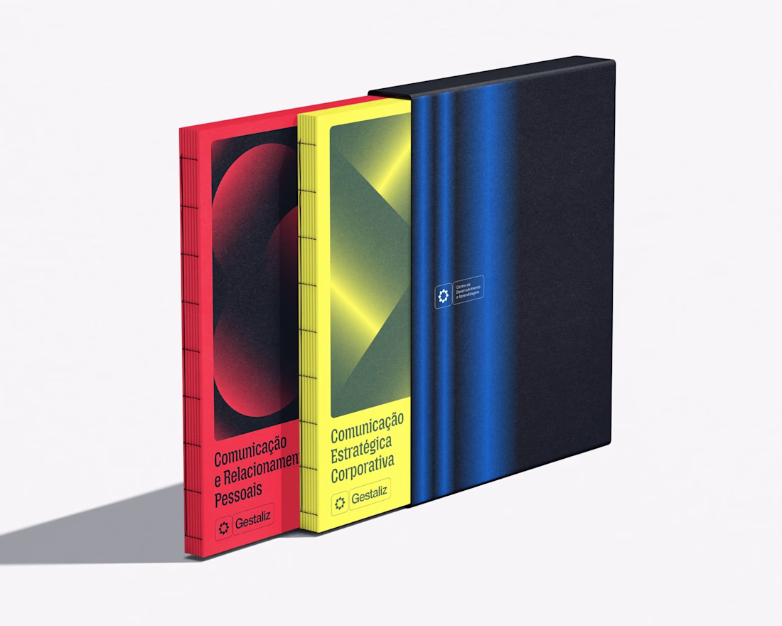
Gestaliz is a learning ecosystem built on the principle that knowledge only generates value when it is structured and applied. Expanding on its brand foundation, this project focuses on the development of a visual system for its course ecosystem — translating strategic thinking into a scalable and coherent design language.
Rather than creating isolated course identities, the approach was to design a unified system capable of organizing different learning paths while maintaining clarity and consistency. The solution is rooted in the use of fundamental geometric forms as carriers of meaning.
Nice work
Trending
Runway
AI video generation is exploding. What are you dreaming up in Runway?
Contra University
Learn from expert creatives how to earn more using next-gen AI tools.
creativeaiflow
Creative AI workflows are evolving. What tools do you use, and what are their strengths and weaknesses?
portfolioreview
The best portfolios tell a story, not just show a grid. Share yours for feedback.
freelancerlife
Freelancer life is wins, pivots, and everything in between. What’s yours right now?