The network for creativity
Join 1.25M professional creatives like you
Connect with clients, get discovered, and run your business 100% commission-free
Creatives on Contra have earned over $150M and we are just getting started
Back to feedPost
Taste Test
Motion vs stillness on landing pages — which wins? ⚡
Some say animation grabs attention. Others say it kills load time and focus.
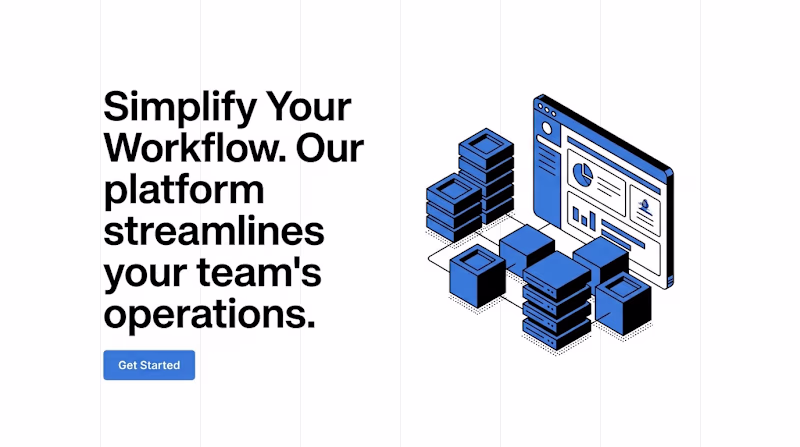
Design 2: Subtle Lottie animation, floating elements, dynamic feel.
Design 1: Pixel-perfect static layout, no distractions, pure focus on copy.
As a designer or dev — which would you build?
2️⃣ = Animated | 1️⃣ = Static
#FrontendDesign #LandingPage #WebAnimation #UIUXDesign #Contra
2 voted
40%
3 voted
60%

5 votes
Closed
Minimal Hero for me. The message is immediately clear, the visual hierarchy is stronger, and my attention goes straight to the value proposition. The animated version feels visually impressive, but the floating elements compete with the headline and make it harder to know where to focus first.
Voted Minimal Hero. For B2B SaaS, copy and clarity usually outperform animation. A Lottie hero can look impressive but when the value prop is complex, you need the visitor reading, not watching.
Really interesting concept. It's exciting to see creators pushing beyond traditional app experiences.
The network for creativity
Join 1.25M professional creatives like you
Connect with clients, get discovered, and run your business 100% commission-free
Creatives on Contra have earned over $150M and we are just getting started
Related posts
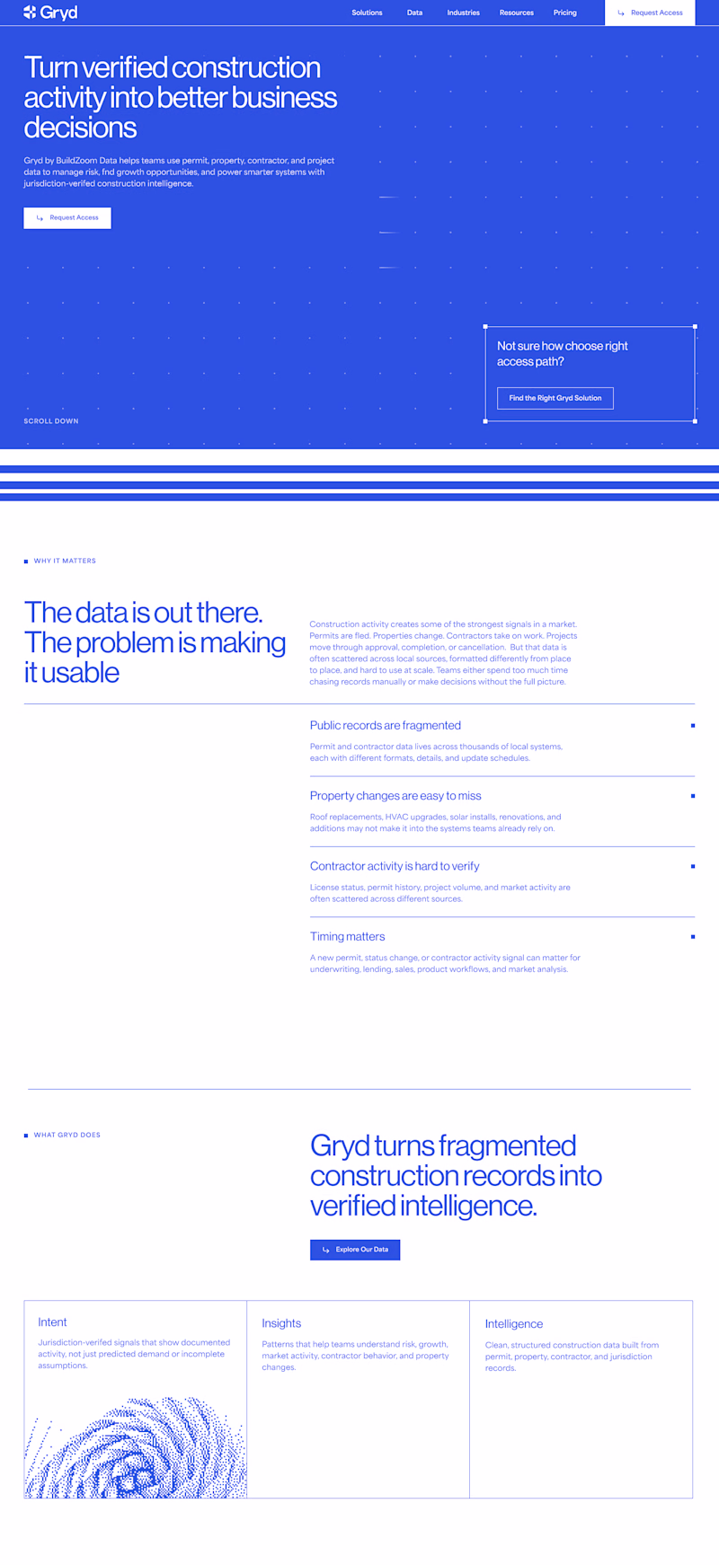
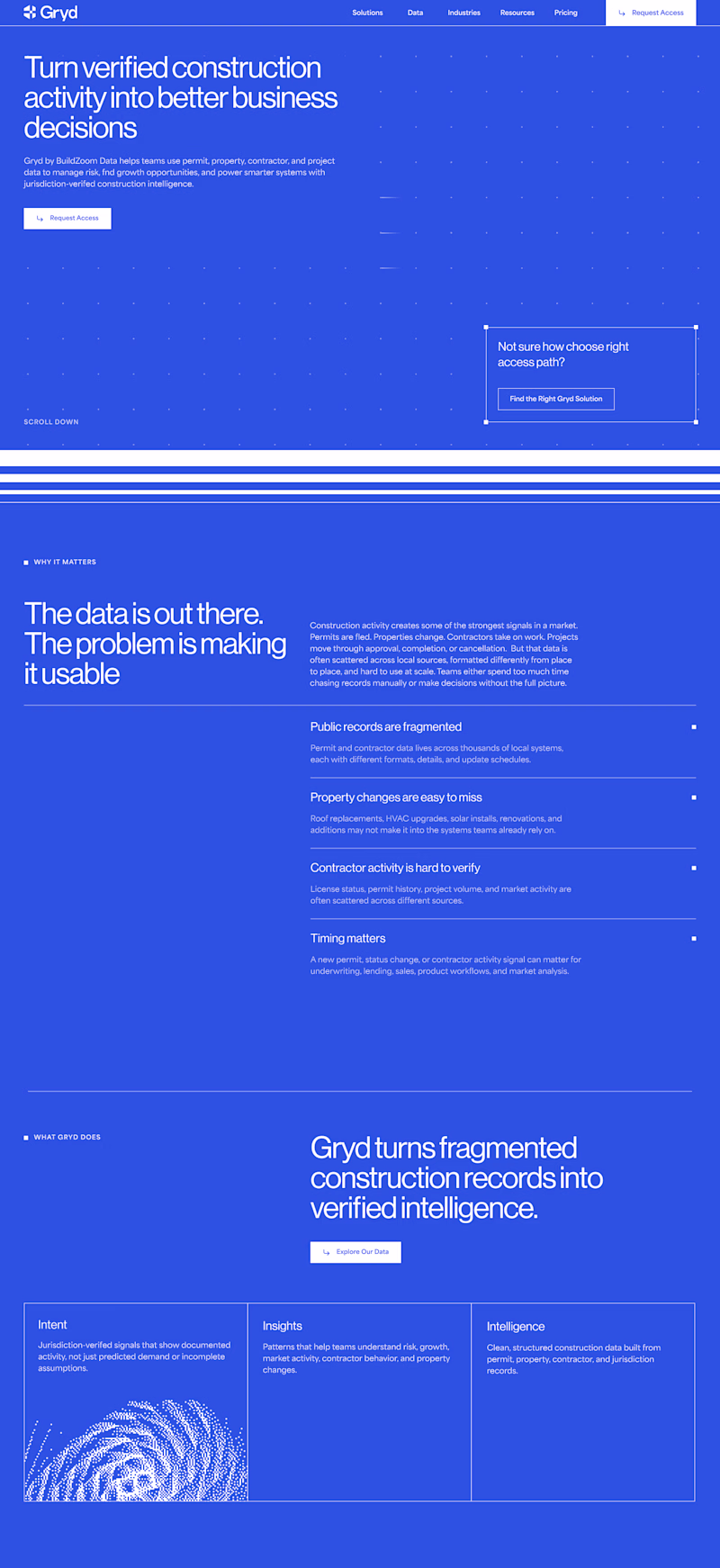
I'm currently working on a website that focuses on data, with minimal imagery and a clean, linear branding style. My question is: is it better to alternate the blocks frequently, as in the version on the left, or to make most of the page blue? 🤔
20 voted
95%
1 voted
5%
21 votes
Closed
White and blue for me always
Who says review sections must be boring? A look at how i used deconstructing layouts for a review section that stands out on Popcorn!
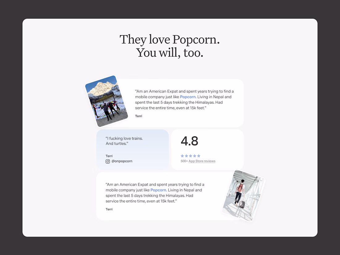
This is amazing
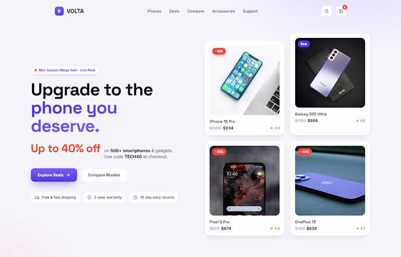
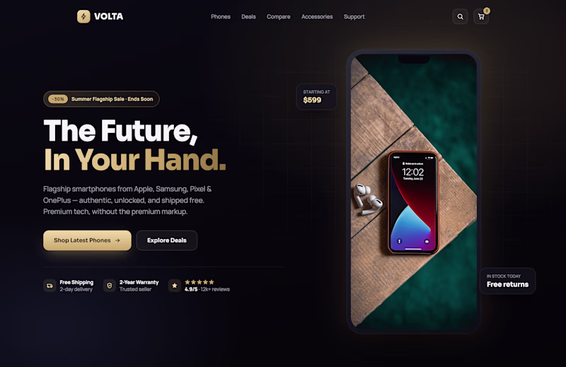
Which one hits harder? 👇
Designed two hero sections for a mobile store, same product, different energy. Now I need your eyes.
A or B? Drop your vote in the comments. No wrong answers. Just your gut reaction.
4 voted
29%
10 voted
71%
14 votes
Closed
A gets my vote. The offer, products, and CTAs are immediately visible, making the path to purchase feel effortless. B has a premium aesthetic, but A balances visual appeal with usability a bit better.
Trending
Claude
Claude has entered the design space. How are you using Claude Design?
Contra University
Learn from expert creatives how to earn more using next-gen AI tools.
MagicPath
The canvas is infinite, and exploration is becoming the workflow. How are you using MagicPath?
creativeaiflow
Creative AI workflows are evolving. What tools do you use, and what are their strengths and weaknesses?
freelancerlife
Freelancer life is wins, pivots, and everything in between. What’s yours right now?