The network for creativity
Join 1.25M professional creatives like you
Connect with clients, get discovered, and run your business 100% commission-free
Creatives on Contra have earned over $150M and we are just getting started
Back to feedPost
Taste Test
Which one hits harder? 👇
Designed two hero sections for a mobile store, same product, different energy. Now I need your eyes.
A or B? Drop your vote in the comments. No wrong answers. Just your gut reaction.
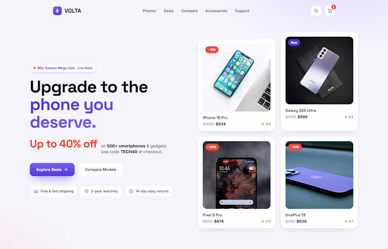
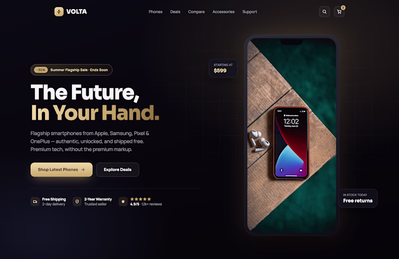
2 votes
Ends in 1d
The network for creativity
Join 1.25M professional creatives like you
Connect with clients, get discovered, and run your business 100% commission-free
Creatives on Contra have earned over $150M and we are just getting started
Related posts
Quick creative challenge 👇
You have 3 seconds to stop someone from scrolling.
Which ad does it better?
🅰️ Minimal & Clean
🅱️ Bold & Dramatic
Vote and tell me what influenced your choice:
• Typography
• Composition
• Color
• Product focus
• Overall impact
14 voted
34%
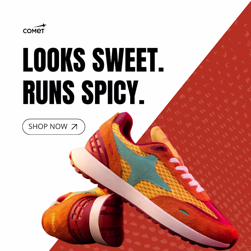
27 voted
66%
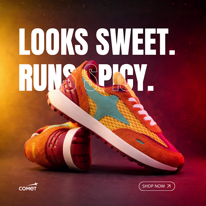
41 votes
Closed
Will go for the Bold & Dramatic
Which website stands out to you the most in terms of design?
https://gaines.pet/
https://www.everlane.com/
4 voted
80%
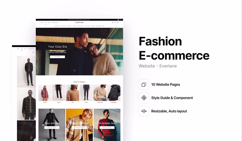
1 voted
20%
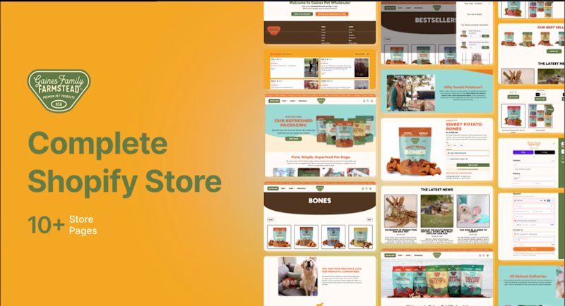
5 votes
Closed
Just comparing two of my recent branding projects and honestly... I can't pick a winner.
Both solve completely different problems, both have their own personality, and I've spent way too much time staring at them trying to decide 😅
So I'll leave this one to you:
🏆 Which branding wins?
22 voted
56%
17 voted
44%
39 votes
Closed
Kinda resonate more with KrowLabs but both are really 🔥
Trending
Claude
Claude has entered the design space. How are you using Claude Design?
Contra University
Learn from expert creatives how to earn more using next-gen AI tools.
MagicPath
The canvas is infinite, and exploration is becoming the workflow. How are you using MagicPath?
creativeaiflow
Creative AI workflows are evolving. What tools do you use, and what are their strengths and weaknesses?
freelancerlife
Freelancer life is wins, pivots, and everything in between. What’s yours right now?