The network for creativity
Join 1.25M professional creatives like you
Connect with clients, get discovered, and run your business 100% commission-free
Creatives on Contra have earned over $150M and we are just getting started
Back to feedPost

Here's a trick most portfolios miss: curiosity converts better than clarity.
Show someone the full picture right away, and their brain files it as "seen, done." Show them almost the full picture, and their brain won't let go until they see the rest.
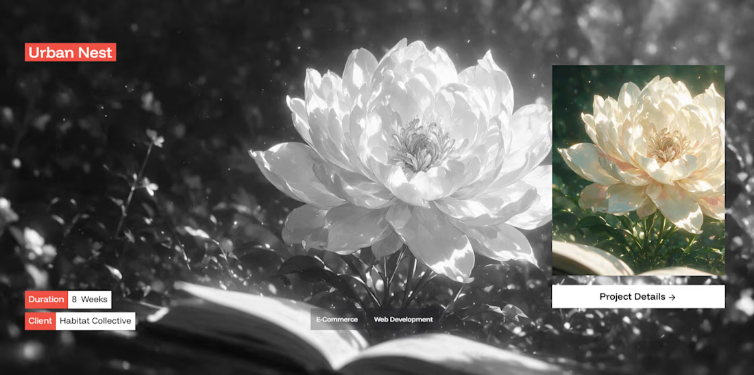
That's exactly what happens in the Projects section of Veriq.
Each project starts in grayscale. Muted, quiet, holding something back. The second you engage, color floods in, like the project is revealing itself to you rather than just sitting there.
It's a small detail. But it changes the whole interaction:
→ Grayscale creates the gap ("what does this actually look like?")
→ Color closes it, but only after you've leaned in
→ The "Project Details" button turns that curiosity into a click, instead of leaving it to fade
Most portfolio grids say "here's my work." This one says "come see what happened." That one-word shift, from presenting to inviting, is the difference between a visitor who scrolls past and one who clicks through.
If you're building a portfolio, creative studio, agency, or lifestyle brand, this section alone is worth stealing : Veriq - A Modern Home for Digital Teams

The network for creativity
Join 1.25M professional creatives like you
Connect with clients, get discovered, and run your business 100% commission-free
Creatives on Contra have earned over $150M and we are just getting started







Related posts


In home page instead of normal blur div, try to use svg filter blur with turbulence and displacement map.. it looks more natural and premium

Libra season is here, and so is spring (in my side of the world)!
🌸🍃 ☀️🌈
I'm using this blooming moment to rebuild my personal brand from the ground up: re-evaluating, brainstorming, and bringing my whole toolset to the table. 💻🧠⚡️
As a multipotential creator, making everything I do fit into one clear story isn't always easy. So I'm giving it the time it deserves, and I'm curious to see where it leads.
STAY TUNED! 😊


Amazing work!